Blog

Posted on 5 Comments

Humpback Whale Totem

Humpback Whale Totem

The latest painting in my Totem series, and while Humpback Whales are found all over the world, I consider this the first image in my Pacific Coast series.

This painting was an incredible challenge, and while I had always intended the Humpback to be part of my Totem series, it was something I wanted to do to prove a little something to myself as well.  Comments on the other animal paintings often mention how much people like the way I paint fur.  While that’s appreciated, I wanted to paint an animal that had none at all, just to see if I could do it.
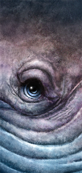
There were a number of challenges with this painting.  First, it’s underwater, so there were choices to make on that.  When dealing with cool colors on cool colors, the effort to make the whale stand out from the background was going to be in the light contrast and taking a lot of creative license in the color of the whale itself.  Another challenge was the texture.  For a few hours while painting this, she looked a little like stucco because I had far too much contrast in the details, so rather than a rubbery looking skin, it looked almost scaly.  While correcting that, I went a little too far and the skin look too airbrushed.  What you see here is the compromise.  Skin that is still textured and non-uniform, but still trying to achieve a smoother look than I’m used to. And finally, I wrestled with the water.  I didn’t want a smooth gradient look, but I also didn’t want to go with the cliché ‘god lights’ that so many artists use in underwater scenes, those rays of light beaming in from the surface to give the painting an ethereal look.  Just didn’t feel right.  The background in my paintings is supposed to be just that, so I broke it up with the suggestion of particulates and bubbles.

Initially, I had planned on the finished image being 30″x40″ at 300 ppi.  Unfortunately, I didn’t get there.  The full resolution file for this painting is 18″x24″ at 300 ppi, because at one point, the working file size was right around 800MB.  My computer’s good, but it gets sluggish when painting detail at that size.  I’ve no doubt that I could still print this file at 30″x40″ at 200ppi on canvas and it would still look good, though.

Had a bunch of highs and lows while painting this little lady (BIG lady) and I can’t even guess how many hours I put into it, but it was a lot, likely more than I’ve put into any other painting.  For a few hours on the weekend, I was very frustrated and was worried I wasn’t going to achieve the look I wanted.  When that was going on, I wasn’t having any fun, whatsoever.

As difficult as this painting was, I learned a lot.  Had to create a few new brushes, something I haven’t done in awhile, but they’re now in my library and will come in handy the next time I paint an animal with mottled textured skin.  I also learned a few new layering techniques to get the suggestion of detail, without making it too sharp.

While it took a lot out of me, I’m pleased with the finished painting, and I think I’ve grown a little more as an artist, which is always the intent.

Posted on 2 Comments

The Perfect Bait

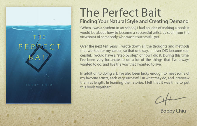
This morning, I finished listening to Bobby Chiu’s new book, The Perfect Bait.  It far exceeded my expectations.

While I have met Bobby before at the Calgary Comic and Entertainment Expo a few years back, and have taken a couple of courses from instructors at his Schoolism.com site, I don’t actually know him.  But I do know his fantastic work, and have followed his career.  Bobby is a successful artist, and while I know his work is ever evolving and he is nowhere near where he intends to be, his example is one that many artists can learn from.   One of his recent more famous projects is that he worked as a creature designer on Tim Burton’s ‘Alice in Wonderland.’   Here’s a look at his creature design work on his CGSociety portfolio.

It should come as no surprise why I’m a fan, and not just because he’s a fellow Canadian.  But it’s not just his work that’s impressive, it’s his philosophy on the business of art.  One of the benefits of buying the book is that you get access to the audio version as well.  So while I haven’t yet received the book, I have listened to the entire thing already while working yesterday and this morning.  Many art books end up being simply motivational ‘you can do it!’ publications, but Bobby talks about real world examples of how specific things worked out for him and why others didn’t, and how failure is as much a recipe for success as any award or accolade.  And best of all, he puts more stock in hard work than talent, something I’ve believed in for years, as I’ve seen artists far more talented than I, fall into obscurity because they simply didn’t apply themselves.

The benefits to me personally were two-fold.  First, there was a fair bit of confirmation in the book that I’m doing a lot of things right.  Had I read the book five years ago, that would not have been the case, but I’ve made plenty of mistakes, learned from them, made course corrections and carried on.  The second benefit was being made aware of a number of things I’m fully capable of doing to better my career but either had not thought of them, or I didn’t think they were important enough to bother with.  I stand corrected and feel better equipped to continue my forward momentum.

Most importantly, Bobby emphasizes the importance of passion in your work.  I’ve heard many times over the years that the work an artist should be doing is the work they would still do even if nobody paid them.  I am incredibly fortunate that with my animal paintings over the past couple of years, I have discovered that work, and am grateful for it.  I was already passionate about painting, but this book stoked that furnace even more.  In a perfect world, everybody would realize their passion and find it within themselves to pursue it.

So if art is your passion, no matter what kind of art that is, I would like to help ONE of you take a step forward.  On Friday afternoon, I will draw a name on my business Facebook page, and then I’ll buy that person a copy of Bobby’s book.  All you have to do is leave a comment on the post that links to this blog entry.

If you would like to buy Bobby’s book, visit the webpage, www.ThePerfectBait.com and get yourself a copy.  You’ll be glad you did.

Posted on 3 Comments

Painting a Gentle Giant

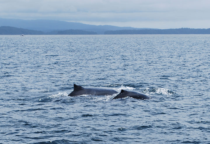
Humpback whale and calf in The Broken Group Islands – Patrick LaMontagne

For as long as I can remember, I’ve been enamored with humpback whales, and I have no idea why this particular species of baleen whale holds my love and interest over any other marine mammal.  My wife and I saw these two (and a few more) on a tour of the Broken Group Islands out of Ucluelet on Vancouver Island this past summer, and although we only saw backs and tails, it was a thrilling experience.

A longtime dream I’ve had is to be in the water with one of these massive creatures.  Now before you think me a little nuts, I’m not oblivious to the danger.  I know that an animal can be as gentle as a kitten, but when it’s the size of a semi truck, you don’t want to be under it when it rolls over.  Despite that, the desire is very strong and I intend to make it happen.  I want to get my diving certification in the next year or two, and to swim with humpbacks in the next five.  It’s an expensive trip, but it’s one worth saving for.

From time to time over the years, I’ve had very vivid dreams featuring different animals.  One in particular, was the spark for my Animal Totem series.  Humpbacks have shown up a few times, most recently last week and it prompted me to start searching for reference.  When I found the right image (and there was no doubt, once I saw it), I started looking for the photographer who took it.

As I’ve mentioned before about photo reference, no photos are ever part of my paintings, but I still need to have great shots to work from in order to get the level of detail that I paint.  I can’t tell you from memory what the hair on a moose looks like as it transitions over the nose, or how a bighorn sheep’s horns curl around in relation to his other features.  So, I rely on the work of wildlife photographers to provide me with the reference I need.

Some photographer friends, of which I thankfully have many, have been very generous in allowing me the use of their work.  For others, I have traded my services as an illustrator for their own projects, or paid them outright for the license to use certain photos.   A few have asked for canvas prints of the finished painting in payment.  I’ve been agreeable to all of these terms, and grateful for their willingness to help me do what I love to do.

From time to time, a wildlife photographer will tell me they aren’t interested or their price will be too high for my budget.  In those cases, I’m usually disappointed, but I thank them for their time and look for other reference.  Even though my finished paintings look very little like the photos I use for reference, so many photographers have had their work stolen online and they’re extra cautious about allowing their work to be used.  It’s unfortunate, but a reality of the business, and as these photos are the product of their time and effort, they have every right to say No,  just as I’ve declined certain uses of my own work.  So I try to be hopeful but not too optimistic when I approach a photographer with whom I have no connection.

When I found the right humpback image, I was pleased.  All that was left was to get permission and the high resolution photo, and that’s how I found Scott Portelli.  Scott is a wildlife photographer out of Sydney,  Australia, and he specializes in taking photos of Humpback Whales.  Each year, for the past decade, he has taken small groups of people to Tonga to swim with these gentle giants.  From August to October, Humpbacks mate and give birth in these warm waters.  Scott is an active supporter of whale conservation and vocal opponent of the practice of whaling that sadly, still goes on today.

Having made ‘the ask,’  I set about to work on other things, as you never know how long the response will take.  Scott replied quickly, was very kind and we soon came to an agreement for the use of the photo.  Yesterday, I received the high-res image and I am very happy.  It’s a beautiful reference to work from, and I now have no doubt that I’ll be able to paint the image I’ve been imagining.  There are a few animals I’ve been waiting to paint until I had just the right reference, and this is one of them.  Thanks, Scott.

While I won’t post the image I’m using, please do look at Scott’s wonderful photos of these and other beautiful animals.  You can find his website and links to his Flickr account at www.scottportelli.com.

What I find especially thrilling is that this search led me not only to the photo, but to the means to fulfill my dream.  When I am ready to swim with Humpback Whales, I will know who to contact.  If you’d like to find out more about Scott’s excursions and tours to the beautiful waters around Tonga, you can find that information at www.swimmingwithgentlegiants.com

Somebody recently made a comment online that my specialty was obviously painting fur.  While it’s great to have that skill recognized, as it took me a long time to develop the techniques, I have no desire to be a one-trick-pony and only be able to paint furry animals, despite how much I enjoy it.  This whale will be a personal challenge as there’s not one hair to be painted in the whole image, but I think I’m up to it.  And I’m excited to get started.

Posted on 4 Comments

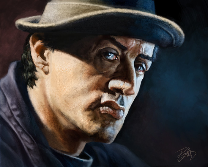
Portrait of Rocky Balboa

This painting, like many that I do these days, was an absolute pleasure to work on.  For the past couple of years, I’ve been focused on my Animal Totems, and although they are still where I plan to continue investing my creative energy, I realized that I hadn’t done a full painting of a person in quite awhile.  Yes, I’ve done a few on the iPad, but not a fully finished painting.  I think the last one I did was a caricature of Bert Monroy, and that was in June of 2010.  I figured it was time to do another one, and rather than a caricature, I wanted to paint a portrait.

Regular readers will know how much I love movies.  One of my favorites is Rocky Balboa, the sixth movie in the series.  I think the reason I like it is because it’s not so much about Rocky’s battle with an opponent, it’s his struggle with getting older, but still feeling he has left something undone.  Some critics panned it for being overly romanticized and unrealistic, but I disagree.  Very much like the tone and writing of the first Rocky movie, the movie that won and was nominated for a slew of Oscars in 1976.   Rocky Balboa inspired me, much like Sylvester Stallone’s own personal story does.  If you aren’t familiar with it, you might want to take the time to listen to how Tony Robbins tells it.

Rather than paint him as the fighter in the ring, I wanted to paint the real character.   His wife has passed on, his son is now a young man living on his own, and Rocky spends his evenings at his restaurant telling people old ‘war stories’ from his glory days.  But there’s still that hunger.  The movie reminds me that one of my own biggest fears is becoming an old man and regretting the things left undone.

This was started as a painting on the iPad, shown here.  I used the procreate app, the Wacom Bamboo Stylus, and the Nomad mini brush.  As much as I enjoy painting on the iPad, and a number of my recent portrait paintings have stopped there, I brought this one into Photoshop and painted over it to get the look and texture I wanted.  While my animal paintings are very detailed, this one is intentionally rougher.  The tone of the piece, and the age of the subject called for a little less polish.  The finished painting was done in Photoshop with a Wacom Intuos4 medium tablet, and the image size is 16″X20″ at 300ppi.

Even though I’ve never had any of my own work printed for myself, I think I will get this one printed on canvas and framed for my office.  Never hurts to be reminded that our time here is short.

Incidentally, one of my favorite onscreen speeches is from this movie, this one from Rocky to his son.

Posted on 1 Comment

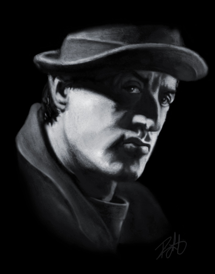
Rocky Balboa – iPad Painting

This is my latest iPad painting, Sylvester Stallone as Rocky in the sixth and final movie of the series, Rocky Balboa.  Some critics scorned it as having too many clichés and being unbelievable, but it’s my favorite of the series.

This is as far as I could take the painting on the iPad, and I’ll be using this as a rough for a finished painting in Photoshop.  The finished painting will not be in black and white, but I find accurate colour to be incredibly difficult and a useless effort on the iPad, so I’ll do that in Photoshop.

I painted this with the procreate app, still the one I prefer to work with most.  Most of the work here was done using the Wacom Bamboo Stylus, but I also used the Nomad Mini brush for some of the nitpicky texture work.

This is by no means finished, and I can already see many things  I want to change and improve on, both in the painted details and the likeness.  But it’s a good start.  With each iPad painting I do, I’m getting more comfortable with it, and figuring out just what’s possible.  Still enjoying working with the device, tools, and apps and I plan to continue improving my skills.

Posted on 1 Comment

Tom Richmond and The Mad Art of Caricature!

There are many people who consider the humourous paintings of people that I do to be caricature, but just as many who don’t.  I consider traditional caricature to be an exaggeration of features while maintaining the likeness.   At the risk of trying to slap a label on it, my work fits somewhere in between caricaturing a person and cartooning them.  Often it will be a large head, small body, with only mild distortion or exaggeration.  For a lot of business or gift purposes, that’s what my clients want.  But wild exaggeration or not, I still feel that I have a lot to learn.

I have no desire to be a quick-sketch caricature artist, the kind you see at an amusement park or event, but I have a great deal of respect for those who are able to fill that role.  It’s a difficult skill to master and very different from the type of painting and cartooning that I do.  You have to be confident and bold when drawing live, and I’m a tentative obsessive sketcher when I’m drawing people.  I don’t mind admitting that I find quick-sketch caricature very difficult and I’d like to become better at it.

When I think of caricature artists that really wow me with their skill, Tom Richmond tops the list.  Tom is best known for his MAD magazine work, but he’s done a lot more than that in his long career.  Rather than list his accomplishments, take a look at his website and I’ll let his work speak for itself.  I’ve written about Tom before on this blog .  OK, maybe more than once.  What can I say, I’m a fan.

Last week, I received a copy of Tom’s new book “The Mad Art of Caricature: A Serious Guide to Drawing Funny Faces.”  People have been nagging him for years to write a book like this, and whether it’s because he got tired of it, or just realized he was ready and made the time, it was well worth the wait.  I pre-ordered the book sometime this summer, and I’ve been looking forward to it ever since.  I had very high expectations, and Tom’s book surpassed them.

I’ve bought many cartooning and caricature books over the years, and this one is hands-down the best I’ve ever seen.  From tutorials on how to draw specific body parts, exaggeration, relationships between facial features…I could go on at great length about all of the wonderful specifics he teaches in this book.  It is comprehensive and complete.  There are techniques and tutorials in this book that I’ve never seen explained in any other I’ve bought, not to mention valuable insights into how to become better at live or studio caricature work.  And content aside, it’s quality printing with beautiful colour, too.  Put simply, I would recommend this book to beginners and professionals alike, without reservation.

While reading the book, I just wanted to pick up a pencil and draw.  Yes, I draw every day already, and while it’s enjoyable, it’s not often that I get excited about it.  I’ve said before that Tom’s work makes me want to be a better artist.  I’ve no doubt that his book will teach me how.

To order a copy of your own, here’s the link again.  “The Mad Art of Caricature: A Serious Guide to Drawing Funny Faces.” 

Posted on 2 Comments

Time and Tide

Over the past four or five years, I’ve spent a great deal of time learning all I can, working to improve my skills, attending conferences, webinars, and even taking a couple of online courses.  This year, I’ve realized that there isn’t as much out there for me when it comes to education.  Yes, there will always be better artists to learn from, but many of them aren’t lecturing at conferences or teaching courses specific enough to warrant the expense.

I wrote recently that I wouldn’t be attending Photoshop World again next year,  so I considered attending the ICON illustration conference.  I’ve read good reviews, but it doesn’t feel like the right thing to do at the moment.  Earlier this year, I had decided not to attend the Association of Canadian Editorial Cartoonists conference next summer in Montreal, because even though there are people I would like to see, it really isn’t a conference about learning.  I can’t justify the expense for three or four days just to hang out and talk shop.  I realize Montreal is a beautiful city, but my wife and I have other vacation plans for 2012.

One decision I’ve now made for the next year is that unless I’m working or speaking at one, I’m not going to be attending any conferences.

With the success of my animal paintings and the fact that I enjoy them so much, it is very clear that I’ve finally found my niche.  This is the work I’m supposed to be doing and it’s a great feeling to have absolutely no doubt about that.  While I still enjoy drawing cartoons and painting people, painting animals is where I find the most fulfillment.

It is gratifying that my work has a growing following.  The paintings are doing well in both Two Wolves in Canmore and the About Canada Gallery in Banff, I’ve signed my first licensing deal with Island Art Publishers, and I’m beginning to get commissions that are a lot of fun to work on.  While I’m fortunate to enjoy most of the work I’ve been doing the past decade, I’ve never enjoyed it more than when I’m painting.

With a couple of DVDs under my belt, my second webinar for Wacom in a few weeks and some knocks on the door from other companies, it has become clear that I’ve stepped well into the realm of teaching, which is often a logical step for many students to take.  While I still intend to keep learning as much as I can, I’ve found that I’m finally comfortable passing on some of the skills I’ve learned, and I’m enjoying it, too.

But, where to go from here?  It’s a question faced by every freelancer, entrepreneur, and self-employed person and one you end up asking yourself over and over at different stages in any career.  Sure, there are many people who have done it before, some of them poorly and others with monumental success, and while their advice and example can aid in the big decisions, the choices still rest with each individual, and with how much each person is willing to risk.

For most of this past year, I was so focused on the DVDs for PhotoshopCAFE and other commission work, that I added only one painting to my Totem series, which was the Great Horned Owl.  Only one.  When I realized that this summer, I don’t mind saying that I wasn’t pleased.  The one thing I love to do more than anything in my work, and it turned out that I made it the lowest priority.  Obviously, I dropped the ball on that.

For the next year, my main focus will be these paintings.  Not just working on them, but promoting and selling them.  I’ve still got other commission work that I’ll be doing, and another DVD in the works for PhotoshopCAFE, but the main priority will be the work I love to do most.

There can often be a number of ‘right’ choices, and because of this, many people will succumb to the paralysis of making no choice at all.  This is the surest way to stall any progress in a freelance career.  Moving forward has always required taking risks, and part of that risk is making bold decisions without knowing how they’ll turn out.  So rather than play a game of wait and see, I’m going to gamble on success.

With that in mind, I’ve decided to get a Small Press booth at the Calgary Comic and Entertainment Expo at the end of April.  Between now and then, I’ll be preparing promotional material, designing and purchasing a large banner and hardware for the booth, figuring out which varieties of prints to sell, and doing as much research as possible to make sure I put my best foot forward.  This will involve a significant expense, but as the old cliché goes, ‘you have to spend money to make money.’

30,000 people went through the doors last year, so I figure it will be a good place to get my trade show feet wet. I’ll be painting live at the booth all weekend, in addition to selling prints and my DVDs.  I have to figure out how many of each I’ll need.  I could bring way too much and go home with a lot of inventory or fail to bring enough and sell out on Day 2.  It’s a gamble because I don’t know how popular my work will be with the attendees, but there’s only one way to find out.

Either way,  I know that I’m going to learn a lot from the experience, and I won’t be standing still.

Posted on 2 Comments

Ostrich Totem

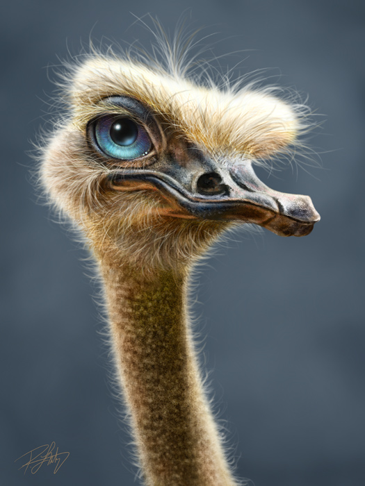
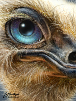
Wait a minute, ostriches don’t live in the Rocky Mountains!  Yes, that’s true, so I guess this one kicks off my African series, something I hadn’t planned on starting for at least another year.  But when life hands you a smart ass ostrich reference photo, what’s a cartoonist to do?

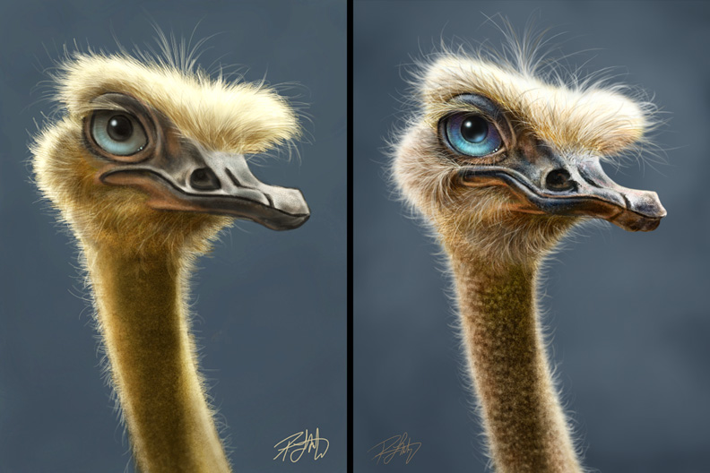
Thanks to Pete Collins, one of the NAPP Photoshop Guys, who sent me some animal photos he’d taken, simply because he thought I might be able to use them.  Pete’s a great guy, but don’t tell him I said that, because his ego is inflated enough (just in case you read this, Pete!). When I saw the ostrich, I thought it looked kind of funny, and since I had a new iPad brush to try out, I decided to do an iPad painting of an ostrich.  Turned out quite well, and that was supposed to be the end of it.

But then my wife saw it, and really liked it.  Shonna doesn’t get excited about my work.  She’s happy I’m doing what I do for a living and she’s able to see things that are wrong in a painting that I might not (especially with likenesses of people), but she’s not a big fan of cartoons or my style of painting.  That’s OK, because she’s still very supportive.  So when she really liked the ostrich, I figured that now I had to REALLY finish it.

She just saw it a few minutes ago and wants a print for her office.  She doesn’t know why, she just really likes this ostrich, and that makes this here painter really happy.  When you’ve been with somebody for 20 years, it takes a lot more effort to impress them.

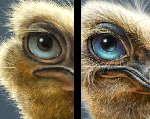
Here’s a comparison of the iPad painting with the finished painting in Photoshop.

On the iPad the size was 9″X13″ at 72 pixels per inch.  That’s pretty small and the print quality wouldn’t be great.  Can’t get much detail at that size.  The final image, painted in Photoshop is 18″X24″ at 300 pixels per inch.  That’s a nice large size, the detail is crisp and sharp and it will reproduce very nicely on canvas.  Actually, it’ll look even better because canvas adds a depth and richness to my paintings that I really like.

So what have I learned?  Well, painting on the iPad just became a lot more useful.  This painting took me a lot less time to paint in Photoshop because I’d already done the real work on structure and fleshing it out on the iPad.  Sort of like a really detailed sketch.  I will definitely do this again, paint first on the iPad, and use that as a base for a finished painting.

It’s unlikely I’ll be printing any limited editions for sale of this one quite yet, because it really doesn’t fit with the galleries here in Canmore and Banff.  Tourists here are looking for mountain wildlife, not African.  But eventually, I’ve no doubt this will get printed just like the others.  It was fun, I really enjoyed working on it, and best of all, my wife likes it.

Posted on Leave a comment

Photo Reference

It’s quite common for me to say that if I take a good photograph, it’s by accident.  The main reason is that taking a good shot doesn’t come naturally to me, and I haven’t the interest in putting in the time required to become better at it.  That’s the key to becoming good at something, devoting yourself to it completely when everyone else around you gives up.  Many people will tell me that they ‘can’t even draw a stick  man,’ which of course is an exaggeration because everybody can draw a stick man, but I get what they’re saying.  The truth is that if a person really does want to become a better artist, they have to be willing to do what it takes to get there.  So it’s not about being willing to draw one stick man, it’s about being willing to draw thousands of them in pursuit of the perfect stick man.

It’s obvious that I’m never going to be a really good at taking photos.  Sure, I’d like to take better snapshots, and over the past few years hanging out with a lot of photographers, I am doing that, but I have no illusion that I’ll ever have any real skill.  My heart just isn’t in it, and truth be told, learning the technical aspects of cameras, lights and equipment  just seems like studying for a math final to me, and I hated math.

Thankfully, I’ve already found my passion elsewhere, but there is still a lot I can learn from photographers.

I love looking at beautiful images and the artistry that photographers put into their work is not lost on me.  Some of my best friends and many of my favorite artists are photographers.  I don’t need to understand how Andrew Zuckerman does what he does to know that I love his images.  Same applies to the work of  Jill Greenberg, Joe McNally, and Moose Peterson.   I know that if you click on any of these links right now, I’ve probably lost you, and I can’t fault you for that.

As a painter, I have learned a lot from photographers.  Images are images, and often, many of the things that contribute to making a great photograph will apply to illustration and painting.  Composition, lighting, texture, atmosphere, and the things done in post processing, all of these important elements directly translate to the work I do.

With that in mind, I’ll often buy books written by photographers, especially if they’re more about how to take a good photograph, rather than how to use the equipment.  Additionally, I’ll buy books about the business of photography as it is very much like the business of illustration and painting.  We show our work in galleries, we work on commission for clients, we deal with the same copyright, licensing issues and agreements.  The talent and skills required may be different, but the disciplines are similar.

What I often learn most from these books is how much more I’ve yet to learn, and I expect that will always be the case.  What I find most fascinating is that the philosophy and dedication required to be a successful photographer is the same as any other creative and artistic profession.  There’s a lot to learn from other creative professionals, especially if they’re working in an entirely different field, because it forces you to consider another perspective.  A musician will have something to teach an actor, an actor will have something to teach a photographer, and a photographer will have something to teach a painter.

I’m currently reading two books on photography right now, and am enjoying them very much.  I’ve had the pleasure of taking a couple of classes from Scott Bourne at Photoshop World, and recently did some caricature work for Moose Peterson, so I was eager to get their books.  Not only is there valuable insight and information in both of them, but as expected,  some beautiful images, too.

Now you can go back and click on those links. 🙂


Posted on Leave a comment

Another Wacom Webinar: Cartooning Techniques!

Since the last one was so well received, the good folks at Wacom have invited me back for another webinar on November 22nd.  While the previous one touched on both cartooning and painting, turns out that some folks felt there was not enough on each, so this one will focus on some more techniques and methods I use in my everyday editorial and illustration cartooning.  A number of these techniques are included on my DVD from PhotoshopCAFE, but I’ve also added a few other things to this webinar that aren’t on the DVD.

I really enjoyed the last one and heard from a lot of people that did as well, so I’m looking forward to another opportunity to share a little of what I know about cartooning in Photoshop.  Hope you can join me in November.

Click HERE to register for the upcoming webinar (or on the image.)  If you’d like to take a look at the last one, here’s the link to Wacom’s YouTube channel.