
I’m currently working on a portrait of Canadian Astronaut Chris Hadfield. The reference that I’m using is from a Youtube video, so even in web HD, the quality isn’t great. I’m used to working with poor quality reference from time to time, and it’s actually a good thing when it comes to portraits, as long as the quality isn’t too bad. If the quality were perfect, I might rely too much on the photo and there wouldn’t be enough art in it, just replication.
A common practice in painting from photos is using the grid method. The short explanation is that you divide your reference photo into grids, then you divide your canvas into equally proportioned grids. This helps a person establish where the major landmarks fall on the reference photo and suggests that those same landmarks should fall in the same place on the canvas grid. Here’s a very basic explanation of The Gridding Method if mine doesn’t do a decent job of it.
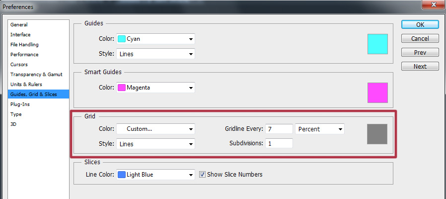
Norman Rockwell, Leonardo da Vinci and many other artists of note would use the grid method in their work. Some artists consider it cheating, but then again, I’ve met artists who say I’m not a real artist because I sell my work commercially. Art for a living is not a profession for anybody with thin skin and there is often no harsher critic than another artist. I don’t have the rare skill to paint a person’s likeness from memory, so I need photo reference, as do most portrait artists. My take on the grid method is that it is a tool that has its place, but I wouldn’t rely on it completely. Photoshop has the ability to apply grids in any configuration over your image. It’s under Preferences > Guides, Grids, and Slices. When I do use it, I choose percentages, but you can choose more precise methods of measurement as well. 7 percent is pretty small, but you’ll see why I chose that at the end of the post.
 I never use the grid at all when I’m painting my Totem paintings because they’re not supposed to look like the reference photos. Nor would I use grids when doing caricature work, because exact proportions would defeat the whole purpose.
Just to prove that I can paint without the grid method, this is a portrait of James Whitmore that I did on the iPad, where grids weren’t possible. I had a photo, the iPad, and nothing but time. It did take quite awhile, and a big challenge was the low resolution possible with the first gen iPad, but I’m pleased with the likeness I was able to achieve.

I try to only use the grid method when I’m stuck on something in a realistic portrait of a person or know that something is wrong and just can’t quite see it. For example, when I’m working on a likeness of a person, I may know that there’s something wrong with the eyes, but can’t figure it out. I’ll flip the canvas horizontally, vertically, try all of my tricks and still be stuck. By using the grids, I’ll see that it could be something as simple as the corner of the eye is in the wrong place or the iris doesn’t have the correct curve. I only use the grids when a painting is in the middle stages. Once the likeness is there, I don’t use them anymore, because I find that relying on it too much makes the subject of a portrait look wooden. I pride myself in the personality and life in my images and that doesn’t come from accurate placement of features, but from artistic impression of the subject. This is also the reason I paint people that inspire me or characters I feel a connection with, because that helps me with the feeling of the work. Having the tools is easy, knowing when to use them comes from experience.
Here’s a challenge I faced this morning on the current painting of Chris Hadfield. In the reference image I’m using, his mission patch is clearly visible on his shirt. Because I’m trying to capture a moment, I want to include that in the painting. I went back and forth on how to do it. That mission patch is readily available online in pristine condition, just as the designer would have finished it. One way to do it was just paste the perfect image in position, use the distort and warp tools, maybe rough it up a bit with a texture brush, add a little blur and it’s done, quick and easy. Another way I could do it, was do a vector trace of the graphic, basically just using the pen tool, trace over the coloured elements, convert them to paths, fill with colour, distort, warp, place, texture, blur, done.
So why didn’t I do either of those? With a logo in an editorial cartoon, I do that all the time, and I’m fine with it. Usually on a tight deadline, it’s a satirical commentary, and an accurate logo that I’ve recreated with the pen tool by tracing over it is something I’m comfortable doing because of the context. It’s part of the job and spending 20 hours on each editorial cartoon would be career suicide. With the painting, however, it felt like cheating. To somebody else, it might not have, and that’s OK. Everybody needs to make their own choices. I just know that had I done either of those, I’d finish the painting, would probably like the end result, but every time I look at that patch, it’s going to bother me.
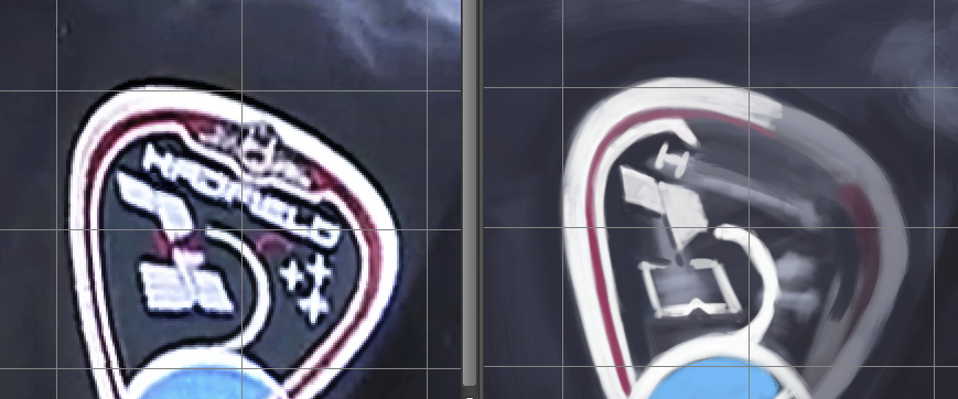
So I decided that for the patch, I would use the grid method to help with the accuracy of the pieces in the patch, but paint it as I see it in the reference image. It’s going to take me quite awhile longer to paint the patch, but I’ll be happier with it in the end. As you can see from the above reference image on the left and painting on the right, I’ve got a long way to go to get it right, but it’s not like it’s wasted time because I’m still learning from every painting I do. In the end, I’ll be happier with the painting, so it’s time well spent.