 Seems that each year, right around this time, I get the urge to paint a portrait.
When fall starts feeling like winter, my mood lowers, some years worse than others. It might be the waning light and the colder temperatures, perhaps the early onset of seasonal affective disorder. Maybe it’s that the end of another year triggers my existential angst, wondering where this whole art career is heading next, and whether it’ll continue to sustain me. Too much time alone naturally leads to expert level navel gazing, a little too much introspection and prolonged eye contact with whatever is down there, lurking in the abyss.
See? Now I’m paraphrasing Nietzsche. How melodramatic.
For whatever reason, I’ve been using portraits of people as a pressure release valve for quite a few years now. I paint them for myself, with no eye on sales, a reminder that even though I am a commercial artist; it doesn’t always have to be about making a buck.
I’ve always found painting likenesses especially challenging, so from time to time, it’s nice to step into that ring and go a few rounds.
The federal election occupied most of my recent attention, not to mention quite a bit of behind-the-scenes file prep for licensing. I’ve not had much time to paint anything, let alone write any blog posts. But when I could, I was stealing time for this portrait, one I’ve wanted to paint for a while.
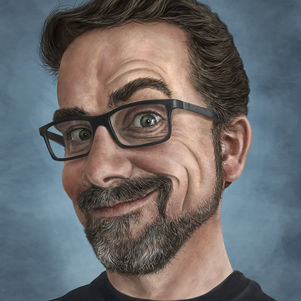
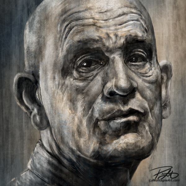
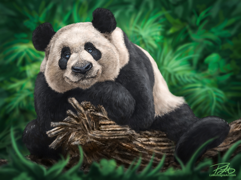
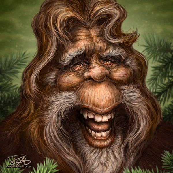
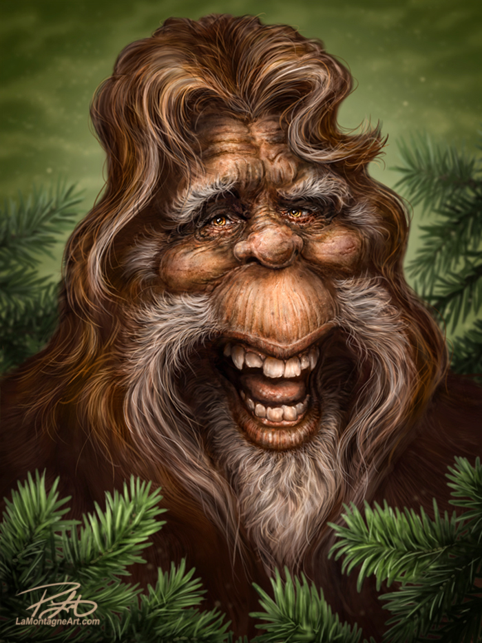
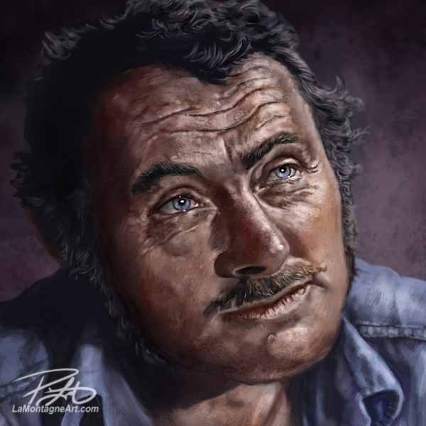
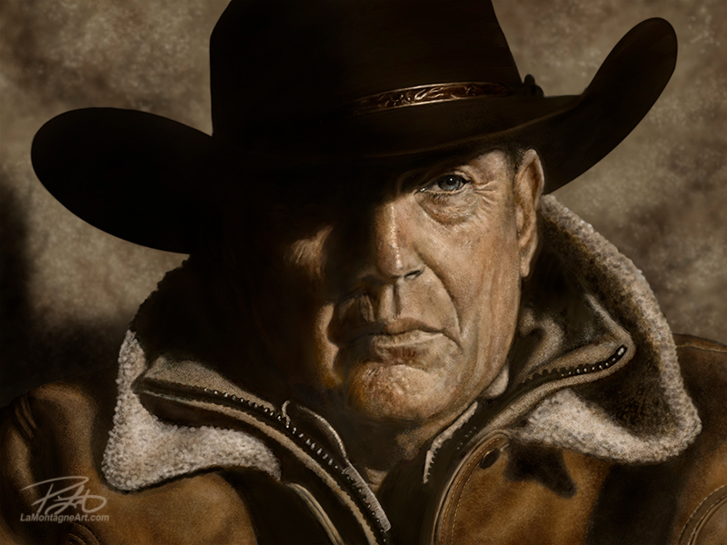
Regular readers will be well aware of my affinity for movies. As a consequence, most of my portraits end up being paintings of characters from films, rather than the actors themselves. Trust me, there’s a big difference, although you don’t get great characters without great actors, so you can chicken and egg that all day long.
While the actor in this image is the late Robert Shaw, the character I’ve painted is Sam Quint, the shark hunter from the movie, “Jaws.”
It’s one of those movies that seems like it has always been there, likely because it first hit screens in 1975. That’s right, Jaws is over 40 years old. It’s one I watch at least once every couple of years and while gathering reference for this painting, I watched it again. It still holds up, even if the non-CGI shark looks a lot more fake than it used to.
That’s right, kids, they used to make movies with hand-made models and camera tricks. There was something called a phone booth in those days, too. Go Google it, I’ll wait.
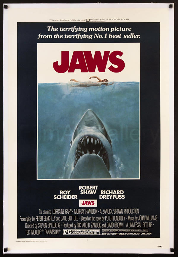 I read somewhere that Jaws was the first real summer blockbuster, and it was so successful, that it changed the way that movies were made and marketed.
Culturally, Jaws is an uncomfortable guilty pleasure. It scared the living hell out of people when it first came out, keeping many away from the beaches in 1975. There are many adults today who saw it when they were too young, and it gave them a lifelong fear of sharks.
What’s worse is that by turning the Great White Shark into a monster, the movie was indirectly responsible for granting tacit approval to the global slaughter of sharks that goes on to this day. According to Greenpeace, 100 million to more than 250 million sharks are killed each year around the world.
Just like every other wild creature with which we share the planet, they’ve got a lot more reason to be afraid of us than vice versa.
Peter Benchley , the author who wrote the novel Jaws and co-wrote the Spielberg screenplay, said he later regretted writing it and felt genuinely responsible for his role in casting sharks as villains, which directly contributed to culls around the world. He spent the rest of his life advocating for shark protection and ocean conservation.
So while the movie’s theme may be yet another scar on our dismal track record as a species, the film is still one I enjoy. In the right context, it’s a thrilling monster movie with plenty of action and well-rounded memorable characters.
I guess I could have painted Chief Brody or Matt Hooper, played by accomplished actors Roy Scheider and Richard Dreyfuss, but it’s usually a specific scene that captures my attention when I choose which character I want to paint. It might be something they said, a trick of the light, an expression, anything that prompts me to cock my head, pause or rewind the movie and think, “hey, there’s a painting there.”
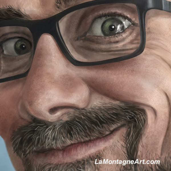
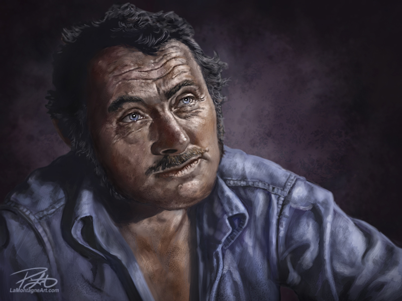
There’s a familiar and wonderfully playful scene in the movie where Hooper and Quint are comparing scars, having drinks while sitting at the galley table of the Orca. At one point, Chief Brody asks about the one on Quint’s forearm. Quint tells him that it’s a tattoo he had removed, the U.S.S. Indianapolis.
Suddenly the tone gets serious and Quint tells his tale.
The scene is one of my favorites of any movie, a classic edge-of-the-seat monologue, leaving the audience hanging on every word. Not only is the real-world tale of the Indianapolis tragic, but it explains Quint’s hatred for sharks and why he hunts them. What you might not know is that the late Robert Shaw was an accomplished writer, and he rewrote the scene with Spielberg. By all accounts the collaboration made it the most resonant scene in the film.
Quint meets his demise a short time later when the shark evens the score. Oh sorry, should I have said, “spoiler alert?”
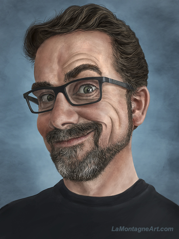
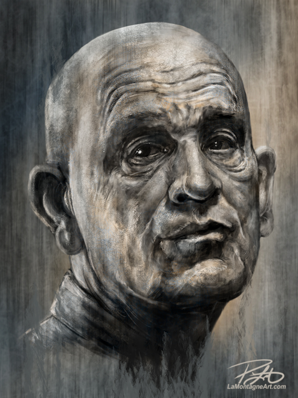
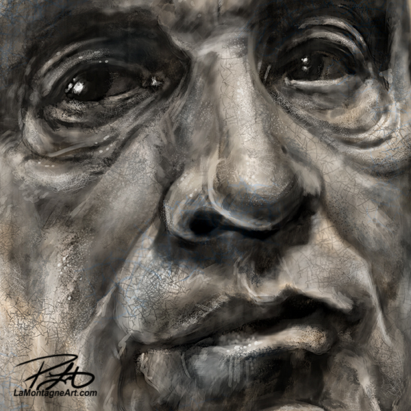
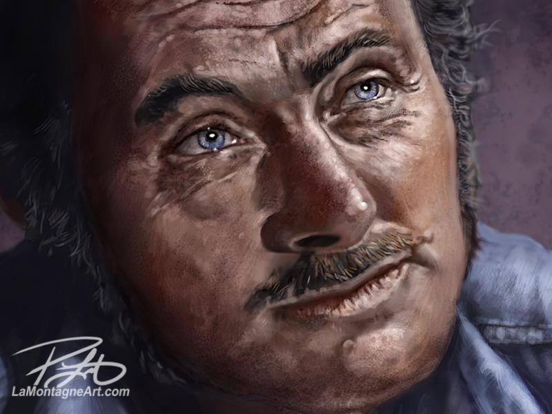 I enjoyed working on this portrait and once I found the time to really devote some hours to it this week, I didn’t want it to end. There was always one more brush stroke to make, a small wrinkle here, a blemish there, just to improve the likeness a little more, to capture the feeling of Quint.
Eventually, as with all of my paintings, I just had to accept that it would never be perfect. I called it finished, content that I was able to carve out some creative time for myself, hopefully improved my skills a little through the effort, and abandoned this painting so that I can start another. I’m pleased with how it turned out and I think I accomplished what I had envisioned.
Given that this winter melancholy and malaise seems to have settled in early this year, I believe I might have another portrait to paint before long.
After I get back to the paying gigs for a while.
Cheers,
Patrick
If you’d like to receive my newsletter which features blog posts, new paintings and editorial cartoons, follow this link to the sign up form.

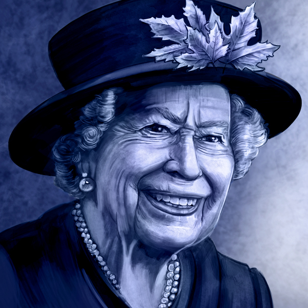
 When she got COVID earlier in February, I drew this cartoon, just in case it was time. While it might seem morbid to some, I can assure you that every media outlet in the world has had content and plans laid out far in advance for her inevitable passing. Long before this year, the Queen herself had a hand in the planning of the events of the past two weeks. I felt I’d rather take the time to do the work I wanted, rather than scramble at the last minute just to get it done by deadline.
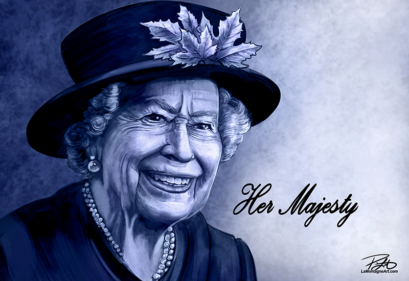
 Canadians will no doubt have a necessary conversation in the coming weeks about this country’s relationship with the monarchy and how it will look in the future. But I drew this second cartoon last week reminding readers that it would be crass to dig into that before her interment. I’m not a monarchist, but one need not be to understand simple respect for the recently deceased and empathy for her family and those who grieve her passing.
 While I don’t enjoy or look forward to drawing them, these types of editorial cartoons are still part of the job.
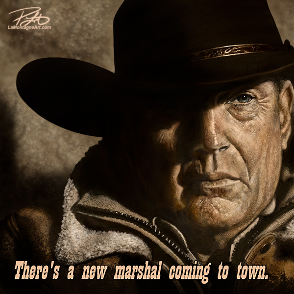

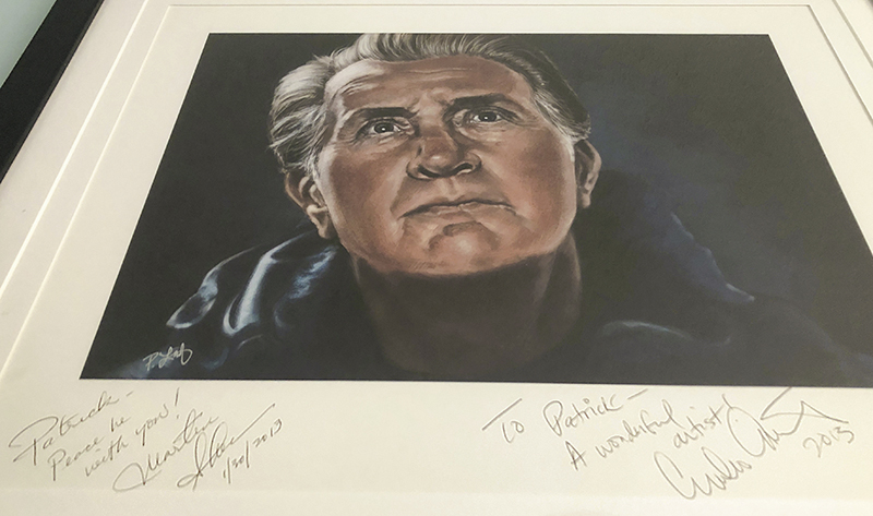 Another was when I painted Canadian astronaut Chris Hadfield while he was in command of the International Space Station. He saw
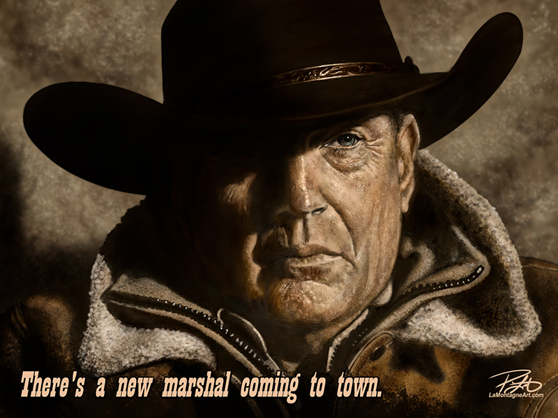 As it also made national news, and Yellowstone is a wildly popular show, I sent it out to my other papers this morning, in case there’s more interest in it. For context outside of Calgary, I added “Calgary Stampede:” before the caption for those other papers.
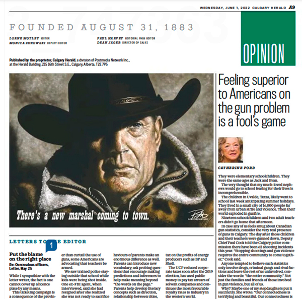 The Costner portrait file is 30” X 40” with a lot of detailed brushwork. To shrink it down and prepare it for newsprint, I had to boost the contrast, oversharpen it, and make other Photoshop adjustments to mitigate a poor result. So while I was happy to see it printed in the Calgary Herald (digital edition above), I couldn’t help but see all the flaws in the reproduction, even though I know that most people won’t notice or care.
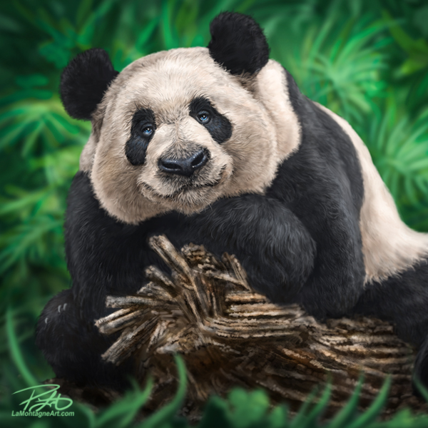
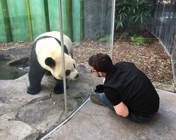
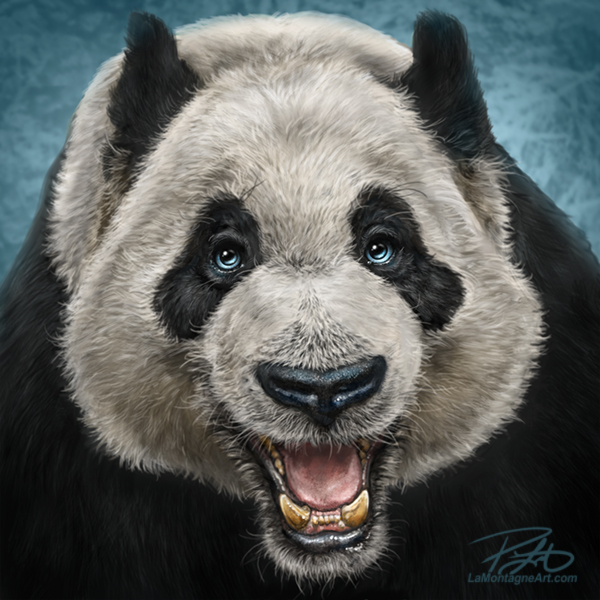
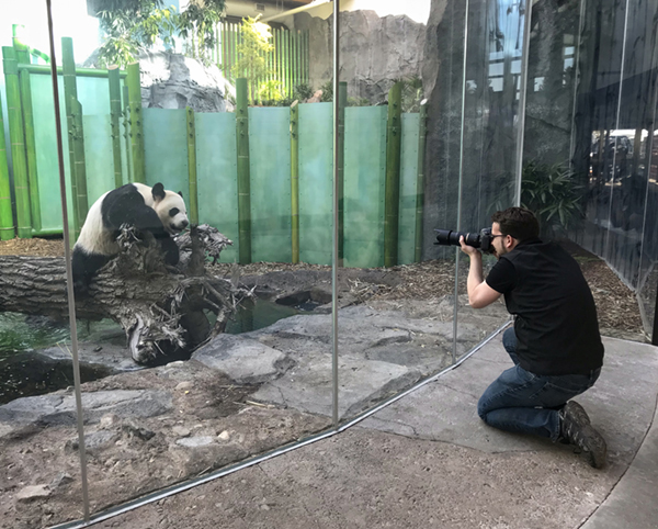
 When I’m not drawing and distributing daily syndicated editorial cartoons, I’m painting whimsical wildlife portraits for prints and licensing. Add in the usual office administration, marketing, writing and everything else that goes along with self-employment, and that’s pretty much how I spend my days.
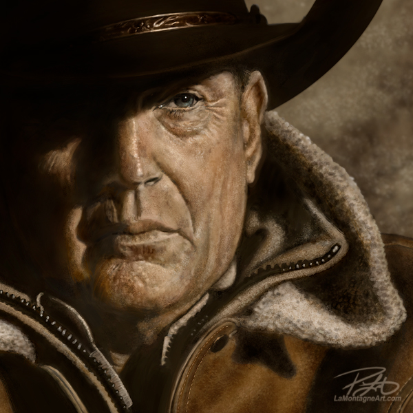
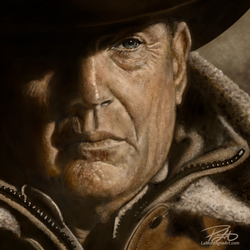 I started this painting in July, and I worked on it for a couple of hours here and there whenever I could find the time. I had planned to have it done before the fourth season began this month, but the paying gigs always take priority. So this past week, I put in the last ten or so hours over a few days. With no deadline, there was no reason to rush it, but I also didn’t want this painting to last for too much longer. As much as I loved the work, the best part is calling it done.