Posted on Leave a comment

Continuing Education

Since I didn’t start seriously drawing until my mid-twenties and never went to art school, I have often felt that I have spent most of my career playing catch-up.

I’m a workaholic perfectionist, which can be good or bad, depending on your metric. Rarely a day goes by that I don’t work, even for a couple of hours. This is not a complaint, nor should it be interpreted as humble-bragging.

It’s just my wiring.

On self-employment, Seth Godin once wrote, “You would never work for somebody who treats you the way you treat yourself.”

See? It’s not just me.

I heard recently on an art podcast that most people who go to art school don’t end up as artists for a living. The talent and art skills aren’t enough; you have to be driven.

The fact that I started late in the game means I’ve always been hungry, which has contributed to my longevity in this profession that’s synonymous with failure. An unhealthy dose of fear plays a big part as well. Grabbing the brass ring is easy but keeping a white-knuckle grip on it for decades, therein lies the struggle.

When people find out that I didn’t go to art school, they’ll often ask, “oh, so you’re self-taught?”

Self-Taught sounds like I just conjured it out of thin air, a claim that would be incredibly arrogant and false. I prefer the term self-directed.

I’ve learned from plenty of teachers, most of whom don’t even know it. While the internet has its fair share of toxicity and bile, it’s also a treasure trove of knowledge we often take for granted. While at Red Deer College, I remember having to drive down to the University of Calgary library to research a Psychology paper because the information wasn’t available in the college or city library where I lived.

Today that sounds positively archaic.

In books, webinars, podcasts, conference classes and online courses, there’s always a new bit of wisdom or technique waiting to be absorbed.

If you can’t find it, you aren’t looking.

Whether it’s how to make an image better or insight into the business of art, there is no excuse for failing to acquire or improve any skill you might have or desire.

That’s why the thought of retirement seems so foreign to me. I may slow my pace and become more selective of the work I do, but I’ll create art for as long as I’m able; however that looks.

I recently bought an online course on Character Design from Aaron Blaise, a fantastic artist with impressive credentials. Although I learned long ago to never say never, I don’t currently want to be a character designer.

But I’ve always felt that the principles of character design and animation, putting more action, life and dynamics into my cartoons and paintings, that’s where my skills are weakest. I’ve taken a couple of other courses on this theme over the years, but they never seemed to take.

This one, however, is fantastic. Even Shonna has noticed an improvement in my cartoons lately, and I’m only halfway through the course. It’s so good that I intend to watch it again, to reinforce some of the techniques. When finished, I’ll take another of Blaise’s courses.

I plan to talk about this course again, likely an accompanying narrative with a painting video, but for now, I’ll say that it has been time and money well spent.
As I approach my 50th birthday, I still feel like I’m playing catch-up when it comes to my art, even though the only person I should be comparing myself to is the artist I was yesterday. Funny how often I fail to remember that, especially while scrolling through Instagram.

Most of the time, everything I draw, whether cartoon or painting, is designed to be a finished piece. However, this course has got me drawing for practice again, investing in the skills that will allow me to make even better finished pieces later.

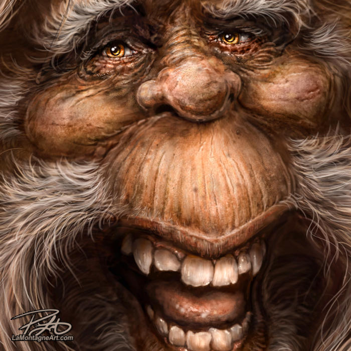
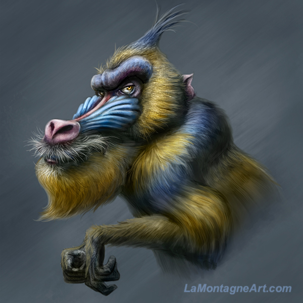
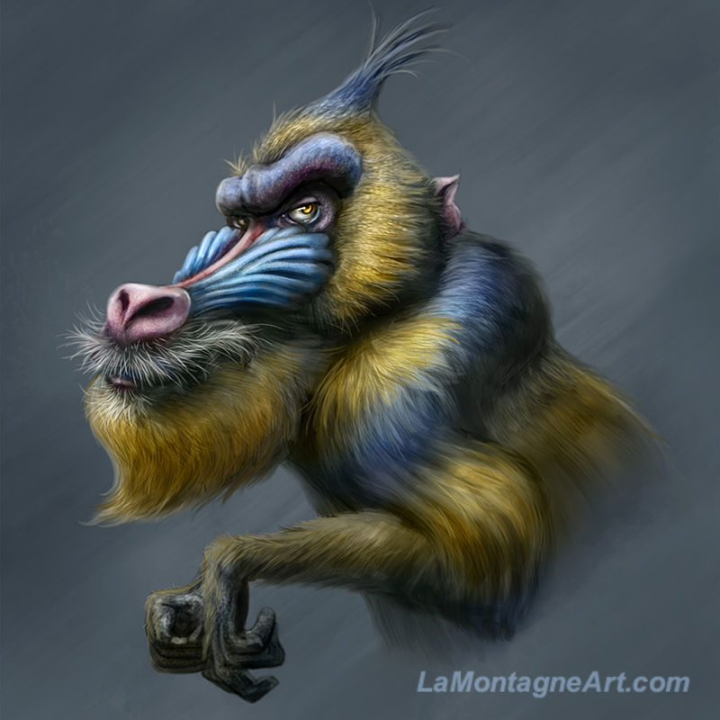
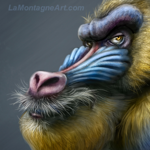
This weekend, I spent most of Saturday morning working on a new commission and Sunday morning on editorial cartoons. But in the afternoons, I played with this funny looking Mandrill. It’s much more developed than I had originally intended because I enjoyed it so much and didn’t want to abandon it.

A lot more caricatured than my usual animals; some might say too much, so it doesn’t fit with the rest of the portfolio. But I have no doubt that the techniques I’m learning to allow me to draw something like this will still inform my future painted work and make it better.

It also provides me with an escape from the work, to draw and paint just for the fun of it, which is why I wanted to do this for a living in the first place.

Cheers,
Patrick

© Patrick LaMontagne
Follow me on Instagram @LaMontagneArt

Posted on

A Cheetah Painting and Photoshop Friends

For many years, I was a member of a group called the National Association of Photoshop Professionals. I don’t remember when I joined, but I think it was sometime in the late 90s or early 2000s, and I remained a member until 2014 when it rebranded.

Owned and operated by Scott Kelby, the organization contained a wealth of online tutorials, a magazine called Photoshop User, and the Photoshop World conference. There was extensive training from internationally well-known instructors, each with their own areas of expertise.

Before social media ruined it all (yeah, I said it!), when like-minded individuals wanted to learn from each other, share their work for critique, answer each other’s questions and simply offer support, there were online forums where artists could gather.

I learned a lot from the NAPP forum and made some terrific friends there. Quite a few of them, I never got to meet in person, but when I finally got to Photoshop World Las Vegas for the first time in 2009, that was the best part of the whole experience, meeting this community in real life.

Over the next five years, I enjoyed seeing them each year, attending classes together all day, parties at night, hanging out at different venues. It was a fun event.

My involvement with NAPP was in a large way responsible for my now expert level skills in Photoshop. The networking opportunities introduced me to people and companies that advanced my career in many ways. I recorded a couple of training DVDs for Photoshop CAFE, wrote some articles for Photoshop User magazine, and won a few prestigious awards. It was due to a weird comedy of errors at my first conference that led me to a long and productive relationship with Wacom, the company that makes the digital tablets and displays on which I create my artwork.

I honestly believe that if I hadn’t been a member of that organization, with the opportunities and insights it afforded, I wouldn’t be painting my whimsical animals today. There’s a direct line between those people and experiences and the work I enjoy most.

Sadly, nothing lasts forever. The organization changed focus, became the Kelby Media Group, they retired the forum,  and most of my friends stopped attending Photoshop World. It doesn’t hold the same value that it used to.

I still talk to some of them now and then, but not nearly as often as I’d like. To this day, there are still a few people who call me Monty, my username from that forum.

For the first part of my career, while I’d been drawing editorial cartoons, I would also paint detailed caricatures of celebrities, and people would hire me to paint them for weddings, anniversaries, birthdays and the like. But I didn’t see a future in it. The first funny looking animal in 2009 was an experiment, inspired by some personal reflection following my first Photoshop World that year.

Without good reference photos, I can’t paint the detail I enjoy, so in the beginning, I had to buy stock photos and relied on the generosity of photographer friends I knew through NAPP.

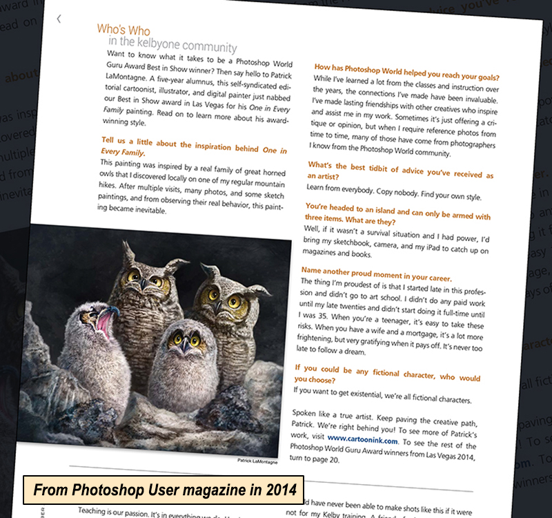
In 2014, I had already been taking my own photos with a decent camera I’d bought, but it was essentially a point-and-shoot with a good zoom lens. That spring, I painted a family of owls from the reference I’d taken myself here at Grassi Lakes above Canmore.
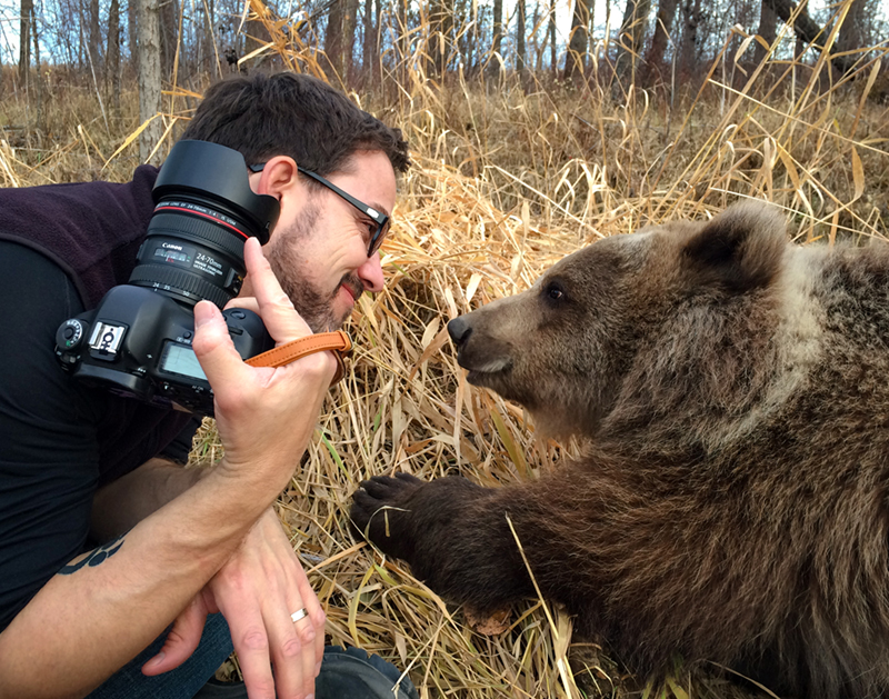
At Photoshop World that year, I won the Best of Show Guru award for that painting. At the last minute, they announced that part of the grand prize would be a Canon 5D Mark III camera. The oohs and aahs from an audience of mostly photographers indicated that it was something special. I had no clue.

When I won, I remember somebody laughing and saying, “Of course, the illustrator won the camera!”

When I returned to my seat, the friends I’d been sitting with told me just how good it was and that it was worth thousands of dollars. I remember calling Shonna to tell her I’d won, and we mused that I should probably sell it on eBay as such a professional camera would be wasted on me.

When I mentioned that idea to my buddy Jeff from Boston, he gave me some of the best advice I’ve ever received in my career. He told me to keep it and learn to use it.

Since then, I’ve discovered a love of taking reference photos, and it has become as much a part of the creative process for me as the painting itself. While I don’t make a habit of calling myself a photographer and have no designs on going pro, I enjoy it a great deal.

I’ve taken good care of that camera, been using it for six years, and it still does the job I need it to do. If something happens to it, or when it comes to the end of its life, I’ll buy another professional camera, because it’s now such a big part of my work.
Still, now and then, I find myself unable to take my own reference pics. This is especially true of commissions, where I rely on clients to provide me with the photos I’ll use to paint their furry family members.

Or it’s merely a case of access and travel being prohibitive. I’ve been searching for the right reference for an elephant painting for years. My friend Serena from Discovery Wildlife Park went to Africa earlier this year and brought back the perfect photos for me.

One of the people I knew well from my years in the NAPP organization and Photoshop World was Susan Koppel. It’s not enough that she was a flight instructor at 18 and then became an aeronautical engineer, but she’s also an incredible photographer and supporter of animals.

Now retired from the aviation industry, Susan’s photography business is her primary focus, pun intended.  She volunteers for the Nevada Humane Society taking pictures of the animals to make them look their best for their adoption photos. She also donates her skills to a wildlife sanctuary and nature center in Reno called Animal Ark.

The facility has adopted several cheetahs, and one of their regular events is to have cheetah runs. This gives the animals much-needed exercise opportunities to run full out, as they would in the wild, but also provides photographers with a chance to take pictures they can’t get outside of Africa. These photography events give the sanctuary added funds to continue the work they do.

Years ago, Susan provided me with the reference for my Raccoon and Fox paintings. I’ve seen her cheetah photos before and recently asked her if she’d be willing to share some. I’ve wanted to paint a full body cheetah in a running pose, mostly inspired by the photos Susan has posted over the years.

Susan generously opened up her online archive to me and told me I could use what I’d like. I ended up grabbing a dozen or so and expect to do three cheetah paintings in the near future. The reference was just so good that I couldn’t decide.
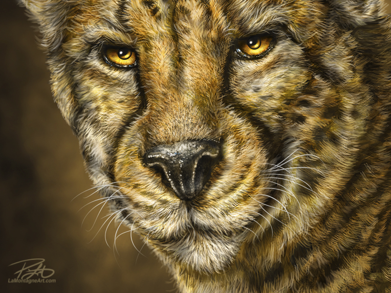
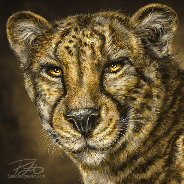
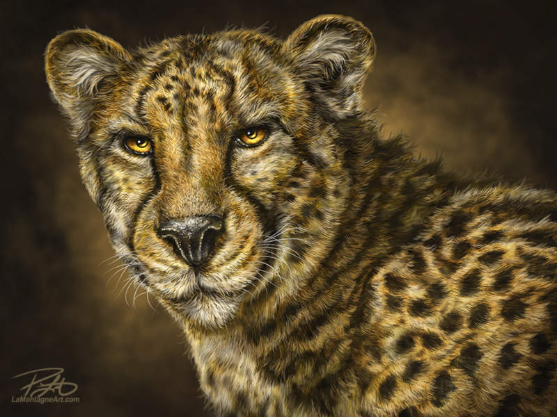
This is the first of those cheetah paintings, and I obsessed over the details. I expect I could have spent another 10 hours on this one, just nitpicking every little hair. But as every creative knows, eventually you just have to abandon one piece so that you can start on the next.

I miss all of those great people in the NAPP organization and at Photoshop World conferences. Each of them, in one way or another, inspired and contributed to my creating the work I love most, and I believe I’m a better artist and a better person for having known them.

Cheers,
Patrick

___

© Patrick LaMontagne
Follow me on Instagram @LaMontagneArt
Sign up for my newsletter which features blog posts, new paintings and editorial cartoons, follow this link to the sign up form.

Posted on

Trudeau Update – A Cartoon Video

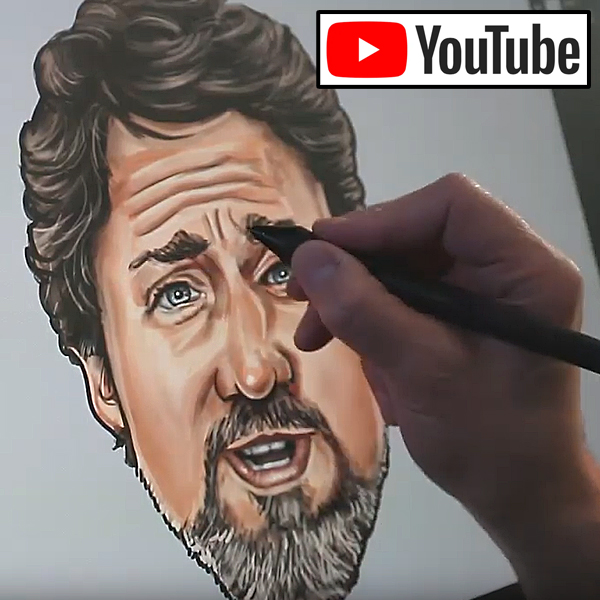
I recorded a high speed video of a cartoon I sent out this morning, some bonus content for my newspaper clients.

The type of cartoon in this video would normally take me about three or four hours since detailed caricatures are a lot more work. Add in camera setup, periodic recording throughout the process, sourcing and buying music, and editing, and I spent about nine hours on this yesterday, which is why I can’t do these as often as I’d like.

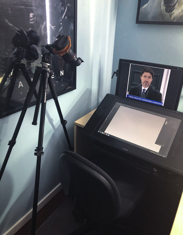
Because of the way I’ve set up my office, having a camera on a tripod over my left shoulder while recording is kind of clumsy. I can’t have it on the right, where there is a lot more room, because my hand would obscure the drawing. With a tripod leg right behind me, I have to be careful not to move my chair back and bump it. So there’s really no way to get into the groove of drawing while recording, at least not one that I’ve found.

I’ve tried recording with my phone or iPad on a goose-neck, since that setup is much more user friendly, but the problem is that even if you manually adjust the brightness, the cameras on portable devices just aren’t designed for recording the backlit display of another screen. I’ve even tried a GoPro camera, but none of them have worked as well as the DSLR camera you see here.

In the photo, you can see my second monitor, where I’ll often put the images I’m using for reference.

The display I’m drawing on is a Wacom Cintiq 24HD and the software is Photoshop, which is the most widely used professional illustration and digital drawing/painting software on the planet. There have been plenty of times I’ve wished it were called something else, because for many years, people assumed that if you were using Photoshop, you must simply be manipulating photos.

Thankfully, anybody younger than me has grown up with this technology, so I don’t have to explain it as often as I used to.

If you like the video below, feel free to share it from YouTube.

Cheers,
Patrick

© Patrick LaMontagne
Follow me on Instagram @LaMontagneArt
Sign up for my newsletter which features blog posts, new paintings and editorial cartoons, follow this link to the sign up form.

Posted on

Sasquatch

From time to time, my retail clients will offer up subject matter if their customers have asked for a specific animal or if it’s popular in a region where my work is sold.

That doesn’t mean they’ll end up being popular paintings,but I’m usually willing to take a chance, especially if I think it’ll make a good image. Some that come to mind are the Elk and Ground Squirrel paintings, suggested by the first gallery that sold my work in Banff. Neither of those paintings ended up being bestsellers, but to be honest, I’ve never liked my elk painting and will likely take another crack at one soon.

The Panda and Hippo were suggestions by the Calgary Zoo, the Beaver and Black Bear by the former owners of About Canada in Banff, and a few others were random suggestions by friends and customers.

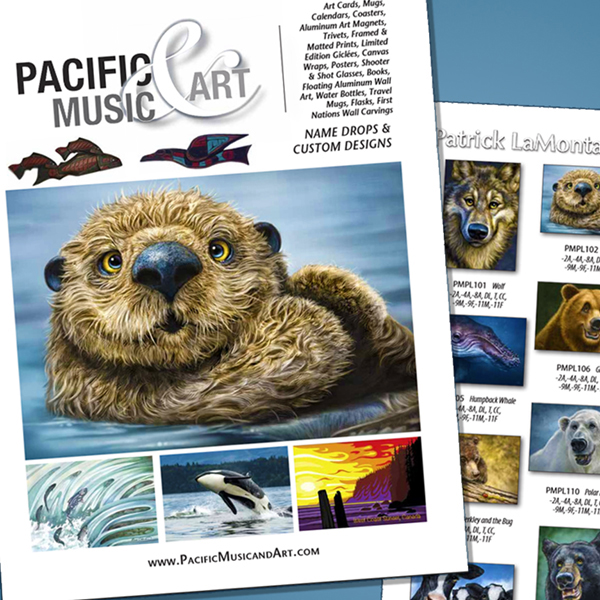
Regular readers will know that I recently signed a license with Pacific Music and Art on Vancouver Island. So far, I’m pleased with how this relationship is progressing. The owner, Mike, had asked for an Orca during our initial conversations. That painting was already in the works, but I bumped it to the top of the list and finished it just over a week ago.

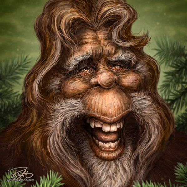
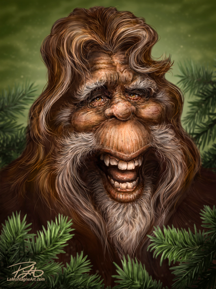
But when he asked for a Sasquatch, that gave me pause. I told him I’d never painted a mythical creature before.

He joked, “But is it?”

At least I think he was joking.

The Sasquatch, he explained, is a popular theme among his customers in Western Canada and he thought it would do quite well for me. The more I thought about it, the more I was intrigued by the idea. The whole challenge would be finding reference to paint from.

Of course, I couldn’t very well use the most popular photo in Bigfoot lore, the lumbering dark blurry shape with which we’re all familiar.My buddy Darrel has a theory that the reason nobody can get a clear shot of a Sasquatch is that they actually look blurry in real life. Who am I to argue?

I thought of doing a more animated pose in an elaborate forest scene, but this was supposed to look similar to my other whimsical wildlife portraits, so it’s the head and shoulders image where the expression and detail take center stage. While it’s nice to stretch boundaries and try new things, art for a living means you often have to paint commercial pieces as well.

Gathering the reference for this was a fun effort. I used a couple of dozen images with different subject matter. A few actors’ expressions and features were used as inspiration, including Ron Perlman, Kurt Russell, Vincent D’Onofrio and one stock photo of a random older man with a funny expression. I didn’t want any suggestion of the actual likeness of any of these people, however, so I just used their images for reference for eye wrinkles, skull structure, teeth and lips, and then exaggerated them all how I saw fit.

For animal reference, I used gorillas, orangutans, chimpanzees and grizzly bears, taking inspiration from each to create the facial structure,textures and hair.

And finally, I was well aware that the most famous Bigfoot characters in media are from Harry and the Hendersons , the Jack Link’s Sasquatch and even Chewbacca from Star Wars. I made conscious choices to deviate from their anatomy as much as I could so that I couldn’t be accused of copying those designs.

For example, both Harry and the Jack Link’s Sasquatch have prominent conical foreheads with dramatic receding hairlines. I deliberately structured the anatomy of mine to avoid that. What resulted was a bit of a salon hairstyle in my painting, but I think that just makes it funnier.

I also chose to paint in prominent white eyebrows, a higher cuter nose and frankly, impossible depth around the lower jaw. All in all, I’m pretty pleased with the result and it contributed a little more to my growth as an artist. Whether it will be a popular image, remains to be seen.

Here’s hoping the real Bigfoot isn’t an art critic.

Cheers,
Patrick

If you’d like to receive my newsletter which features blog posts, new paintings and editorial cartoons, follow this link to the sign up form.

Posted on

Caricature and Cartoons

MulcairNotley
When I first started out as an editorial cartoonist, I was horrible at caricature. It took forever for me just to get a passable likeness and sometimes, I even had to put the name of the person on a briefcase or name tag just to be sure that people would know who they were looking at.

As time went on, I spent a lot of energy trying to become better at that, because this artistic shortcoming drove me nuts. I tried to do the extreme exaggeration caricature, with the huge features, but never really took to it. I tried to do faces that were far too realistic so that they weren’t caricatured at all. Eventually, I discovered my own style which is a mix of the two, leaning more toward a realistic than extreme distortion. But still with big noggins.

It has been my experience that caricature is often seen as something easy to do by people who don’t draw or paint. I’m not sure why that is, perhaps it’s because many people have seen or had their caricature painted by one of those artists at county fairs or carnivals in ten minutes or less. What most people don’t realize is that the people who can do that are incredibly talented. That kind of speed and accuracy takes years to acquire and I have a lot of respect for the artists I know who can do it. It is a skill I do not possess.

I took an online caricature course years ago from Jason Seiler through Schoolism.com. Jason is an incredibly talented portrait and caricature artist, his work has appeared in many magazines and publications. He has even painted Pope Francis for Time’s Man of The Year cover last year. You probably saw it, even if you didn’t know who did it.

I learned a lot from Jason’s course, it was well worth my time and money. I probably found my own personal value more in the painting techniques I learned from that course, rather than the caricature. That’s not a failing on his part, far from it. It’s just where my interest was. A lot of the painting techniques I still use today have core elements of the skills I learned from Jason.

When it comes to caricature, I’ve done commissions for individuals, illustrations for magazines and newspapers, business graphics, and celebrity portfolio pieces. After I discovered my animal work, however, I realized that’s where my niche was and have since devoted most of my painting time to that. My caricature skills, such as they are, are clearly a part of that work. While I will still get requests from time to time for caricature commissions of people, I most often turn them down unless there are very special circumstances.

These days, the majority of my caricatures are for editorial cartoons. As deadlines are constantly on my mind, I can’t always put long hours into them, but every once in a while, I’ll make the time.
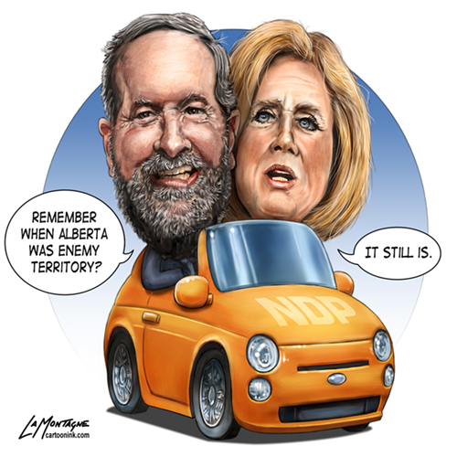
MulcairNotley_closeupAs I’d had the idea for this cartoon on Friday, in anticipation of the upcoming NDP convention in Edmonton, I decided to devote Sunday to working on it. I started with the sketches very early in the morning and finished painting it sometime around 3 pm, I think. Allowing for time to eat, chitchat with my wife throughout the day, I would guess this one took me somewhere around 6 or 7 hours to complete.

Editorial cartoon caricatures are tough because newsprint is a muddy and unpredictable medium. Subtle brushstrokes often get blurred out so they’re not even seen. For that reason, I have to paint with more contrast, harder lines, and include black lines where I might normally leave them out in another painting. It’s about finding the right balance between how I’d really like to paint the face and what I need to do to make it stand out on newsprint and hopefully look relatively the same in all of the publications that print it. You’d be surprised how one press can make a cartoon look great, while another can make it look completely washed out, all from the same file.

For those who follow my artwork, but not my editorial cartoons or Canadian politics, the guy is Thomas Mulcair, leader of the New Democrat Party of Canada. The woman is Rachel Notley, Premier of Alberta, also with the NDP but at the provincial level. Neither is very popular right now and they’re both struggling for relevance.

I thoroughly enjoyed this, not only the faces, but also painting the car, just spending time on the whole image overall. Without worrying about whether it gets widely published or if my editors like it, I had fun painting it, nitpicking over the details, trying a few experiments, improving on my skills. It was time well spent.

While there will always be room for improvement, likenesses are a lot easier for me now than they used to be. And best of all, I’m confident that I don’t have to write their names in there anymore.

Cheers,
Patrick
MulcairNotleyCartoon

Posted on

Raccoon Totem

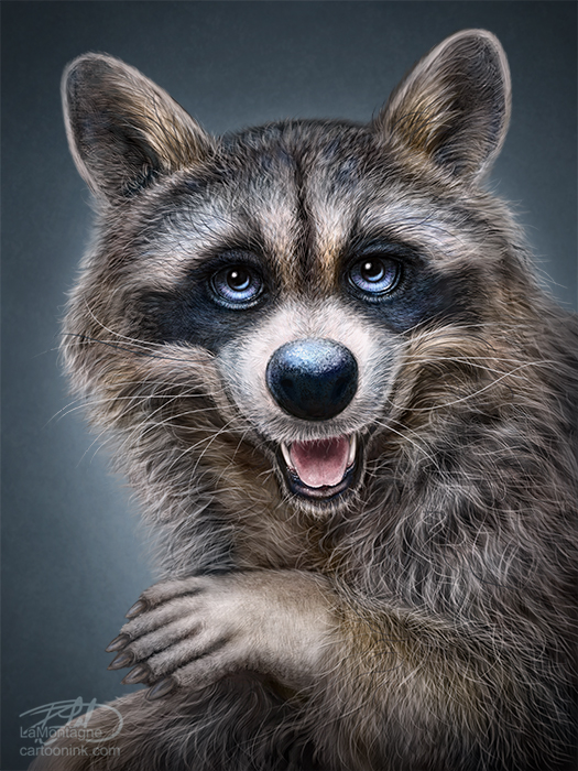
RaccoonTotemHere’s the last painting of the year and another addition to my Totem series.  At present, I’ve got about eight to ten animals waiting in the wings to be painted.  I’ve had the reference photos for a number of them for quite some time and even though I don’t have an order in mind, it just seems that each gets their turn whenever it feels right.  I had not expected to be painting the Raccoon Totem this year, but when choosing which would be my last painting of 2013, I went through the different folders and reference images, and it just seemed the right time to paint this one.

Whenever I try to manipulate which Totem I’ll paint, whether it’s for commercial reasons or a request from the gallery, I never feel completely good about it.  I learned a while ago to just paint whichever one feels right for the time I’m ready to start a new one and my best work will come through.  This time, it was the raccoon, and (say it with me)…I had a lot of fun with this one.

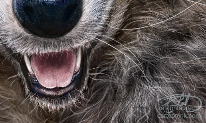
There appear to be new challenges with each Totem, whether it’s features or fur and for this one, the fur and hair was different.  It wasn’t particularly difficult, but the wiry raccoon hair is unlike any of the animals I’ve painted before.  Just as the Bison and Otter Totems required me to paint hair a little differently, the Raccoon required me to paint on more layers than I normally would, in order to get that deeper layered look I achieved with the hair in this painting.  I’m pretty pleased with how it turned out.

RaccoonCloseThis was painted on both the Wacom Cintiq 24HD and Wacom Cintiq 13HD displays, using Photoshop CC.  No photos or overlaid textures were used in this image, it was all done with brush work.  I don’t keep track of how long it takes to paint these anymore, because I usually spend an hour or two here and there over a two or three weeks when my other deadlines allow it.  As always, I relied on a few reference photos for this painting and would like to thank my friend Susan Koppel who provided me my main reference for this Totem.  Susan takes wonderful pet portraits, and also donates her time to her local Humane Society in Nevada and you can’t help but want to adopt all of the pets she photographs as she makes them look their absolute best.  Rather than me ramble on about her skill and talent as a photographer, check out her website and you’ll see for yourself.  You can find her at susankoppel.com

Happy to end the year with a Totem painting and looking forward to painting a lot more of them in 2014.


Posted on

Remembering Ralph

This week will see a lot of tributes to former Alberta Premier Ralph Klein, who passed away on Friday, March 29th.  He’d been a television reporter and radio personality for a good chunk of his career, the Mayor of Calgary from 1980-89, and in provincial politics from 1989-2006, the large majority of that time as the Premier.  Many Albertans just called him Ralph, a testament to his ‘man of the people’ persona.  He was loved and despised, depending on who you were talking to.

As an editorial cartoonist, I liked Ralph a lot.  He was fun to draw, was never boring, and I knew I’d miss him when he retired in 2006.  One thing about Ralph, you always knew where he stood.  Unlike so many politicians who will waffle on their ideals depending on the latest public opinion polls, you knew what you were getting with Ralph, even if you didn’t always like it.  He was human and he made unpopular decisions sometimes.  He also screwed up.  But the difference with Ralph was that when you called him on it, he’d either argue his point, tell you to get over it, or in some cases, even apologize.  There wasn’t a lot of bullshit with Ralph.

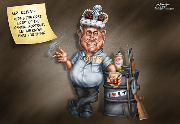
Like many Albertans, I have fond memories of Ralph Klein.  He did a lot for this province.  If you want specifics, just do a Google search.  You’ll find no shortage of anecdotes and stories about King Ralph this week.  One of my favorite personal stories took place right around his retirement.  Knowing his resignation was coming and having already thought about the cartoon I’d do, this is what I came up with.

2006Toon

Under the guise of the ‘official portrait’ I tried to include as many of the controversies and noteworthy events from Ralph’s career as I could.  There were his days socializing at the St. Louis Hotel in Calgary (written on the glass in his hand), the famous “shoot, shovel and shut-up” comment as well as the one about eastern “bums and creeps” straining Calgary resources.  In his pocket, the $400 Prosperity Bonus cheques he gave to every Albertan after the provincial debt had been paid off.

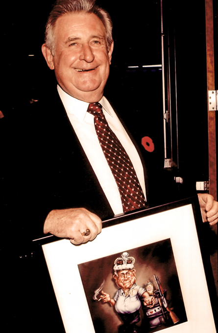
The cartoon appeared in the Calgary Herald and a number of other newspapers.  Shortly after, I received an email from someone who wanted a framed print of it, minus the ‘official portrait’ post-it note.  I had removed that feature from the image when I’d added it to my portfolio.  Two more print orders followed.  Sometime the next month, Klein was honored at Mount Royal College in Calgary and a day later, I opened the Calgary Herald to see the photo below.  Much to my surprise, one of the framed prints had been a retirement gift for Ralph.  I ordered a copy of the photo for my office.  Forgive me that I no longer remember the name of the Herald photographer who captured the scanned image below.

Ralph

I look at the caricature now and I see all of the flaws.  As I am a better artist today than I was then, there are a lot of things I would have changed and done better with this image, but every artist looking back on anything they’ve done could say the same thing of prior work.  So, I try to look past that.  It’s a good memory of moments in my career, both the time spent painting the caricature and knowing that Ralph was given a copy while he was still in good health.  This is how I’d like to remember him and I’m glad I ordered the photo.

Posted on 1 Comment

Tom Richmond and The Mad Art of Caricature!

There are many people who consider the humourous paintings of people that I do to be caricature, but just as many who don’t.  I consider traditional caricature to be an exaggeration of features while maintaining the likeness.   At the risk of trying to slap a label on it, my work fits somewhere in between caricaturing a person and cartooning them.  Often it will be a large head, small body, with only mild distortion or exaggeration.  For a lot of business or gift purposes, that’s what my clients want.  But wild exaggeration or not, I still feel that I have a lot to learn.

I have no desire to be a quick-sketch caricature artist, the kind you see at an amusement park or event, but I have a great deal of respect for those who are able to fill that role.  It’s a difficult skill to master and very different from the type of painting and cartooning that I do.  You have to be confident and bold when drawing live, and I’m a tentative obsessive sketcher when I’m drawing people.  I don’t mind admitting that I find quick-sketch caricature very difficult and I’d like to become better at it.

When I think of caricature artists that really wow me with their skill, Tom Richmond tops the list.  Tom is best known for his MAD magazine work, but he’s done a lot more than that in his long career.  Rather than list his accomplishments, take a look at his website and I’ll let his work speak for itself.  I’ve written about Tom before on this blog .  OK, maybe more than once.  What can I say, I’m a fan.

Last week, I received a copy of Tom’s new book “The Mad Art of Caricature: A Serious Guide to Drawing Funny Faces.”  People have been nagging him for years to write a book like this, and whether it’s because he got tired of it, or just realized he was ready and made the time, it was well worth the wait.  I pre-ordered the book sometime this summer, and I’ve been looking forward to it ever since.  I had very high expectations, and Tom’s book surpassed them.

I’ve bought many cartooning and caricature books over the years, and this one is hands-down the best I’ve ever seen.  From tutorials on how to draw specific body parts, exaggeration, relationships between facial features…I could go on at great length about all of the wonderful specifics he teaches in this book.  It is comprehensive and complete.  There are techniques and tutorials in this book that I’ve never seen explained in any other I’ve bought, not to mention valuable insights into how to become better at live or studio caricature work.  And content aside, it’s quality printing with beautiful colour, too.  Put simply, I would recommend this book to beginners and professionals alike, without reservation.

While reading the book, I just wanted to pick up a pencil and draw.  Yes, I draw every day already, and while it’s enjoyable, it’s not often that I get excited about it.  I’ve said before that Tom’s work makes me want to be a better artist.  I’ve no doubt that his book will teach me how.

To order a copy of your own, here’s the link again.  “The Mad Art of Caricature: A Serious Guide to Drawing Funny Faces.” 

Posted on 1 Comment

Ostrich – iPad Painting

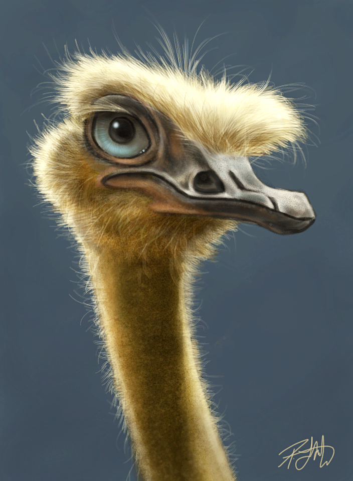
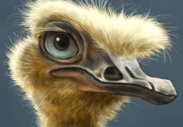
Here’s another painting I did on the iPad over a period of three or four days.  This is the kind of thing I like to do while sitting watching TV, as it’s not on deadline and is just fun to work on.

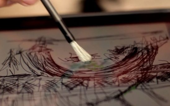
This was painted using the Procreate app, the Wacom Bamboo Stylus and the Nomad mini brush, which arrived last week.  While I’m very happy with the Wacom, I’ve been seeing ads and reviews for the Nomad brush around the net and I thought I’d give it a try.  Because I like having everything portable, I bought the mini brush instead of the longer ones and I really enjoyed working with it.  It doesn’t really do anything I can’t do with the Wacom stylus, but when it came to working on the little hairs and some subtle shading, it was more enjoyable to work with as it glides over the screen a lot easier than a traditional stylus.

I wouldn’t want to be limited to only the Nomad brush, however.  While it’s great for painting, I don’t like it for drawing, but then, it’s not really designed for that anyway.  After finishing this painting using the Wacom and the Nomad, I’m going to continue to use them both.  They each have their strengths and I enjoyed using them both on this painting.  The only downside of the brush is that you want to be careful not to squash or wreck the bristles by leaving it lying around.  I was thinking that a little cap would have been a good thing to include with this brush/stylus.  But then again, I’d probably lose the cap, so it’s probably fine the way it is.

When I’m using the iPad, I have the brightness set to 50 percent.  Because I spend so much time in front of the computer, the brightness of my desktop monitor is set pretty low as well.  I plan to preserve my eyesight as long as possible, so I try to minimize my exposure to bright light.  The downside of working on the iPad is that it means making adjustments for that before posting.  There are a few apps out there that will make color and brightness adjustments but I’m still getting used to how far I have to push things to get them to look right online.  It’s an ongoing process, but I’m learning.

This close-up is actual pixels, 72 ppi, so you can see that this is one of the limitations of working on the iPad.  I have the first generation iPad, and I know the 2nd generation has better resolution, so you’ll be able to get a little more detail, but not a lot more.

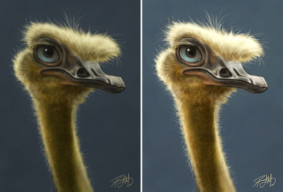
So, in the interest of full disclosure, I did bring this into Photoshop for some color adjustment.  Every monitor is going to be different, but mine is calibrated and the color I saw on the iPad is not what it looked like when I emailed it to myself in order to post it.  So while all of the brush work was done on the iPad, I did do a Hue/Saturation and Levels adjustment on my desktop.  I also used a bit of Smart Sharpen.  Here, you can see the difference side by side.  While the one on the left is what I got from the iPad in my inbox, the one of the right (after adjustments) more closely resembles what I was seeing on the iPad when I was working on it.

The iPad will not replace my Wacom tablet and Photoshop anytime soon, so you might wonder why I bother.  It really is just for the fun and the challenge of it.  I’m enjoying seeing just how far I can take a painting before I can’t go any further.  This is equivalent to painting in low-res in Photoshop and that translates directly to my more detailed paintings because they all start in low-res.  Working on the iPad with limited tools and resolution does end up making my more detailed work better because it forces me to do my best on the foundation of the painting before working on the fine details.

While I intended this to end at being an iPad painting, I’m toying with the idea of bringing it into Photoshop, bumping up the resolution and making a full size, full resolution painting out of it, because I know I can take it further.  It’ll mean working a number of more hours on it, but I think the end result might be something I’ll be proud of.

Posted on Leave a comment

Tom Richmond

While there are many artists I admire, there are a select few whose artwork continues to inspire me and makes me want to be a better artist.  I’ll consistently tell people who ask me for career advice, to find and learn from artists whose work you like and who are better than you are.

The first part is important.  While it’s easy to find people who are better artists, if you don’t like their work, it just won’t make you want to be better by seeing it.  Consistently, I can go to artists like Drew Struzan, Neville Page, and Jason Seiler and know that I’ll find work I’m not able to do yet, but because I love their work, it inspires me to try.  Better artists will almost always have something to teach you, because hopefully by the time you’ve gotten better, so have they.

Another artist who consistently makes me green with envy (in a good way) is Tom Richmond, a very well known and popular MAD magazine and caricature artist.  I’ve been a fan of his for many years.  If you draw caricatures, and haven’t seen Tom’s work, you might want to take a look.  He’s got a great website and blog.  I especially enjoy his Sunday Mailbag posts where he answers reader questions.  Tom’s got a great reputation in the industry not only for his work, but he’s active in the community and always willing to offer helpful advice.

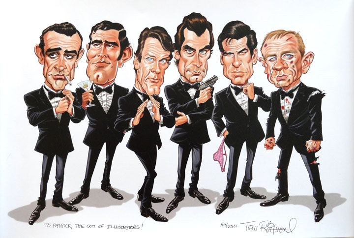
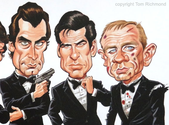
Recently, he mentioned that he had taken a bunch of limited edition prints of the one you see here to Comic-Con in San Diego and ended up coming back with some.  When I saw the print (shown here, with permission), I knew I was buying one.  It made me laugh out loud.  There’s just something in Tom’s style  of drawing that I’m missing in my own cartoons, some life and action I want to capture but am not quite there yet, and I knew this would inspire me to keep trying.  So it will be matted and framed and hang in my office where I can easily see it.  It’s a great print.  Still some available here, if you’re interested.

Incidentally, Tom’s long awaited book “The Mad Art of Caricature” (which I ordered this morning) is going to be released next month.  If you want to draw caricatures, there are a lot of great books out there, but without even having seen it yet, aside from sneak peeks on his blog, I have a feeling this will be at the top of the list.

Thanks, Tom!