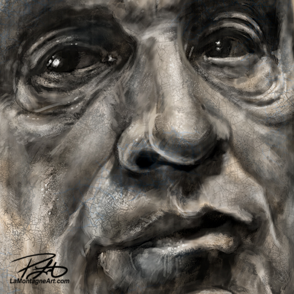
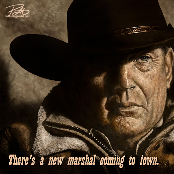
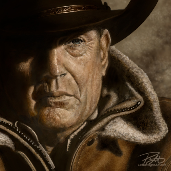
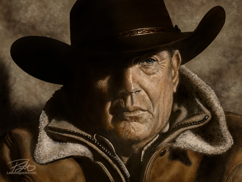
In November of last year, I finished this painting of Kevin Costner as John Dutton from the top-rated Paramount show Yellowstone. Like many of the portraits I paint, it was a personal project, something I did for my own enjoyment. You can read about that piece here.
I don’t attach any expectations to these portraits, but sometimes they either reach the people I’ve painted or attract some attention after the fact that I couldn’t have anticipated. But I learned long ago that if you try to make stuff like that happen, it rarely works. All I can do is complete the painting, put it out there and move on to the next one.
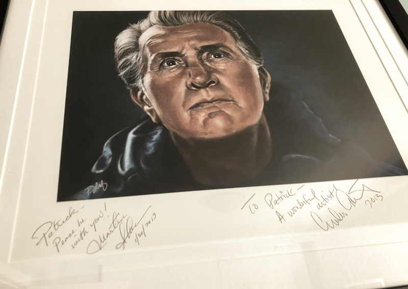
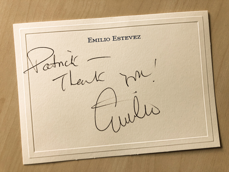
I have a couple of favourite unexpected results, like when Emilio Estevez wanted to buy the original canvas of a painting I did of his father, Martin Sheen. That was almost ten years ago, so I won’t rehash it again. However, if you’re not familiar with that story, you can read about it here. The print signed by both of them hangs in my office. Another was when I painted Canadian astronaut Chris Hadfield while he was in command of the International Space Station. He saw the painting online and sent me an appreciative tweet from space, which was a special moment.
This week, the Calgary Stampede announced that Kevin Costner would be this year’s parade marshal. I’m a fan, or I wouldn’t have painted the portrait in the first place. But I’m not big on crowds, and it’s unlikely I’ll attend the parade or Stampede. Still, the event is a big deal for Calgary. After the last two years, here’s hoping an unrestricted Stampede is a welcome economic boost for the city and surrounding communities, mine included.
As the Calgary Herald has been running my syndicated cartoons regularly for almost 20 years, I emailed the editor and suggested the painting as a cartoon for the announcement, with the caption you see below. He liked the idea, and it appeared in Wednesday’s edition. As it also made national news, and Yellowstone is a wildly popular show, I sent it out to my other papers this morning, in case there’s more interest in it. For context outside of Calgary, I added “Calgary Stampede:” before the caption for those other papers.
I’ve done portraits for cartoons before, but most often, it’s for memorials, and they’re never as detailed as I would like. It took more than 20 hours to paint this portrait, so it’s not something I would have done specifically for this purpose. There wouldn’t be a decent return on the investment, and I couldn’t get it done on a tight deadline anyway. To have had the painting done and ready to use for this announcement was a nice moment of serendipity.
Newsprint is unfortunately a muddy medium. Publications use different colour profiles and printers, so a cartoon that might look bright and crisp in one paper might look too bright or dark and desaturated in another. I can do nothing about that, so I adjust the image to find the middle ground for all papers. I put a lot of time into getting the colour right in my work, so I’m most often disappointed when I see it in newsprint, but I’ve had to make peace with that. The Costner portrait file is 30” X 40” with a lot of detailed brushwork. To shrink it down and prepare it for newsprint, I had to boost the contrast, oversharpen it, and make other Photoshop adjustments to mitigate a poor result. So while I was happy to see it printed in the Calgary Herald (digital edition above), I couldn’t help but see all the flaws in the reproduction, even though I know that most people won’t notice or care.
When I’m not drawing and distributing daily syndicated editorial cartoons, I’m painting whimsical wildlife portraits for prints and licensing. Add in the usual office administration, marketing, writing and everything else that goes along with self-employment, and that’s pretty much how I spend my days.
However, I enjoy painting portraits of people, most often characters from movies. I usually make the time for a couple of these a year, but I’ve only managed this one in 2021.
I’ve often mentioned that I paint these when I’m feeling the need to reconnect to art for art’s sake or when I’m in a low place creatively, but thankfully I’m not feeling that this year. The whole year has been low for obvious reasons, and I just felt like painting a portrait.
I have no interest in painting the publicity or paparazzi headshots of movie stars or celebrities. The less I know about the gossip or their personal lives, the better. Instead, I’m more interested in the characters they play. Those characters are created by skilled writers, directors, and gifted actors, including the supporting cast and professional crews that bring it all together.
When I painted Quint from Jaws, it wasn’t just the actor Robert Shaw I was painting, but the character he inhabited, written by Peter Benchley, directed by Stephen Spielberg and brought to life in a scene with Richard Dreyfuss and Roy Scheider.
I love movies, but we’re living in an age with great television, too, with plenty of writing and acting that can easily go up against any Academy award-winning film.
One of the shows I’ve enjoyed most in recent years is Paramount Network’s Yellowstone. Written and often directed by Taylor Sheridan, Yellowstone chronicles the lives of a generational ranching family in Montana, led by the patriarch, John Dutton.
It’s simply a great show, but not for the faint of heart. If you’ve got issues with language, violence, nudity, sex, lawlessness, smoking, gambling, alcohol, and more, you should seek your entertainment elsewhere.
There are no flawless heroes here. Instead, it’s a family of broken people, each with their dark pasts and demons. One moment they’re prey, the next predators, and you’re never quite sure when they’re right or wrong. But with incredible writing, scenery, and rich characters played by a stellar cast, it’s never dull. I am fulfilled and disappointed after each episode because I must wait a week for the next one.
But I’m glad they dole it out. If they released the season all at once, we’d easily gorge ourselves on it in a few days.
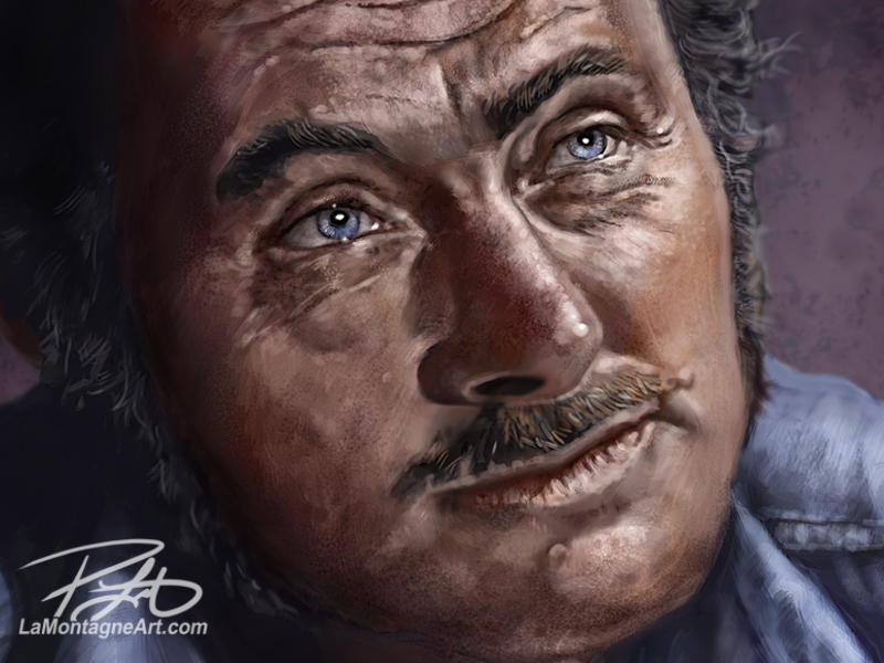
I realized that I wanted to paint John Dutton, played by Kevin Costner, about the middle of last season. Tough as nails, Dutton tries to keep his ranch and family together, while outside interests plot to take it away from him, piece by piece. Even though he knows he’s fighting a losing battle against progress and the future, he won’t resign himself to his inevitable fate.
As often happens when I want to paint other characters, I won’t know what I’m looking for until I see it. Near the end of last season, there’s a scene where Dutton is sitting on his porch, and he looks off to the horizon in the fading light. The moment clicked with me, and I had found my reference, thanks to Cinematographer Ben Richardson’s lighting and cameras.
I painted the scene more sepia tone than the reference, with more contrast, making my own choices for the painting. I like to be inspired by moviemakers and their vision, but I don’t want to create a carbon copy. Otherwise, what’s the point?
I started this painting in July, and I worked on it for a couple of hours here and there whenever I could find the time. I had planned to have it done before the fourth season began this month, but the paying gigs always take priority. So this past week, I put in the last ten or so hours over a few days. With no deadline, there was no reason to rush it, but I also didn’t want this painting to last for too much longer. As much as I loved the work, the best part is calling it done.
If you’re already a Yellowstone fan, I hope you like my rendering of this great character.
If you haven’t yet seen the show, I envy you. You get to start at the beginning with almost four seasons of great storytelling ahead of you.
In 2014, the cast of the 1986 film, Aliens reunited at the Calgary Comic and Entertainment Expo. There were autograph signings, photo ops, and a stand-alone event one night where the cast was interviewed, and shared stories in front of an audience of thousands.
Because I was working at my booth, selling my funny looking animal prints, I missed it.
For one reason or another, sci-fi and fantasy movie fans have one favorite franchise.
For some it’s Star Wars, others it’s Star Trek, Lord of the Rings, the Marvel Universe and many others. While I can take or leave the Lord of the Rings, I enjoy those others and have seen them multiple times. Then again, I’ve seen all of the Scorsese’s stuff multiple times, too.
I just love movies.
Even though television writing has improved in leaps and bounds in recent years, and I’ve got many shows I like, I’d choose movies over TV every day of the week.
I’ve been a fan of the Alien movie franchise for most of my life, although I can’t remember when I first saw the original movies but I know it wasn’t in a theatre. I do know that the gateway movie for me, however, was James Cameron’s Aliens.
Over the years, I’ve owned the box sets in multiple formats and have watched them often. I own all six on Blu-Ray and digital and enjoy each movie on its own and as part of the whole. I could rate them in order of preference, but I’m not a militant fan-boy about it. They’re still just movies.
You won’t find me on a forum anywhere arguing continuity errors, or debating the Ridley Scott vision of the canon vs. James Cameron’s. I didn’t get angry when Prometheus and Covenant went off in a truly unexpected direction, because I’m just a fan along for the ride. They don’t owe me anything and truth be told, I like those latest movies, too.
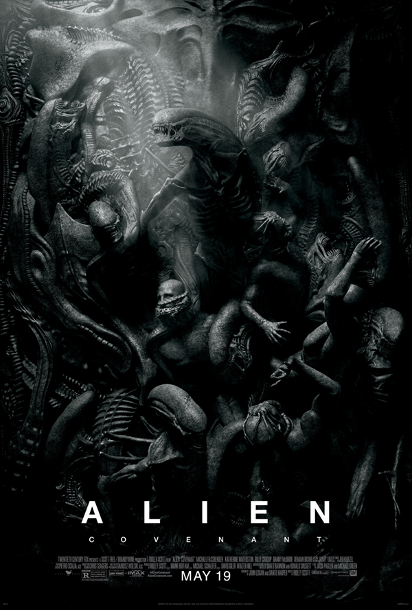
I don’t have shelves full of toys and action figures…OK, I have one xenomorph figure, and I also have the poster for Alien: Covenant beside my desk, but simply because I love the art.
H.R. Giger’s Alien design and art wasn’t part of why I started liking these movies, but it certainly is today.
It’s fun escapism and for whatever reason, this franchise resonates with me. I can quote more lines from Aliens than from any other movie, much to the eye-rolling annoyance of my wife.
For reasons I need not explain, I’ve been pretty low the past couple of months. Lost a big chunk of my newspaper clients, the licensing momentum I was looking forward to building upon this year has been crippled, the Calgary Expo was cancelled, along with two trips to Vancouver Island this spring and summer, and until recently, I haven’t been able to see my friends.
I haven’t slept well in quite some time and my back is killing me, both directly related to my inability to deal with stress. It’s been a shitty year so far, as it has been for everyone.
I have little motivation to paint happy animals right now, because I’m just not feeling it.
Even before the virus-that-shall-not-be-named ruined everything, I’ve fallen down in the dumps creatively from time to time. It happens to all artists.
While it usually occurs at the end of the calendar year, when the darkness and cold of winter sets in, this year it’s spring, usually my most upbeat and productive time of year. It’s a feeling that everything I’ve ever painted sucks and there’s no hope for it to get better. I’m a hack, kidding myself about my skills, might as well throw in the towel and give up this foolishness. Anyone who creates anything knows this feeling at some point.
What has worked in the past to help me shake the blues is to paint a portrait of a movie character I like. It gives me a break from the commercial stuff, reminds me why I like painting, and has no financial pressure or deadline attached to it. With a few exceptions, most of the portraits in my Character gallery were painted for my own enjoyment.
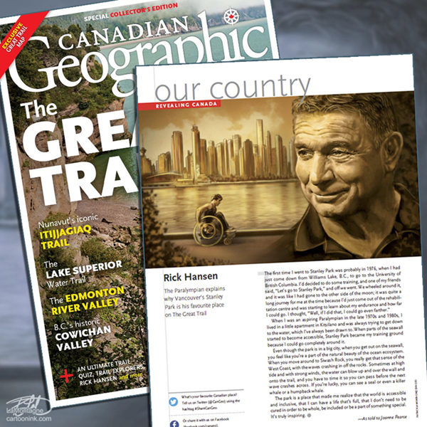
Canadian Geographic Magazine commissioned me to paint Rick Hansen in 2018, and a couple paintings have attracted attention after I posted them on Twitter years ago, most notably Martin Sheen and Canadian astronaut Chris Hadfield. The latter sent me two tweets from the International Space Station about my work, a surreal experience. But, I don’t really expect the subject will see the portrait I paint of them.
So even though I’ve been focused on keeping my finances secure during all of this, trying to maximize revenue, my mood has been steadily declining and I needed a break.
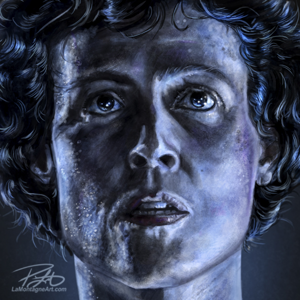
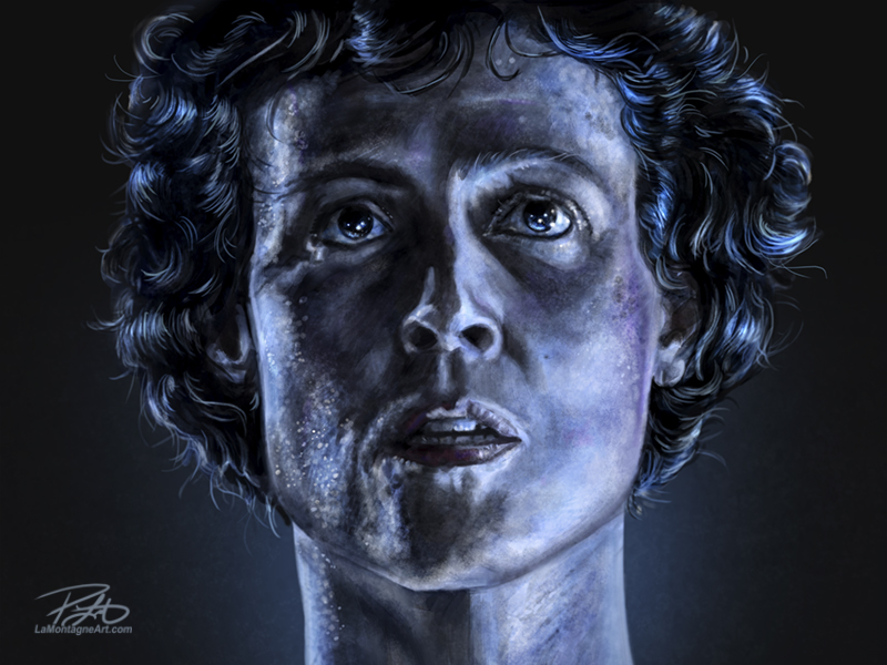
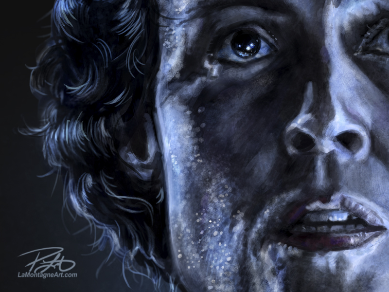
I figured my skills might finally be good enough to attempt a painting of my favorite movie action hero, Ellen Ripley, played by Sigourney Weaver in multiple films.
My buddy Derek once asked me if she was a movie crush and no, it was never about that. What I admired about the character was that she was a regular person, put to the test. Step up or buckle, and most likely die.
At a time when women in action movies were usually just damsels in distress, T&A accessories for the men who would ultimately save them, Ripley became a leader who held it all together and kicked some ass, even though she didn’t want the hero role.
Say what you want about James Cameron and the stories about him being difficult to work for, but he’s always written great roles for strong independent women. Sarah Connor in Terminator, Rose in Titanic, Lindsey in The Abyss, Neytiri and Grace in Avatar, and Ripley in Aliens.
True, Ridley Scott birthed the Ripley character in the original Alien movie, but it was Cameron who allowed Sigourney Weaver to turn her into a badass.
Interesting side note about James Cameron’s creative skills, it was his hands drawing the portrait of Rose in the movie Titanic. He was drawing right handed for those scenes but is actually left handed. He also drew all of the sketches in Jack’s portfolio for that film.
Throughout this painting, I found myself rushing it at times and having to stop myself. This wasn’t a deadline, I had all the time in the world, and the whole point was to enjoy it, get lost in it, and to improve my skills with the work.
While watching the movie again to find reference, I had a lot of options. I could have painted her with the pulse rifle in the action hero pose, the alien eggs around her, ready to start firing. Maybe in the power loader suit doing battle with the Alien Queen, or standing outside on the planet after they realized they were stranded on LV-426, right after Newt says, “They mostly come at night. Mostly.”
I know, I’m descending into nerdy stuff here. Bear with me.
Ultimately when I choose to paint a character, there’s usually a look I see on screen, combined with the right lighting and I just know that’s it.
This painting is from a scene close to the end. The colony has been blown up, the drop ship has returned to the Sulaco in orbit and Ripley is telling Bishop that he did okay. Seconds later, the Alien Queen emerges from the landing gear, tears Bishop in two and starts looking for revenge.
It’s at that moment, Ripley looks up at the Queen in disbelief, but realizes once again that it’s either step up or run and hide. That’s the moment I painted.
Not long after, Ripley steps out into the light in the power loader and says one of the most memorable lines in movie history.
“Get away from her, you bitch!”
The two hardest parts of any painting is starting and finishing. Getting those first lines of the sketch down, convincing myself, “I can do this,” while a louder voice in my head says, “No, you can’t.”
Eventually I come to a moment when I have to say, “This is the best I’ve got right now” and call it finished, while that other voice is saying, “well your best ain’t much.”
It happens on every single painting.
In between those moments, however, it’s like working clay, smoothing out the curve of a cheekbone, lightening a shadow that’s too dark, choosing colours, angles, highlights, a hair here, another there, and putting in the hours, all in search of an accurate likeness and bringing a vision to life.
A likeness in a portrait isn’t about getting the features right, it’s about the relationship between those features as well. I could paint the eyes perfectly, but if the nose is too far away from them, or the angle of the mouth is wrong, the whole thing falls apart.
It’s a balancing act, zooming in and out, squinting, painting tweaks here and there, flipping the canvas and reference back and forth to see what I’m not seeing, shutting it down and walking away, only to open it again the next day and instantly see something I need to fix.
Finally I had to call it done; knowing that a year from now, I’ll look at this and think I could do a better job of it. But that’s art for you; it’s the epitome of the cliché about the journey vs. the destination. As for the whole cast coming to Calgary that year, my priority was my booth, not signatures and photo-ops. The video of the interview session in the corral was put online later on, so I still got to watch all of that after the fact. I enjoy behind-the-scenes stories of movie making, especially ones I’ve enjoyed for years.
I did share an elevator with Lance Henriksen, who played the android Bishop, at the Palliser Hotel that week, twice in fact. I didn’t embarrass myself, and simply said it was nice to see him and I hoped he enjoyed Calgary.
Shonna and I and our friend Michelle were having a late dinner one night in the lounge, when almost the entire cast of Colonial Marines from Aliens came in to have a drink together. Peppered around the room were other celebrity guests. It was quite the surreal environment, but in true Canadian fashion, nobody approached or bothered them, mindful that they deserved their downtime too.
I never did see Sigourney Weaver or Bill Paxton that week, but I was fine with that. Had I the skills to have painted this portrait then, I might have lined up to have Ms. Weaver sign it, but that would have been an exceptional circumstance.
At the end of the Expo that year, while everybody began tearing down, a voice came over the loudspeaker. I don’t know if it was live or recorded earlier, but Bill Paxton recited some of his most famous lines from Aliens, including Hudson’s “Game Over, Man”, with intentional overacting.
After five long days, the vendors and staff exhausted, weary and wanting to go home, the place went nuts with cheers and applause. That’s one of my favorite memories from Expo, and a little bitter sweet. Paxton died four years later at 61, complications from surgery to repair a damaged heart valve.
I don’t know what I’m going to paint next, will need to give it a bit to see if this portrait shook loose the creative cobwebs, but I’m glad I made the time.
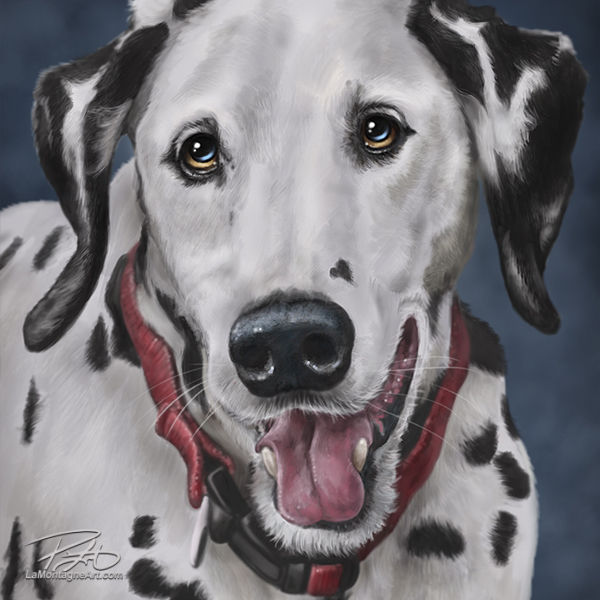
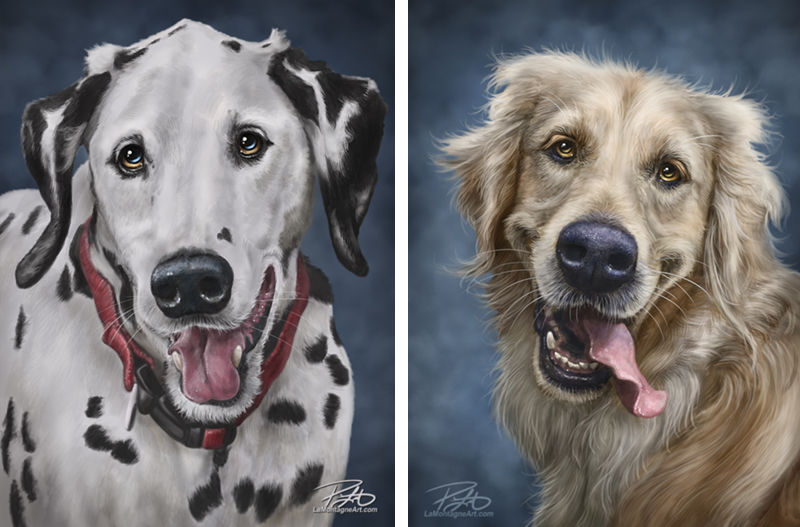
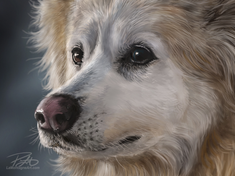
This is the second piece for the same client as my most recent commission post, my painting of Sammy, the Golden Retriever.
Rocky’s portrait is a memorial piece, as he passed away some time ago. The very image of a firefighting dog, Rocky was the fire mascot in the World Police and Fire Games in Vancouver in 2009. He even participated in the parade and opening ceremony.
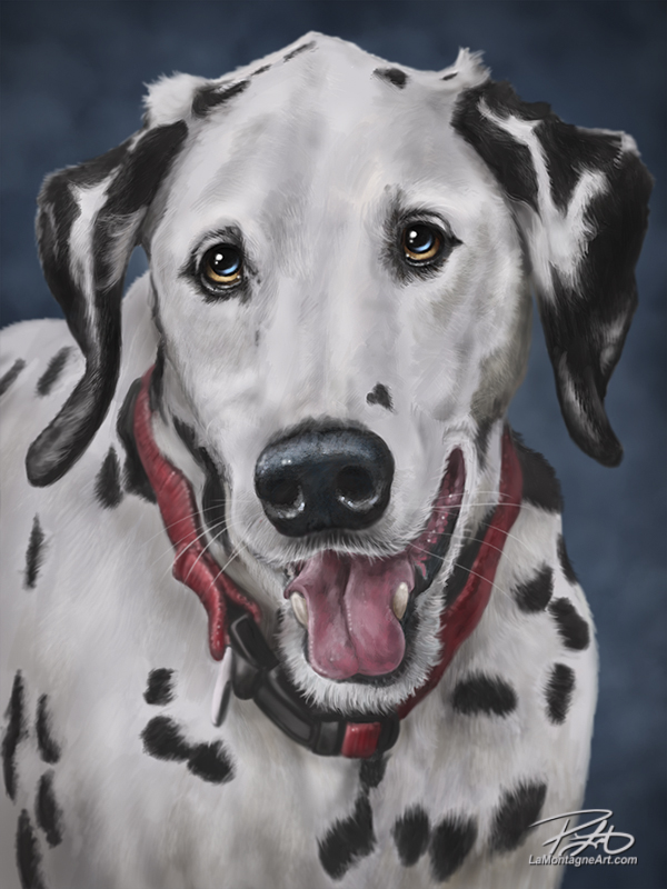
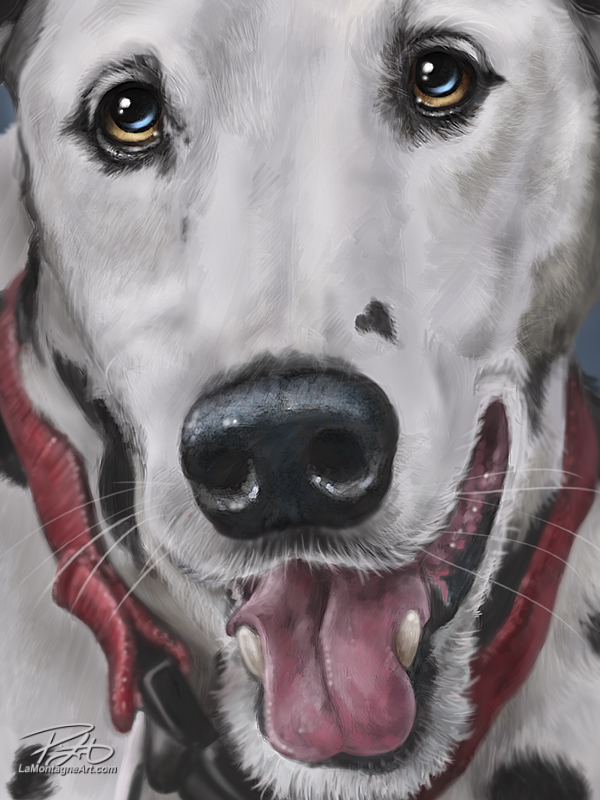
I’ve never painted a Dalmatian before and this was a fun piece. It was a challenge to make sure I got all of the markings in the right place, even as I exaggerated his features in my whimsical style.
When it comes to getting it right, it’s not only about the features themselves, but also the relationships between the features, affecting how believable the likeness will be. This is especially important when painting people.
Black and white fur is tricky because I couldn’t paint pure black or pure white. The blackest black or whitest white in a colour piece will create flat dead spots that will rob the image of its life. It’s all about degrees of shading and how the light reflects in the dark and light areas. Black will often be a very dark blue, white the brightest yellow or pink.
There isn’t much fur detail in a short-haired black and white dog, so it requires restraint. Too much detail and it wouldn’t look right, especially if I painted the fur too sharp. It became about manipulating the depth of field, blurring out some areas and sharpening others. The personality and overall image were the focus and it was important not to have any one detail distract from that. He really does have that heart shaped feature above his nose, however, and I wanted to make sure it was evident.
This client was a joy to work with, for purely selfish reasons. Aside from some minor direction I was happy to accept, I had the freedom to paint these beautiful dogs my own way. For this painting, I asked if they wanted me to include the collar or not. I didn’t include one for their other dog because he had long, luxurious hair, but I was hoping they would want it for this one. They did and said they preferred it to be red.
Considering that Rocky was a firefighter dog, it added a lot, balancing out the black and white with a splash of colour. Had they given me no direction at all, I would have made the same choices.
Because I don’t know how the clients are planning to hang the canvases, I wanted them to look good on their own or together, so I made both of the backdrops blue, with Rocky’s a little darker because I liked the way it looked against the subject. After painting whimsical wildlife and pet portrait commissions for more than ten years, I’m confident in my abilities and the skills I’ve developed. But each painting still presents unique challenges, and I would be disappointed if it were otherwise. Overcoming those obstacles makes for improved skills and better prepares me for the next piece, no matter what that may be.
As always, the most crucial part of any commission is the client’s approval and I’m happy to report that they were pleased with both finished pieces. Next up, I’ll be sending these off for printing, then shipping them to their new home in B.C.
For you tech and art people, I painted this image in Photoshop on a Wacom Cintiq 24HD display. Photos are only for reference, not used in my paintings. It’s all digital brushwork.
My fuel gauge approaches empty when December rolls around, so I spend it in hermit mode, a little more than usual. We attend Shonna’s office Christmas party, but that’s about it because I don’t have the energy to play the festive role. Celebrating Christmas seems like one more obligation, so I opt out.
In the days between Christmas and New Year’s Day, however, I do get reflective in my seasonal melancholy. I spent some time last week going through the 2019 blog posts to remind myself of the year that was.
In February, I checked out of social media entirely but then went back to Instagram a couple of months ago. I missed seeing art from those whose work I admire, but I’m still on the fence about that decision.
On the promotion and sales front, there were two significant developments this year.
The first was watching my work spread to many new places, thanks to the license with Pacific Music and Art. Seems a regular thing now for somebody to say they saw my stuff in a store in Oregon, or Alaska, all over B.C. and Alberta, not to mention the calendars and notepads in so many Save-On stores. I had lunch with a friend on Saturday, visiting from Vancouver Island and she said it’s strange walking by the gift store on Mt. Washington where she works, seeing a whole floor to ceiling corner of my art. It’s looking like 2020 will see more of that migration, but it’s my nature to be cautious. Those chickens ain’t hatched yet.
Secondly, the revival of my relationship with Wacom was a welcome surprise. With so many talented digital artists in the world to choose from, I enjoy the ego boost that comes with being a Wacom influencer. I’ve already agreed to another project with them shortly, but there’s a reason they make you sign a non-disclosure agreement. Must keep secrets.
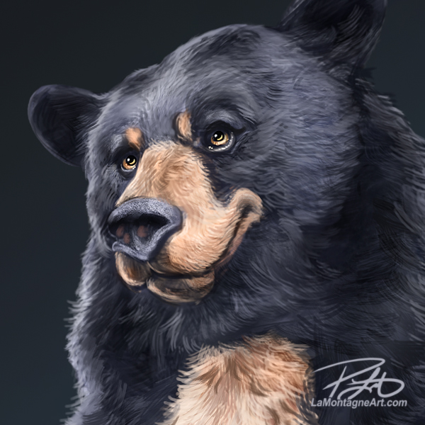
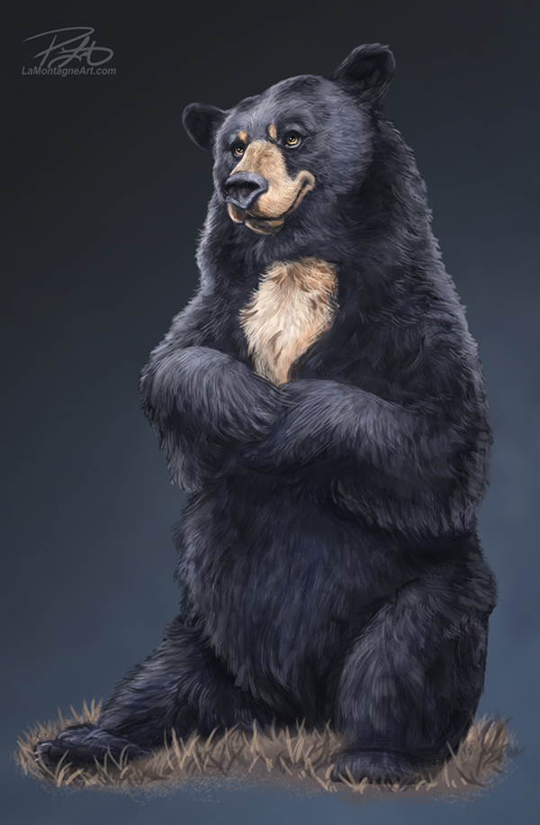
I painted 11 finished funny looking animal pieces this past year, the latest one above. I called it ‘Sitting Pretty,’ and she’s based on a black bear named Angel, who lives at Discovery Wildlife Park. I’d like to have painted more critters, but I’ll always say that. If I had painted 15, well, it should have been 20.
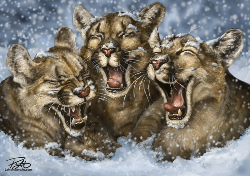
While there’s something about each painting that I enjoy, if I had to pick a favourite from this year, it would be Snow Day with the three cougar cubs. That was the best of both worlds, a real challenge and a lot of fun. I should have prints of this one available soon. I painted a couple of dogs for fun, but no commission work this year until just recently. I’m not disappointed by that because I had plenty to do and wanted to focus on more images for licensing. The two dogs I’m currently painting in my whimsical style are for the same client, hoping to finish in a few weeks. They contacted me about the commissions after seeing my work in a BC Ferries terminal gift shop, a side bonus from my license with Pacific.
Two portraits of people this year, John Malkovich and Quint from Jaws, both of which I enjoyed a great deal. I’d always like to have more time for those, but wouldn’t we all like more time for the fun stuff? Taking into account all of the syndicated cartoons I did this year, plus the custom local ones I draw each week for the Rocky Mountain Outlook, I drew 419 editorial cartoons in 2019. That might be an annual record for me. I have mixed feelings about that. I wonder how many paintings I could have done with all of those hours.
As for the coming year, I’m not big on resolutions. Well, maybe just one. I intend to write a lot more. There’s undiscovered country there and I need to explore it.
There are other things I want to accomplish, both personal and professional, growth I’d like to achieve, and skills I’d like to learn. Try to keep moving forward, best I can, just like everybody else.
Of course, none of this would be possible were it not for those of you who follow and support my work, read my ramblings, and tolerate my eccentricities. We all have limited time and attention in this life, and I appreciate that you spend some of yours with me.
Seems that each year, right around this time, I get the urge to paint a portrait.
When fall starts feeling like winter, my mood lowers, some years worse than others. It might be the waning light and the colder temperatures, perhaps the early onset of seasonal affective disorder. Maybe it’s that the end of another year triggers my existential angst, wondering where this whole art career is heading next, and whether it’ll continue to sustain me. Too much time alone naturally leads to expert level navel gazing, a little too much introspection and prolonged eye contact with whatever is down there, lurking in the abyss.
See? Now I’m paraphrasing Nietzsche. How melodramatic.
For whatever reason, I’ve been using portraits of people as a pressure release valve for quite a few years now. I paint them for myself, with no eye on sales, a reminder that even though I am a commercial artist; it doesn’t always have to be about making a buck.
I’ve always found painting likenesses especially challenging, so from time to time, it’s nice to step into that ring and go a few rounds.
The federal election occupied most of my recent attention, not to mention quite a bit of behind-the-scenes file prep for licensing. I’ve not had much time to paint anything, let alone write any blog posts. But when I could, I was stealing time for this portrait, one I’ve wanted to paint for a while.
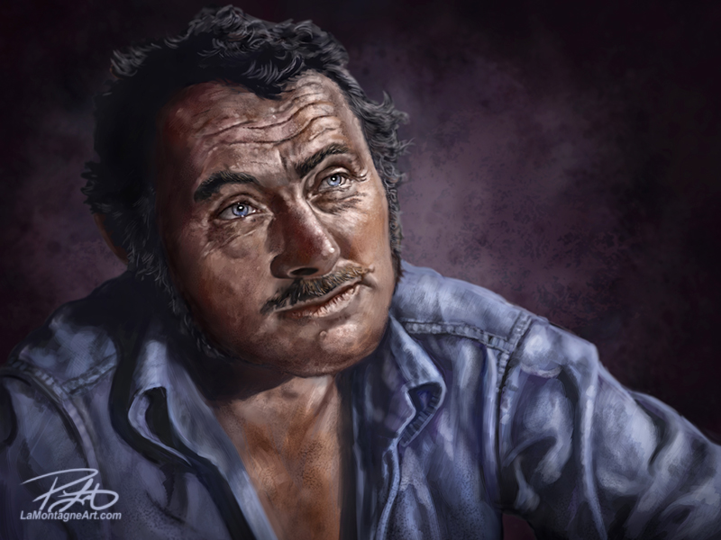
Regular readers will be well aware of my affinity for movies. As a consequence, most of my portraits end up being paintings of characters from films, rather than the actors themselves. Trust me, there’s a big difference, although you don’t get great characters without great actors, so you can chicken and egg that all day long.
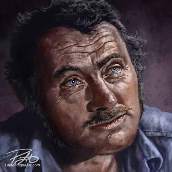
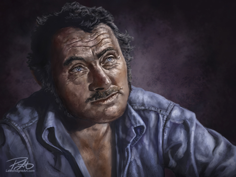
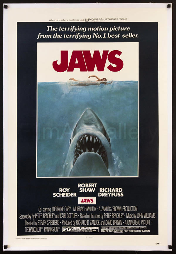
While the actor in this image is the late Robert Shaw, the character I’ve painted is Sam Quint, the shark hunter from the movie, “Jaws.”
It’s one of those movies that seems like it has always been there, likely because it first hit screens in 1975. That’s right, Jaws is over 40 years old. It’s one I watch at least once every couple of years and while gathering reference for this painting, I watched it again. It still holds up, even if the non-CGI shark looks a lot more fake than it used to.
That’s right, kids, they used to make movies with hand-made models and camera tricks. There was something called a phone booth in those days, too. Go Google it, I’ll wait. I read somewhere that Jaws was the first real summer blockbuster, and it was so successful, that it changed the way that movies were made and marketed.
Culturally, Jaws is an uncomfortable guilty pleasure. It scared the living hell out of people when it first came out, keeping many away from the beaches in 1975. There are many adults today who saw it when they were too young, and it gave them a lifelong fear of sharks.
What’s worse is that by turning the Great White Shark into a monster, the movie was indirectly responsible for granting tacit approval to the global slaughter of sharks that goes on to this day. According to Greenpeace, 100 million to more than 250 million sharks are killed each year around the world.
Just like every other wild creature with which we share the planet, they’ve got a lot more reason to be afraid of us than vice versa.
Peter Benchley , the author who wrote the novel Jaws and co-wrote the Spielberg screenplay, said he later regretted writing it and felt genuinely responsible for his role in casting sharks as villains, which directly contributed to culls around the world. He spent the rest of his life advocating for shark protection and ocean conservation.
So while the movie’s theme may be yet another scar on our dismal track record as a species, the film is still one I enjoy. In the right context, it’s a thrilling monster movie with plenty of action and well-rounded memorable characters.
I guess I could have painted Chief Brody or Matt Hooper, played by accomplished actors Roy Scheider and Richard Dreyfuss, but it’s usually a specific scene that captures my attention when I choose which character I want to paint. It might be something they said, a trick of the light, an expression, anything that prompts me to cock my head, pause or rewind the movie and think, “hey, there’s a painting there.”
There’s a familiar and wonderfully playful scene in the movie where Hooper and Quint are comparing scars, having drinks while sitting at the galley table of the Orca. At one point, Chief Brody asks about the one on Quint’s forearm. Quint tells him that it’s a tattoo he had removed, the U.S.S. Indianapolis.
Suddenly the tone gets serious and Quint tells his tale.
The scene is one of my favorites of any movie, a classic edge-of-the-seat monologue, leaving the audience hanging on every word. Not only is the real-world tale of the Indianapolis tragic, but it explains Quint’s hatred for sharks and why he hunts them. What you might not know is that the late Robert Shaw was an accomplished writer, and he rewrote the scene with Spielberg. By all accounts the collaboration made it the most resonant scene in the film.
Quint meets his demise a short time later when the shark evens the score. Oh sorry, should I have said, “spoiler alert?” I enjoyed working on this portrait and once I found the time to really devote some hours to it this week, I didn’t want it to end. There was always one more brush stroke to make, a small wrinkle here, a blemish there, just to improve the likeness a little more, to capture the feeling of Quint.
Eventually, as with all of my paintings, I just had to accept that it would never be perfect. I called it finished, content that I was able to carve out some creative time for myself, hopefully improved my skills a little through the effort, and abandoned this painting so that I can start another. I’m pleased with how it turned out and I think I accomplished what I had envisioned.
Given that this winter melancholy and malaise seems to have settled in early this year, I believe I might have another portrait to paint before long.
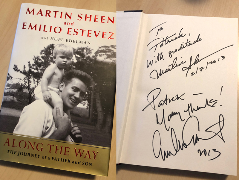
One of the more interesting highlights of my art career happened in 2013 when Emilio Estevez wanted to buy the original painting I did of his father, Martin Sheen. I’ve told this story more than once, but if it’s new to you, here’s the link.
While it did generate some media publicity for me, and was personally exciting, it did little for my career. Painting portraits of people is something I do for my own enjoyment and with the exception of one commission I did for Canadian Geographic and the occasional editorial cartoon portrait (usually when somebody dies), I’m not hired for this sort of work and that suits me fine. The editorial cartoons and funny looking animals keep me plenty busy.
I do enjoy telling the story about that experience when it comes up, especially about how genuine and kind both actors were in our communication. Not only did they sign a print for me that hangs in my office, they gave me a signed copy of the book they co-wrote as well, as I’d mentioned in our correspondence that I’d given my copy to my father. Incidentally, if you haven’t seen the movie The Way, which inspired my painting, it’s one of my favorites. Few films have moved me the way that one still does.
A short time ago, I came across a note card that Estevez included when he returned the signed prints. Or it came with the book, I don’t remember. It was an unnecessary nicety that might not seem like much, but it struck me as a classy gesture. I remember thinking at the time that I should get little note cards like this. It added more value to the experience, and I thought it might be nice to pass the same feeling on to my clients. Obviously it’s something on which I failed to follow through.
Whenever I send a print out to someone who has purchased from my online store, I usually include a little note on the invoice or on a post-it, just a little thank you in my own handwriting, which is atrocious, by the way.
But on the invoice or post-it, it always feels a little cheap to me. It’s a personal note, sure, but it’s still the bare minimum.
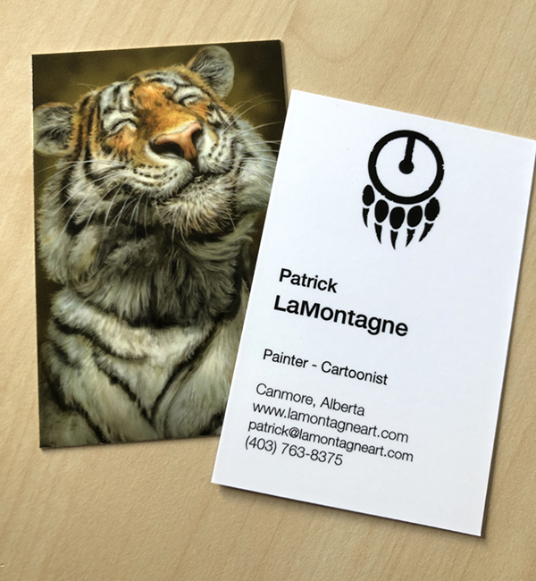
This year, my painted work is being seen in more places than ever before. Thanks to my licenses with Pacific Music and Art, Harlequin Nature Graphics and Art Licensing International, it’s very easy to buy my work online. You can now order a canvas print of my funny looking animals from Wal-Mart, Amazon and other sites in the U.S. through one of my licenses.
But when people order from MY store, they’re getting it from me. I hand-sign the print, I package it, I put the art bio in the sleeve and I’m the one who personally takes it to the post office to ship it. Sure, I’ve included an extra art card or another small goodie when I can, but every once in a while, I’ve thought about that note card from Emilio Estevez.
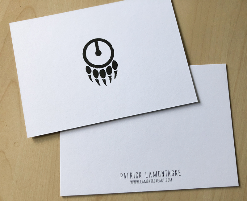
A couple of weeks ago, I designed and ordered new business cards to reflect the changeover from Cartoon Ink to LaMontagne Art. Those arrived yesterday, along with my new note cards. It’s just a small thing and it adds to the print cost on my end, but I think it’s worth it.
At a time when you can order anything and everything online from an impersonal shopping cart, every so often I like to remind my customers that their purchase is appreciated, that it was bought from a real person. We all work hard for our money, so when somebody thinks one of my prints is worth parting with some of theirs, that’s pretty cool.
In January of last year, my buddy Darrel and I rented a cabin in central Alberta and were instantly taken with the place and the area around it. A couple of months later, my friend Jim and I went out there and he fell for the place, too. Since then, he’s gone there on his own, introduced another friend to it, and we’ve all had more than a few repeat visits over the course of a year. I’ve been there five times.
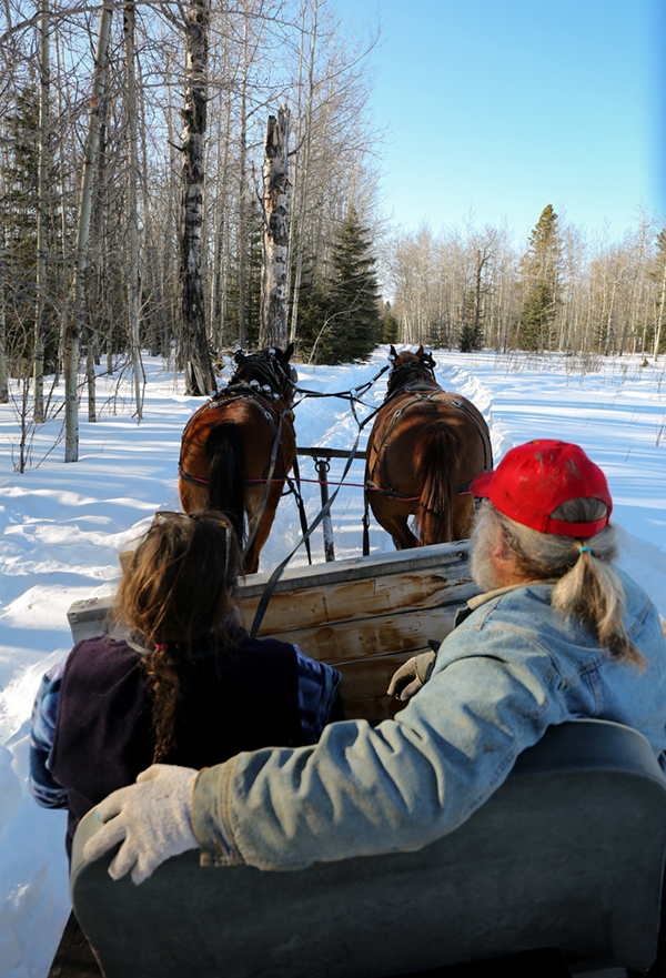
The owners of KB Trails have been welcoming, friendly and we’ve all enjoyed getting to know them. We’ve invited them over for drinks while we’ve been on their property, they’ve returned the favour, and Jim and I were even invited for a horse-drawn sleigh ride through the woods.
We wondered if they thought we were a couple.
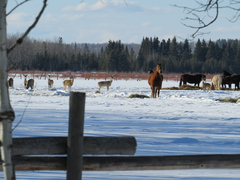
As always, I’ve often got the camera at the ready, because you never know when an unexpected critter will show up and capture my eye. On those multiple visits to the cabin, I’ve taken plenty of photos of their horses and will shortly be working on my first painting from some of those. I’ll often hang on to reference for quite some time before I get to it. I take a lot of pictures out there.
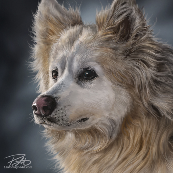
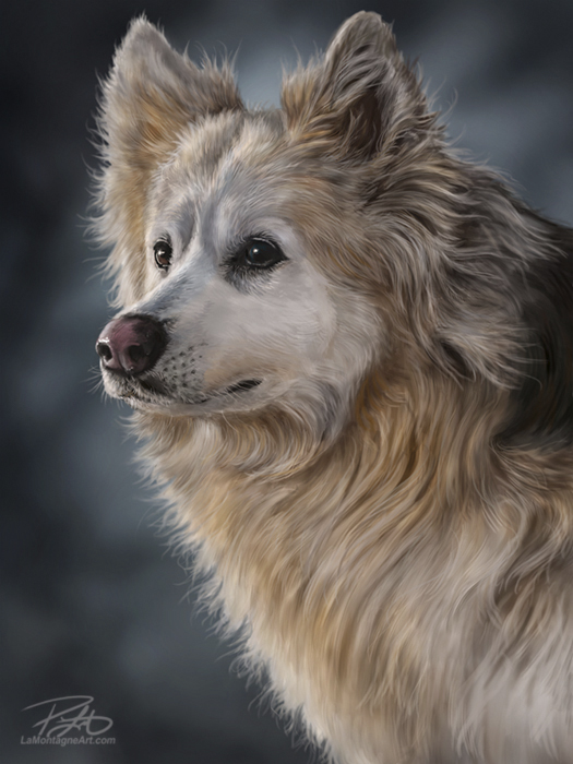
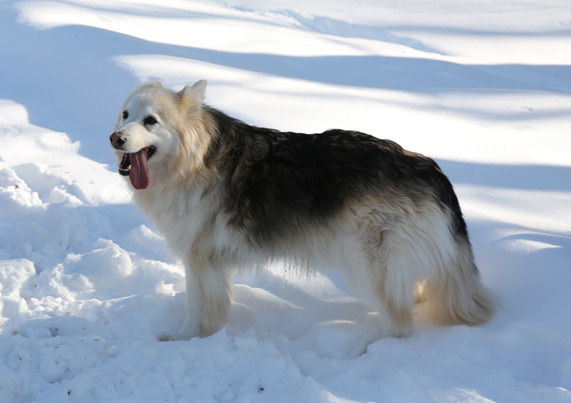
One of my favorite things about the cabin visits is Jingles. She’s a great ranch/farm dog, friendly to all, likes to be around people, but definitely not a pampered princess. She’s happiest outdoors and Bob and Karen have told us that she’s only interested in sleeping in the house on the coldest of nights. I expect this past February saw her inside more than usual.
But most of the time, Jingles is content to be by Bob or Karen’s side, or out holding court over her 320 acres. She’s always happy to see people, but she tires of it quickly. Squirrels to chase, property to patrol, a dog with things to do.
I remember on one of Bob’s visits, we’d been sitting on the back deck and once the chill set in, the three of us went inside to warm up by the fire. I called Jingles to come in and she did. But it wasn’t long before she was looking expectantly at the door and Bob said she was getting antsy to go back outside. So I opened the door and without hesitation, Jingles was out into the snow.
When Bob was ready to leave, she showed up to jump in the truck and off they went.
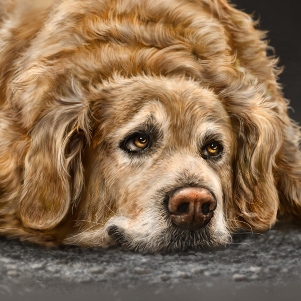
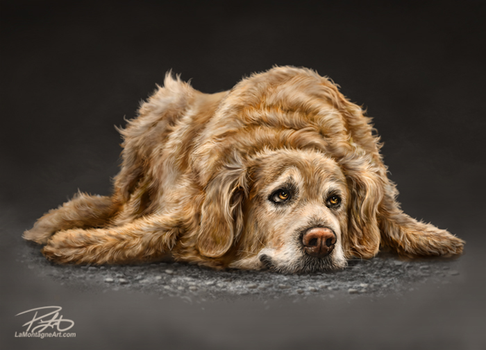
Like most dogs I’ve encountered, Jingles doesn’t like having her picture taken, but despite that, I’ve managed to get plenty of shots on our past visits and knew that I’d eventually find the time to paint her. I began this last month and while a slow start, the past few sessions on this have been quite enjoyable and I’m pleased with how it turned out. I do plan to paint her again in the other style, but this was the right choice for this painting. Here’s a closeup.
Before I started writing this post, I wondered on which visit I took the reference pic. I figured it was either in January or March. Turns out I finished this painting exactly one year from when I took the reference. March 11th, when Jim and I were there. Quite the coincidence, and completely unplanned.
We’ll be at the cabin again later this month for the first visit of the year, with more to follow, no doubt.
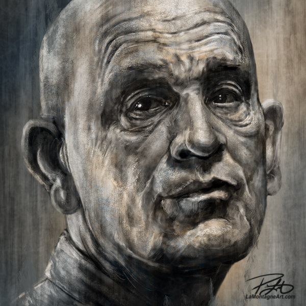
Whenever I’ve painted portraits of actors, it’s been a character I like from a movie, rather than a portrait of the person playing the part. This one is an exception.
There was a lot of hype surrounding the movie Bird Box, mostly because the media reported that some were mimicking the characters and doing silly things while blindfolded. Despite hearing some negative reviews, I guess the gimmick worked well on me, because I gave it a chance while drawing one evening.
I didn’t find the movie terrible, but it’s not one I’d rush to watch again. It struck me as a poor man’s copy of A Quiet Place, but it was certainly watchable and I didn’t count it a waste of my time. A shame that the characters were forgettable, however, since it featured accomplished actors.
One of those, in a supporting role, was John Malkovich, an actor I’ve always liked and admired.
As often happens when I paint movie characters, it wasn’t something I had planned in advance. There was a scene where Malkovich turned and it struck me that I wanted to paint him from that moment. The light, the composition, his expression, who knows?
Aside from one commission last year from Canadian Geographic Magazine, where I was tasked with painting Rick Hansen, I paint portraits of people for my own enjoyment, to challenge and improve my skills. A couple have attracted attention after I posted them on Twitter years ago, most notably Martin Sheen and Canadian astronaut Chris Hadfield, but I don’t ever expect the subject will see the portraits I paint of them.
Now that I’m off social media entirely, there’s no incentive to tag them or add a dozen hashtags, which I think is a good thing. It takes away the pressure for likes and shares and leaves me free to paint how I like without wondering how it will be received. I started this on the iPad Pro in the procreate app, then brought it to my desktop and painted the second half in Photoshop on my Wacom Cintiq 24HD display. The brushwork was initially a lot smoother while I nitpicked the details to get the likeness right, but in the final couple hours, I added layers of texture and grunge to rough it up. Seems to better fit the character and feel of the movie.
There are some other portraits I expect to paint this year, but for now, it’s back to the funny looking animals.
From time to time, my buddy Jim and I will visit our friends Babe and Sue at their place in Golden, BC. In the early nineties, while still living in Banff, Babe and friends had built a small cabin high up on the property. A little later, he built his studio on the main landing and when he and Sue retired from Banff, they built a new house across from that.
In the old days (did I just write that?), the cabin was a quiet getaway. Most of the time, as they were still working, Babe and Sue wouldn’t even be there, but they’ve always been generous folks and the cabin has had a long-standing open door policy for their close friends.
No water, no power, haul the gear up the hill on a winding trail. In winter, with infrequent use, the trail had to be broken with snowshoes, first to the cabin, then to the outhouse. We had to pull the gear up by sled.
The not-so-airtight Franklin stove would smoke us out from time to time, but we had to have something to bitch about, usually while we were chopping wood to fill it.
You really earned that first beer. OK, second beer. In recent years, however, as they’ve moved away from Banff and transitioned to retired life, the reason we visit isn’t for the seclusion, but to see our good friends. Today, it’s hardly roughing it, with fresh coffee waiting for us at the house each morning, a big breakfast in their modern kitchen and a daily shower. They’re wonderful hosts.
I can’t even guess how many times I’ve been out there in the past 23 years.
In all that time, they’ve made plenty of new friends in that area, good people we’ve come to know as well. Birthdays, holidays, or just Friday afternoon in the sun on their deck ‘hey, come on over,‘ visits.
As it’s a rural area on the mountain side, bordering the Blaeberry, all of the homes are acreages of varying size, with plenty of trees providing natural privacy. Close enough to be friendly with your neighbours, far enough to often feel like you’re alone.
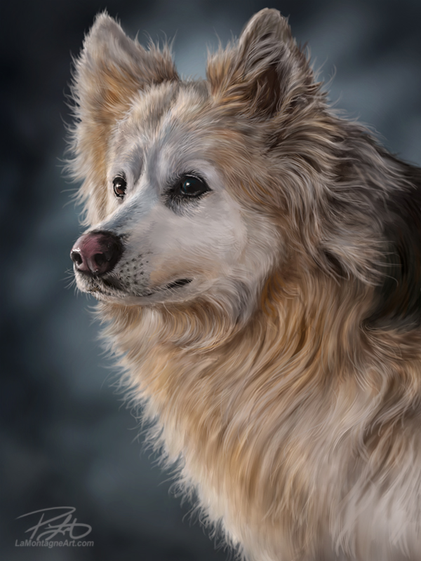
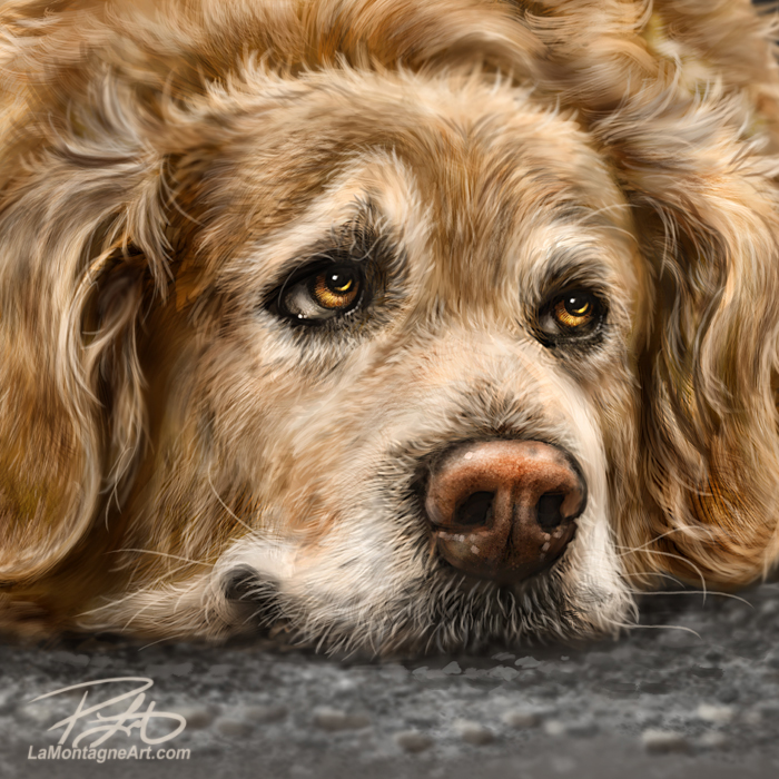
Wade and his family live across the road and he’s a big fan of a certain hockey team, which is why he named his dog, Boston. Shonna and I don’t have the lifestyle for a dog, but if we ever did, I’d want one just like him. I’ve never met a Golden Retriever I didn’t like and I imagine most people feel the same way. In the right environment with plenty of exercise, it’s such an affable breed.
On our last visit in October, the weather was still nice enough to sit outside most of the time. Boston doesn’t always visit, but on that weekend, he was there often, likely because he was getting plenty of attention.
It wasn’t long before I got the camera out of the truck and started snapping photos, something I’ve inflicted on him before. In my experience, most dogs aren’t fans of having their picture taken, and Boston is no exception. He tolerated the snapping fingers to draw his eyes, the kissing noises, the endless calling of his name, but only for so long.
Eventually, he just lay down and looked anywhere but the camera, which was still in his face as I lay down in the driveway in front of him.
If I recall correctly, the reference for this photo was him pleading to Susan, “Please, make him stop.”
Eventually I gave in and went back to throwing the stick for him.
Like most people who take photos of wildlife (or dogs), I shoot on rapid fire. That weekend, I probably took a couple hundred photos of Boston. As is often the case when I select a reference shot from which to paint, it’s not what I had initially planned.
If you’d asked me what I was looking for, before I took any photos, I would have talked about getting him to look at the camera, mouth open panting so it looked like a smile, with nice lighting, of course. Kind of like this. When I paint a commission, that’s what the client is usually after, so that’s what I tell them to look for in the photos they send me.
As this wasn’t for a client, I had the freedom to paint what I wanted. While going through the reference, it was the “make him stop” pose that I kept considering, and I like how it turned out.
Susan sent me a text the day after I got home from the last visit and said that Boston had come back that morning looking for us. I’ll have to bring him some treats or a new toy next time, payment for being such a tolerant model.

 In November of last year, I finished this painting of Kevin Costner as John Dutton from the top-rated Paramount show Yellowstone. Like many of the portraits I paint, it was a personal project, something I did for my own enjoyment. You can read about that piece here.
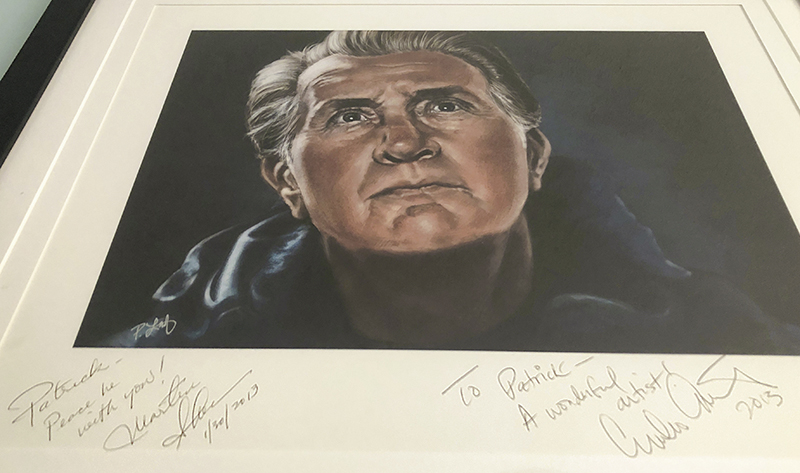 Another was when I painted Canadian astronaut Chris Hadfield while he was in command of the International Space Station. He saw the painting online and sent me an appreciative tweet from space, which was a special moment.
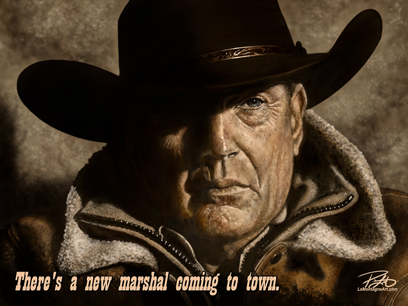 As it also made national news, and Yellowstone is a wildly popular show, I sent it out to my other papers this morning, in case there’s more interest in it. For context outside of Calgary, I added “Calgary Stampede:” before the caption for those other papers.
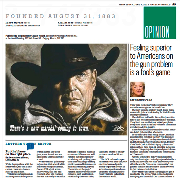 The Costner portrait file is 30” X 40” with a lot of detailed brushwork. To shrink it down and prepare it for newsprint, I had to boost the contrast, oversharpen it, and make other Photoshop adjustments to mitigate a poor result. So while I was happy to see it printed in the Calgary Herald (digital edition above), I couldn’t help but see all the flaws in the reproduction, even though I know that most people won’t notice or care.
 When I’m not drawing and distributing daily syndicated editorial cartoons, I’m painting whimsical wildlife portraits for prints and licensing. Add in the usual office administration, marketing, writing and everything else that goes along with self-employment, and that’s pretty much how I spend my days.
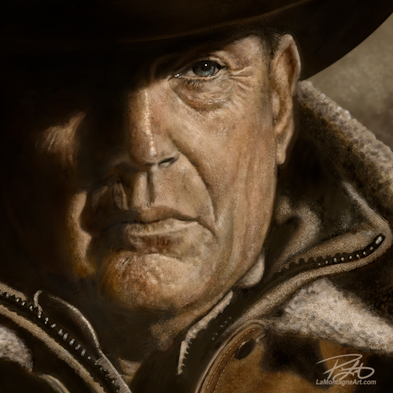 I started this painting in July, and I worked on it for a couple of hours here and there whenever I could find the time. I had planned to have it done before the fourth season began this month, but the paying gigs always take priority. So this past week, I put in the last ten or so hours over a few days. With no deadline, there was no reason to rush it, but I also didn’t want this painting to last for too much longer. As much as I loved the work, the best part is calling it done.