
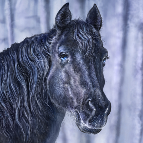
Another horse painting, finished earlier this month.
I took the reference for this at the cabin a couple of years ago, the same weekend as the previous horse painting. While my recent Gold painting was a warm colour palette, this one is colder, a black horse in a winter scene. Each presented its challenges, though I find warm tones easier to paint.
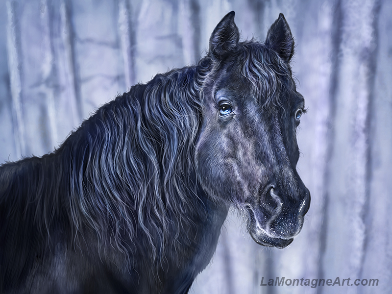
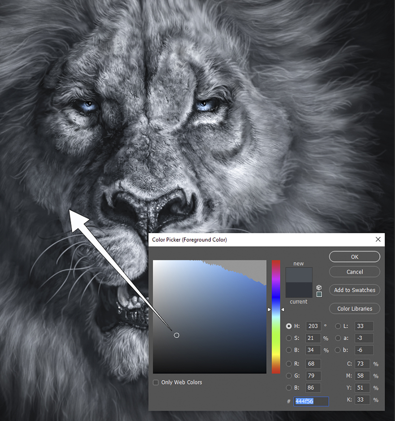
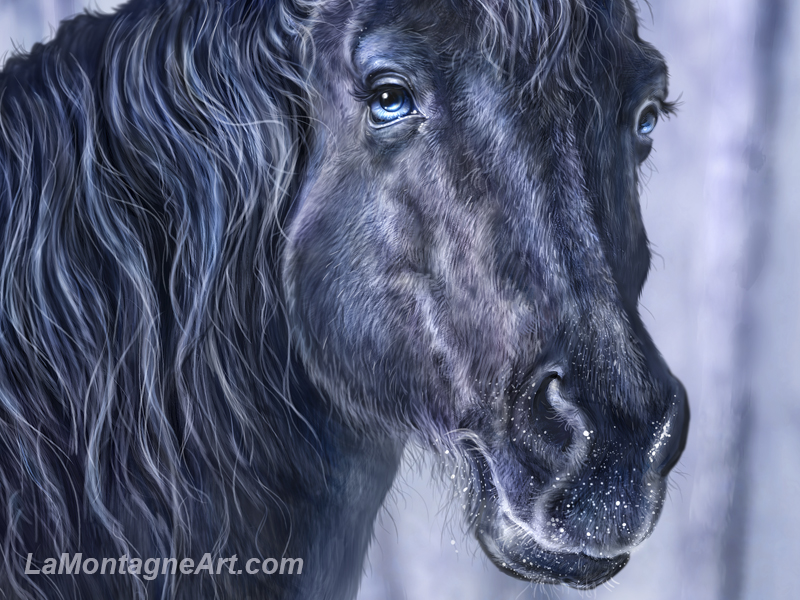
Black fur is difficult. Using pure black or pure white in a painting will rob it of any life. For the darkest shadow areas, I’m careful not to use absolute black because it will appear as a flat spot in the image, especially when printed. There’s always a little colour in it. Even Sire, my black and white lion painting, is just shades of de-saturated blue. If it were pure black, white, and grey, it would appear lifeless, at least it would to me.
 The lighter areas on black fur are often warmer or cooler tones, reflections of the environment and ambient light. The same goes for white animals, the shades and shadows made up of whatever light is present.
Since my artwork isn’t supposed to be an accurate representation of the animal, I push the features to get a whimsical expression. Not quite caricature, but not real, either. I often do the same thing with the colours, which is why this horse looks very blue.
 I’m confident I’ll paint more horses in the future, but having painted two in the past couple of months, I’m ready to move on to something else. Thankfully, I have a massive archive of reference photos, so no shortage of potential subjects.
Cheers,
Patrick
___
© Patrick LaMontagne
Follow me on Instagram @LaMontagneArt
Sign up for my newsletter which features blog posts, new paintings and editorial cartoons, follow this link to the sign up form.