There’s an old saying that says, “Do what you love for a living and you’ll never work a day in your life.”
There’s another old saying, “Be careful what you wish for. You just might get it.”
With the accessibility of training, the affordability of equipment and an endless string of stories of people who have turned their hobbies into their living, it seems that many have become convinced of that being the end goal for any creative pursuit. If you can draw, write, paint, play music, act, sculpt or create anything, you’re supposed to be working to make that your profession.
As someone who made that very choice and is creative for a living, I consider it a great job, but it is still very much ‘a job.’
Right about now, you’re likely thinking this motivational blog post just went wildly off the rails. My apologies if you’re disappointed, but there’s plenty of ‘you can do it!’ advice out there and too few reality checks. Brace yourself.
Now, I don’t want you to think that I’m not comfortable with my choice to be an artist for a living, because I am. I make my own schedule, I answer only to whom I choose, and if I sense a job is going to be a nightmare, I’m in the enviable position that I can turn it down. Lately, however, I’ve been experiencing an uncomfortable anxiety about my work. While there are going to be bad days in every profession, regardless of how much you like it, there seem to be many more days lately where I get up in the morning and just don’t feel like drawing or painting. For somebody who used to find any excuse to do either, that’s disturbing.
I used to work at a hotel in Banff. As far as jobs go, it was a very good one with good people, and I look back on my time there fondly. During my six or seven years at that hotel, I ran a waterslide facility, then worked night audit, front desk and eventually became the accounting clerk. During the off season, there was more than the usual downtime. Sometimes, after all of the cleaning was done each day, I might be alone in the waterslides for an hour or more, just sitting at the desk. It was then that I’d doodle and sketch and it would pass the time. When I worked night audit, I would arrive just before midnight, run the reports and balances until about 2:00 AM and then just babysit a sleeping hotel until about 6:00 when people would start to be up and about and the day staff would come in. That gave me about four hours to read, draw and sketch.
No deadlines, no expectations, just enjoyable drawing. It was a nice hobby.
During that time, I began drawing one editorial cartoon for the Banff Crag and Canyon, the local weekly newspaper. Not very well drawn, not very insightful, but no real pressure. It wasn’t the National Post.
I could write a whole volume about what has come between then and now, how one thing led to another and how I ended up being a full-time artist. Let’s enter that as read and we’ll jump ahead to the present, shall we?
I can’t remember the last time I drew something simply for fun.
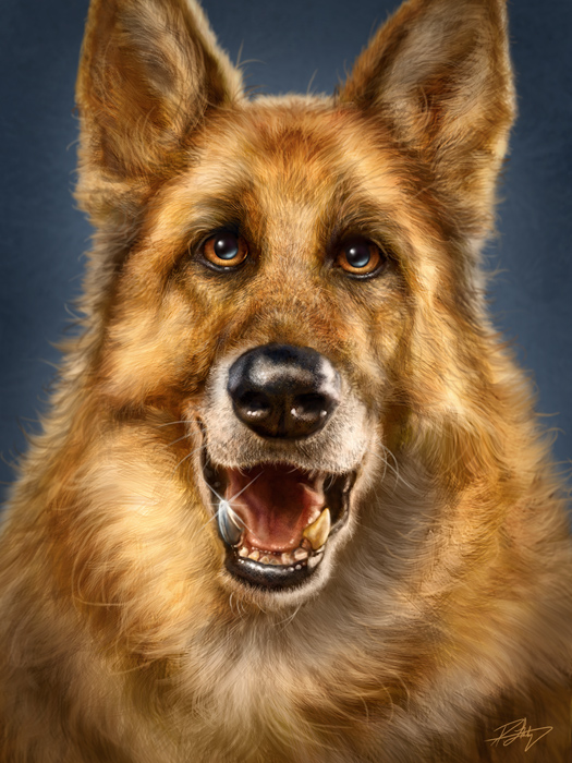
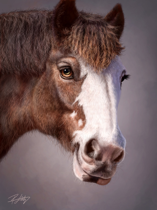
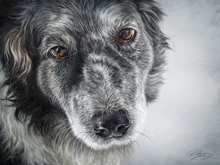
You see, these days, everything I create is part of an end product. If I’m sketching or drawing, it’s for an editorial cartoon or illustration. If I’m painting, it’s for promotion, a training video or DVD, or an image I will sell or have been commissioned to do. Everything feeds the constant deadline. I realized this recently while working on my last couple of Totems and a commission piece. There was something missing in the enjoyment of it and it was unsettling.
At the beginning of this ride, there was excitement in the scramble of it all. Getting that new newspaper, having a magazine print an image, being recognized by a publication or resource. I was younger, hungrier and enjoyed the competition. After you reach a certain level, however, it’s no longer a thrill of being ‘on the way up’, but the maintenance required to ‘keep from losing any ground.’ The same old drug dosage is no longer providing the high that it used to.
Continuing on with known sayings, how about this one? “When your hobby becomes your job, you need to find another hobby.”
I used to have full-time day job, and editorial cartooning was the fun gig on the side. Then it became ‘the job.’ Illustration was then the fun side gig, then it became part of ‘the job.’ Painting became the fun side gig…you can see where I’m headed, here.
Being an artist for a living is great. I wouldn’t want to do anything else and I would still say that even when I’m having a bad day. But if you’re considering that leap, go into it with your eyes wide open.
The truth is that business and marketing is where success lies as a creative, not doing what you love. I’ve seen artists so much better than myself and others, fail to get anywhere because they don’t know how to sell and manage their business at all, or ignore the necessity of it. I know some self-employed people who are three years behind on their taxes and are living under a ton of debt they’ll be lucky to ever crawl out from. They wonder why they have no money but they haven’t done any invoicing in months. I speak to school classes regularly and one question always comes up about whether or not they should go to art school. I tell them to go to business school. If you love art, you’ll do it anyway and will find the resources to become better by yourself, but where most artists fail is running their business and selling their work.
You have to be every department as a freelancer. Accounting, PR, sales, admin, and creative. Invoicing is done immediately or at the end of the month, without fail. GST payments are never late. Tax installments are never late. You must foster relationships with your clients all the time. If they know you and like you, they’re unlikely to replace you. I would estimate that I spend only half my time drawing and creating, and the other half of my time running the business. All of that comes with expenses, too. Website design, printing costs, accountants, bookkeepers, lawyers, etc. Even designing your own budget website will cut into the time you’d rather be working on why you’re in business in the first place.
If this is what you want and are prepared for what it takes, then more power to you. I would encourage anybody to give it a shot because I prefer these long hours working for myself than shorter hours, vacation time and weekends off working for somebody else. If, however, you just love to draw or create, seriously consider if you really want to risk that by turning it into your job. When your hobby becomes your work, it will change how you feel about it and it will no longer be that which you do in order to relax and unwind. While compromise is always a part of life, decide how much you’re comfortable with. There is no right or wrong answer, but there is a choice.
I will still write inspirational ‘you can do it’ posts here and elsewhere, and if you read one of those, don’t doubt that I mean it, but success stories will always be about hard work. In this age of instant celebrity with folks believing they will be ‘discovered’ on shows like American Idol or YouTube and that they deserve to be successful by the simple virtue that they exist, inspiration needs to be tempered with reality, too.
Finally, a word of caution in the form of one more old saying. “Judge your success by what you had to give up in order to get it.