In an effort to broaden my digital painting horizons, I recently bought Corel Painter 12 and am trying to get used to it.
Having been a digital painter with Photoshop for many years now, I’m very comfortable not only with the default tools, but with customizing and designing my own brushes so that I can paint the way I like.
By pairing and customizing Wacom’s hardware and Adobe’s Photoshop software, I’ve developed a very comfortable workflow and I know how to get the results I want with the tools at hand. So if everything is working so well, you might wonder why I’m bothering with Painter. The short version is that Photoshop and Painter are the industry standards when it comes to digital painting. Some artists use only one of them, but many use both together, taking advantage of the strengths that each offers to produce the best results. I would like to have that option.
I invested in some initial training with Lynda.com to try to learn the ropes, but it didn’t give me what I needed. The class and instructor were fine, but when it comes to software, I seem to learn best by first doing something. If I can’t figure it out by trial and error (usually a LOT of error), then I’ll go searching for articles, videos, and classes online.
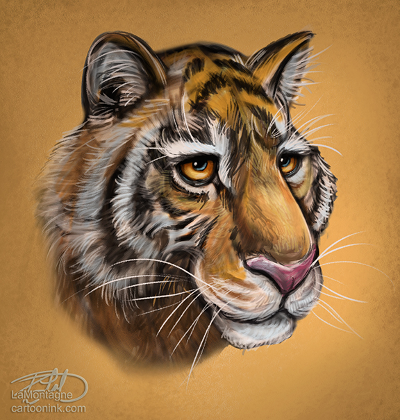
The painted sketch you see above is my first attempt at painting in Corel Painter 12. It took me a few hours as I tried a lot of the different available mediums, quickly realizing which ones I didn’t like and which ones had potential.
Painter 12 is designed to emulate traditional media. If you’re a traditional artist, that’s probably great news. But I’ve never painted with traditional tools. I learned how to paint in Photoshop, so to use oil painting or watercolour in Painter was incredibly frustrating because I’ve never used them before and didn’t like the way they worked. In all honestly, there were a few instances where I tried a brush and said, “Ugh!”, disgusted at the results. When it came to the cloning tools, I abandoned them without even taking them for a spin. I’ve never like painting or tracing over a photo and those tools are designed to do just that. While some people enjoy working with that option, I’ve never done it in Photoshop and I don’t plan to start now. Photos don’t belong in my work.
Now you might be wondering if this is just a blog entry to slam Painter. Let me assure you that it’s not. While half of my drawing and painting time was spent with a furrowed brow and clenched jaw when the tools were not working the way I wanted them to, the other half was spent with raised eyebrows in surprise and even a grin or two when I discovered a few things I really liked. I might have even said, “hey, that’s cool” out loud a few times.
Once I realized that I didn’t have to use EVERY medium in Painter, I started to enjoy myself. After all, I only use a small percentage of the features in Photoshop. Painter is designed to emulate most traditional mediums so that it appeals to a wide range of artists. But it doesn’t mean that a watercolour painter now has to learn oils and charcoal just because they’re suddenly available in the same place.
I found painting with the acrylic brushes really enjoyable. They work the way I want them to and I plan to spend a lot of time painting with those. The airbrush tool offers a LOT more options than the Photoshop airbrush does, so I’m really looking forward to incorporating that into some fine detail work.
I pride myself on having a really good handle on the Photoshop brush engine but the Painter brush engine is a whole new animal. I’m bracing myself for when I tackle that monster. Taming that beast is an absolute necessity because designing and using my own brushes is a big part of how I paint.
So what do I think of Painter 12 after only using it a short time? I think it’s an impressive piece of software that I have no idea how to use. Now, had you asked me the same thing about Photoshop ten years ago, I would have given you the same answer. They do share many of the same shortcut keys and tool options, like zooming, panning, layers and other functions, but there are other operations that are completely different and therein lies the challenge.
When talking about this on my Facebook page, I said, “It’s as if somebody came into the kitchen while I was cooking and moved everything to different cupboards and drawers, changed labels, and translated the recipes into foreign languages. I can still cook, but there won’t be any finesse to it until I get used to the new layout.”
Just like anything worth doing, it’s going to take me time to become good with Painter, just as it took years to become good with Photoshop. When it comes to painting, neither one of them is a ‘press this button, press that button’ piece of software. Digital painting is an art medium all on its own. If I were learning how to paint with oils, acrylics, watercolour, charcoal or any other traditional medium, the learning curve would be just as steep, if not more so.
I’m off to a good start, but I’m under no illusion that I’ll be doing any commission or gallery work in Painter anytime soon. Probably a lot more of the type of painted sketch you see above for the next little while. But I plan to keep at it, work through the frustration and practice as often as I can.
When it comes down to it, that’s the only way to create better art no matter what medium you’re using.

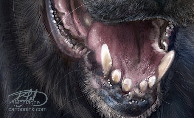
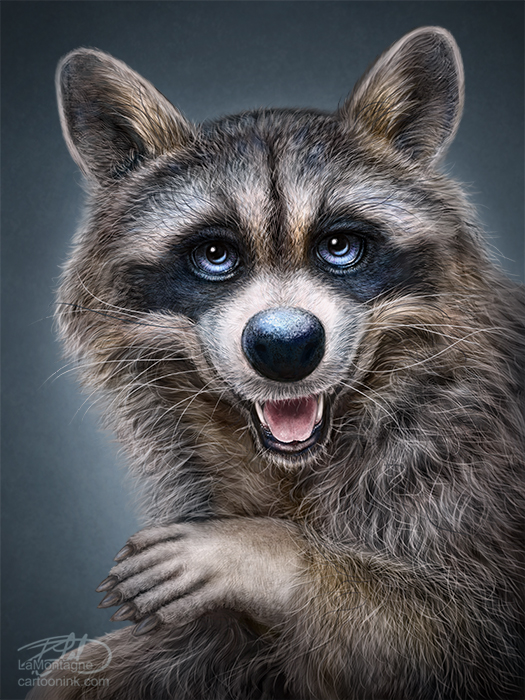 Here’s the last painting of the year and another addition to my Totem series. At present, I’ve got about eight to ten animals waiting in the wings to be painted. I’ve had the reference photos for a number of them for quite some time and even though I don’t have an order in mind, it just seems that each gets their turn whenever it feels right. I had not expected to be painting the Raccoon Totem this year, but when choosing which would be my last painting of 2013, I went through the different folders and reference images, and it just seemed the right time to paint this one.
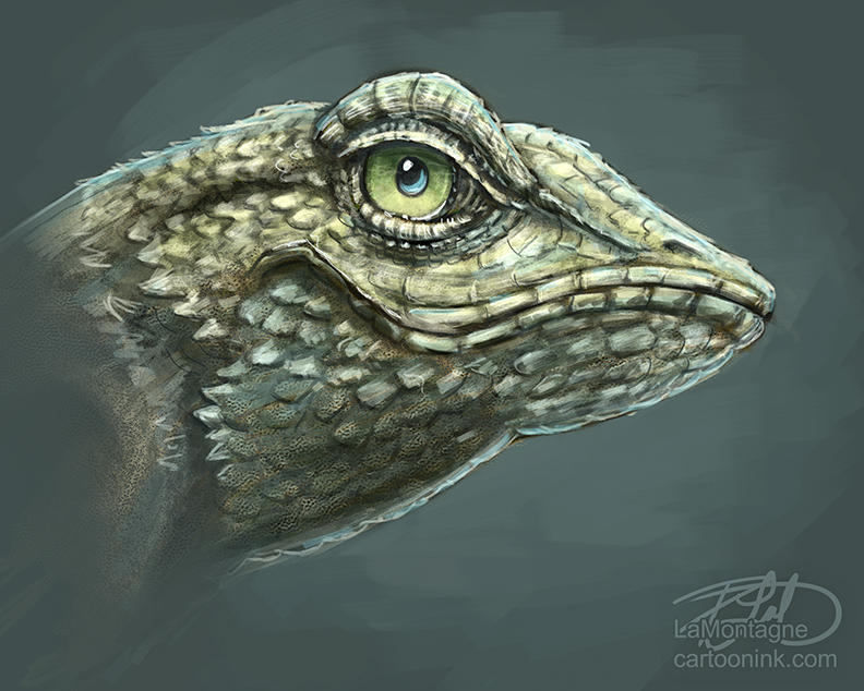
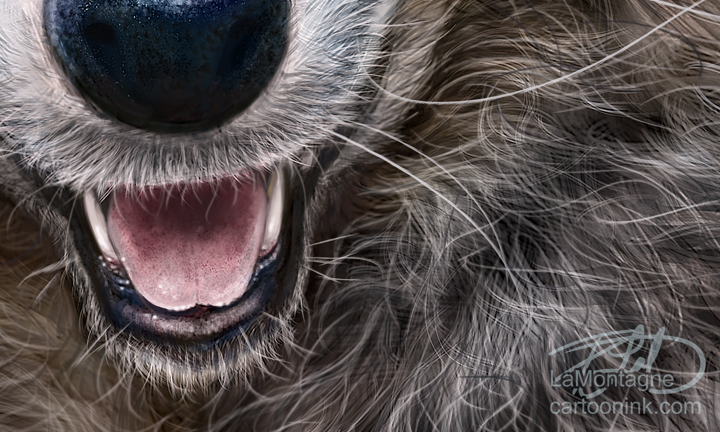 This was painted on both the Wacom Cintiq 24HD and Wacom Cintiq 13HD displays, using Photoshop CC. No photos or overlaid textures were used in this image, it was all done with brush work. I don’t keep track of how long it takes to paint these anymore, because I usually spend an hour or two here and there over a two or three weeks when my other deadlines allow it. As always, I relied on a few reference photos for this painting and would like to thank my friend Susan Koppel who provided me my main reference for this Totem. Susan takes wonderful pet portraits, and also donates her time to her local Humane Society in Nevada and you can’t help but want to adopt all of the pets she photographs as she makes them look their absolute best. Rather than me ramble on about her skill and talent as a photographer, check out her website and you’ll see for yourself. You can find her at susankoppel.com

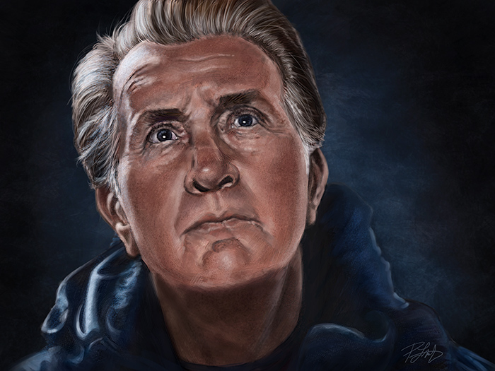 Yesterday, I wrote about why I painted this portrait of Martin Sheen’s character, Tom, from the movie