Posted on

Papillons, Paintings and Prints

PupsMy final commission of the year was completed this past week, a challenging piece.

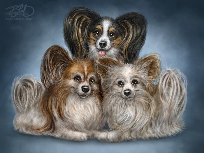
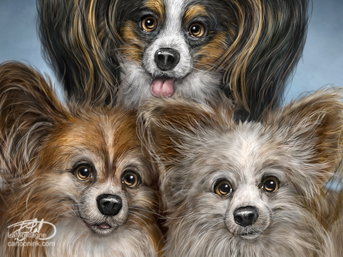
Featuring three Papillon dogs, each with distinctive colouring, personalities and subtle size differences, keeping them straight was almost an exercise in futility. From the top, moving clockwise, they are Desperado, Ringo and Mick.

For some reason, I kept mixing up the personality traits and subtleties of Desperado and Mick. Apparently Mick is less vocal, but I’d originally drawn him with his mouth open, which didn’t fit. Desperado is the mouthy one. Mick tilts his head left, but I drew Desperado doing that, which I ended up keeping after all. Then, after I made the changes in the sketch and got approval, I went back and started painting on the original sketch, which meant I had to correct it again. Chalk it up to a silly mistake from not paying close enough attention.
Sketch
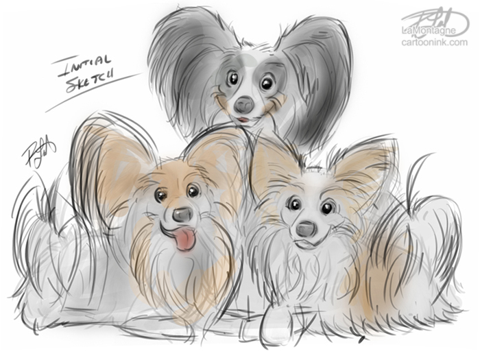
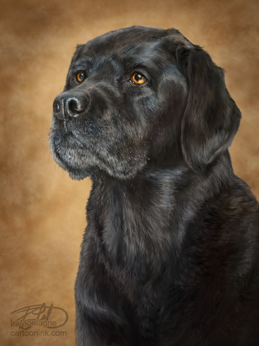
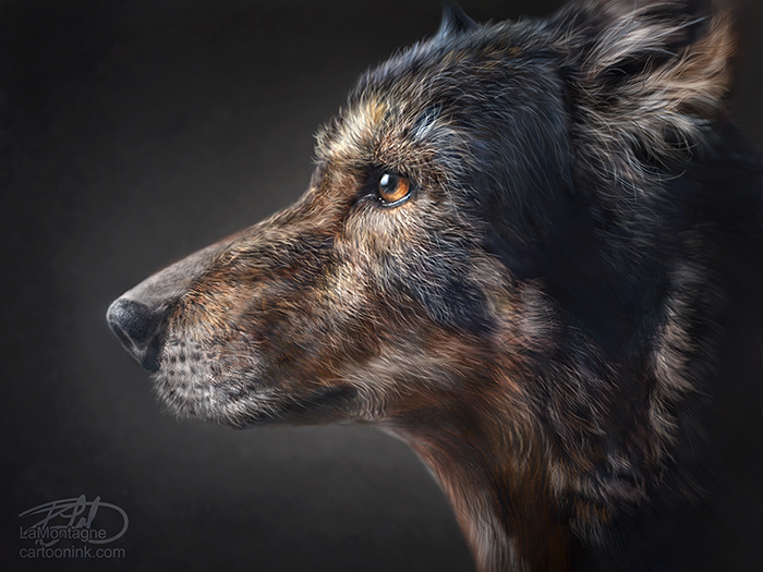
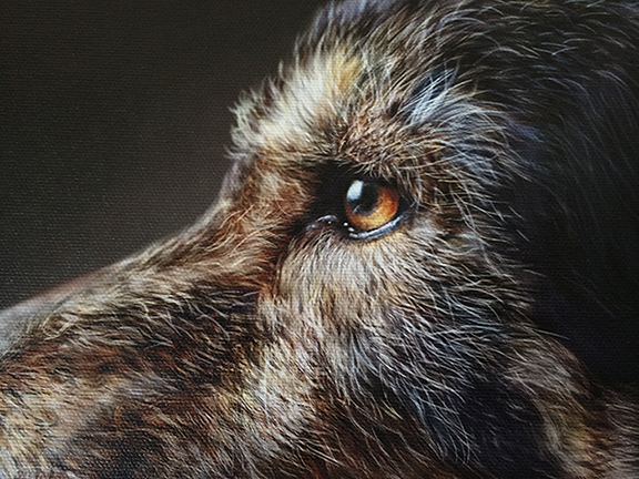
While the client gave me dozens of photos to work from, almost all of the eyes in the usable pics were washed out by flash reflection or were small pics with low resolution and poor lighting. It happens and I do my best to work with what I’ve got. For the details, however, I did buy half a dozen stock photos of other Papillons. The colours were all wrong, but it helped me see fur direction, layering, poses and to fill in the missing anatomy I needed, but didn’t have in the supplied reference.

All well in the end and the client told me I managed to get each personality right with each dog. The painting has gone to print and I should be able to pick it up and ship it by week’s end. Thankfully, this one is right here in Alberta, so there shouldn’t be any issues with shipping at one of the busiest times of the year for parcels.

It occurred to me this week that I’ve been breaking an important rule of mine recently. I’ve said in the past, and have advised other artists, that proofing is essential every time I have a painting printed. A proof is a test print.

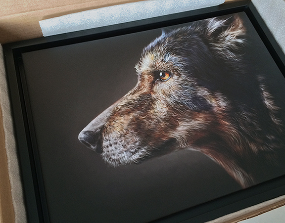
Kelly at Chroma Surge has been printing my canvas and matted prints for the past five years. During that time, there have been growing pains. Prints came out too dark or too light, colours too bright or not bright enough, whites and blacks sometimes washed out and muddy, different papers and materials producing different results.

Kelly’s printers and machines are colour calibrated, as is my own display, but with different profiles and myriad little adjustments here and there, a bunch of little deviations can make for large problems, and it wasn’t anybody’s fault. This is why proofing has been essential, especially in the beginning. For my poster prints, I use Maranda Reprographics and Printing in Calgary, and the same thing happened when I first went with them. The adjustments I make for Kelly’s prints are different than those I make for Maranda’s prints.

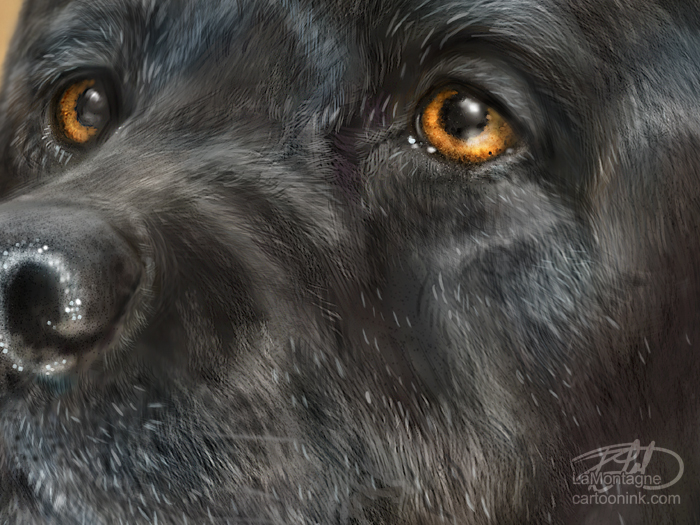
In recent years, Kelly and I have come to that Goldilocks zone for printing my work. When I send a painting to print, I know which adjustments I have to make ahead of time and I save them in the Photoshop file, a layer that tells me what I did, and that becomes the Master File. A dog with a lot of black fur (which is really not black), needs to be lighter than a dog with light fur, because I know the detail in those blacks is going to be gone if I don’t compensate.

Whites can’t be fully white and blacks can’t be fully black because it sucks the life right out of a painting. Pinks, reds, blues and greens have to be selectively desaturated in the print file, which means making them less colorful. I’ve seen skin tones print very red on portraits, a dog’s tongue so pink that it overpowers an entire painting, or a green background dominate the animal in front of it, simply because the adjustments weren’t made or were done incorrectly on my end. A canvas print will often appear more saturated, especially after it has been spray coated, so I have to compensate for that as well.

All of these things I’ve learned by proofing, which is usually just doing a preliminary small print on canvas and taking a good hard look at the colours to make sure the shift isn’t significant. When it all works, images on canvas just POP! I’m never as happy with a painting as when I see it on canvas.

Now, I could get really meticulous about the proofing, pull out a loupe and check for every little variation, but what I’ve also learned over the years is that tiny little colour shifts from my screen to canvas, matted print, or poster print are acceptable up to a point.
PupsCloseI attended a class at Photoshop World last year, taught by my friend Alan Hess. He was talking about how to reduce noise in a low-light image and how to compensate for it with camera settings in night photography. But he also cautioned that the only people who really care about noise in an image are other photographers.

That lesson applies to my work as well. The only person who really cares if the fur colour in the print exactly matches the fur colour on the screen is me, or possibly another artist. Most people don’t see it, or don’t care. A screen is also backlit, which means every image will always be brighter on a screen as opposed to a print. So it’s all just finding a balance that’s good enough.

Incidentally, the term ‘good enough’ is like fingernails on a chalkboard to me. Like most creative types, I’m a perfectionist. Thankfully middle-age has taught me to let that go a lot more than I used to. Perfection is unattainable and as the mantra goes, “Done is better than perfect.”

As a result, I have let go of that rule of proofing everything for the very good reason that I now have plenty of experience with the known variables. I know my printer and he knows my work. If there’s a problem, he’ll let me know. Kelly did a test print of my last two commissions, but I never saw them in person. He just told me that he knows what I want and how I like my paintings and that he thought they looked good.

I weighed my options. I could take a few hours out of my day to drive to Airdrie to see the proofs and then tell him to go ahead with the print, or I could just gamble on our past history and the fact that I can’t remember the last time I’ve had to reproof something with him. So I told him to go ahead and when I picked them up this week, the prints were fantastic.

For this commission of the three dogs, I decided to continue the streak and let it ride. I sent Kelly the image Friday morning and got back, “The proof looks great! I’ll run it off here shortly.”

I’ve no doubt that I’ll be happy with finished result.

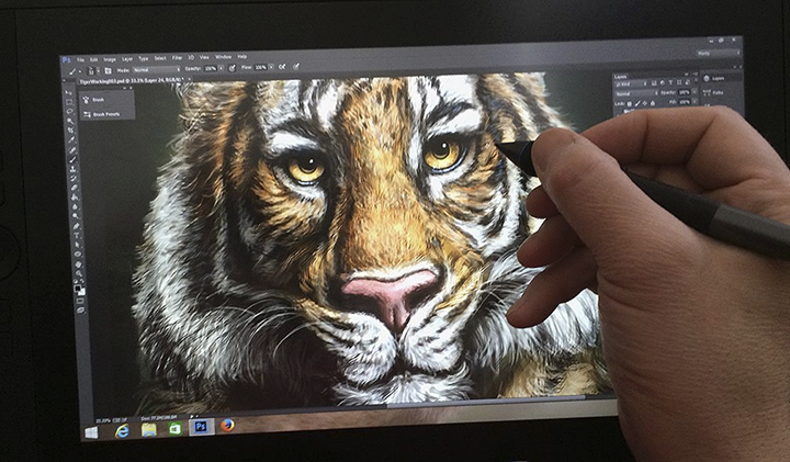
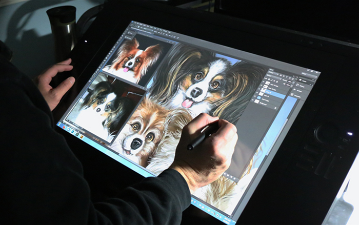
Technical details. This was painted in Adobe Photoshop CC, using both a Wacom Cintiq 13HD and 24HD displays. Photos were only used as reference. For most of the painting, I kept each dog on it’s own layer, to help with painting the hair.
PupsCintiq

If you’d like to receive my newsletter which features blog posts, new paintings and editorial cartoons, follow this link to the sign up form.  Thanks!

Posted on

A Tale of Two Paintings

My usual routine is to write a little blog post after each painting I do, to provide a close-up and maybe share a little bit of relevant info. Given the fact that I’ve been working on two commissions at the same time recently and finished them quite close together, I thought I’d share them both in the same post. It gives me an opportunity to show the difference between the two styles of commission paintings I do.

Loki

The first painting I recently finished was Loki, a beautiful old boy who passed away a little while ago. This is the second memorial painting I’ve done for this client; the first was Odin a couple of years ago. The client is very familiar with my work and chose a portrait style, which is quite often the case with memorial paintings I’m commissioned to do. With plenty of photos to choose from, I had the freedom to go with whichever pose I wanted to use. As usual, one photo spoke to me clearly and I got to work.

LokiCloseI usually only have a rough idea of what a painting will look like before I get started, but it’s usually enough. The background colour might change in the middle of a painting, but this one was orange and yellow from the beginning. The reference pic was taken in the fall and I knew those colours would just bring out his eyes. For me, it’s all about the eyes. If I get the eyes right, the rest of the painting will always come together. And if they’re wrong, nothing looks right.

Having lost a pet of my own this summer, there was a little more gravitas for me with this one. This old boy was loved a lot and I thought of that often while working on it. What a privilege.

SaxonThe next painting was in my Totem style, which is a whimsical caricature look, the same way I paint my wildlife paintings. The clients saw my paintings for sale in About Canada Gallery in Banff while on vacation and looked me up to see if I did commissions.

Saxon was described as a “beautiful drooling mastiff” and when I saw the photos, I was inclined to agree. His personality was evident in many of the pics and again, I found one that I thought would best represent what the client wanted him to look like.

SaxonCloseAs is the case in many of my whimsical paintings, I found myself smiling a lot while painting this big fella, and even laughed out loud a few times. I really wanted to paint in long strings of drool coming from those jowls, but the client didn’t want that. A commission is a significant investment, and while most of my clients give me carte blanche to paint what I want, I’m willing to take direction if it makes for a happier client.

Case in point, when this piece was finished yesterday, I had intentionally made the body a little narrow to draw attention to his big head, but the client thought I made him too skinny and wanted me to bulk up the body a bit. I spent another hour on the painting last night and delivered a final that pleased everybody, including me.

No matter what style my clients choose for their paintings, portrait or whimsical, memorial or just because, it’s such an honour to be trusted with the task. I enjoy these a great deal and each one challenges and teaches me something new. These two were no exception.

These will both be sent for proofing tomorrow and I intend to have them printed, framed and shipped in a couple of weeks.

Thanks for stopping by,

Patrick

If you’d like to receive my newsletter which features blog posts, new paintings and editorial cartoons, follow this link to the sign up form.  Thanks!

Posted on

A Trio of Ostriches

PaintingSomething about painting these animals of mine with the intention of printing and selling them is that I can become a little too focused on the end result and forget why I started creating them in the first place, which was for the simple joy of it. I’ll often go through my now very extensive, but neatly organized folders full of animal photos, looking for inspiration for the next piece. While there are plenty of animals I’ve got pics for and have yet to paint, it’s a matter of timing. Certain animal paintings just happen when the mood strikes me, when it’s just their time. I’ve had some pics for years before I’ve gotten around to using them for a painting.

Even though I’ve painted an ostrich before, part of my Totem series, and despite the fact that it’s one my best selling prints, I found myself looking at some recent ostrich pics I took at Discovery Wildlife Park in Innisfail and others I’d taken at the Calgary Zoo. I just love the attitude of these animals. It’s completely unjustified, but they always seem two seconds away from bristling at whatever imagined indignity is confronting them. Kind of like a cross between, “how dare you?!” and “don’t you know who I am?”

At the Calgary Zoo, the ostriches and zebras share an enclosure. While I was taking photos one day, a zebra made his way toward me, clearly with the intent of eating some of the hay by the fence. To get there, he (or she, can’t remember) had to walk between two ostriches and their reaction made me laugh out loud. They quickly backed away, hissed at the zebra and their body language indicated that they were offended at this worst of possible slights and invasion of their personal space. The zebra seemed to be used to all of this and just ambled through without giving them a second glance. It was pretty amusing.
CloseupWhile looking at the reference pics, I realized that there were plenty of other animals I could have painted right now to add to my menagerie of marketable prints, but in the end, I just wanted to paint some more ostriches. I might have painted them all looking angry and indignant, but I just went with what I felt while working on them. There’s a trace of that attitude in there, especially in the one on the right, but to me, they just seem to be a trio of ridiculous looking goofs. Whatever you see in them is right for you, of course.

For some reason, it also reminds me of three awkward teenage kids being forced to pose together for a family portrait.

This was a lot of fun and while I doubt I’ll be painting more ostriches in the near future, you never can tell. I didn’t expect to be painting these three. This was painted in Photoshop CC 2015 on both the Wacom Cintiq 13HD and 24HD displays, with photos used only for reference.

If you’d like to receive my newsletter which features blog posts, new paintings and editorial cartoons, follow this link to the sign up form.  Thanks!

Posted on

Zendaya

Zendaya
My latest painting, a lion cub named Zendaya.

At the end of May, I had the opportunity to spend some time with a couple of lion cubs at Discovery Wildlife Park in Innisfail. It’s a wonderful place I’d driven by on many an occasion but had never made the time to stop in.

I’m wary of supporting zoos if they don’t have a mandate or reputation for existing for the right reasons and for treating the animals well, so I did a little research before attending. I was pleased with what I found out and if you’re curious, I’d encourage you to visit their site to read a little about the work they do.

I’ve been fortunate to enjoy the generosity of many of my photographer friends who’ve been willing to let me use their images for reference on a number of my paintings. Some of my most popular pieces wouldn’t have been possible without their assistance. In other cases, I’ve purchased stock photos online. The common thread in both of those options is trying to find the right photos to work with that will get me close to the vision I see in my head. Often, I find that even though the photos might be excellent, I’m working with what I’ve got and have to settle a little. This should in no way be seen as a criticism of the photographs, just a missing element, namely my own experience with the animal I’m painting.

In recent years, I’ve been taking my own reference pics and that has quickly become the preferred option. Having won a high end camera along with my Best in Show Award at Photoshop World last year, I’ve been working to become a better photographer. Between that camera and the one I already had, each with their own uses, more and more often I’m using my own reference pics for paintings.

Discovery Wildlife Park offers behind-the-scenes experiences with some of their animals, under the vigilant supervision of their keepers. This year, with the arrival of two lion cub siblings, they offered an opportunity for very small groups of people to get up close and personal with the cubs, for an additional fee, as would be expected. This will only last as long as the cubs are enjoying it and while they’re small enough that it doesn’t expose guests to any risk.
LoungingTwo trainers, two other guests and I were brought into an area outside of the cubs’ main enclosure, but still in a controlled area. The two cubs were each brought out on a leash by a trainer. Initially, the female, Zendaya, the subject of this painting, didn’t seem to want to come out and be sociable and they had told us earlier that it was up to the cubs. If they didn’t feel like participating, they wouldn’t be forced. I quite liked that.
CubCuddleGriffin, the boy, seemed to love the attention and exploring outside of his enclosure. He was also clearly enjoying the physical interaction with the keeper and there was an obvious bond there. When Zendaya finally decided she was missing out on her brother’s fun, she wanted to come out as well and was just as affectionate with her keeper.
WalkWe had plenty of opportunity to ask questions and for much of the time; I was within arm’s reach of either cub. When the keeper felt that one of the cubs was relaxed enough, we were allowed to touch them, specifically told to keep our hands away from their heads as they didn’t know us. I was allowed to take plenty of pictures and the whole experience was a real thrill.

When I got home, I had so many great shots to choose from, I knew I was going to paint one of the cubs and will very likely paint the other in the near future. I’m also planning to return to the Park very soon to get some more photos of the other animals for similar painting reference. They have a very cooperative beaver there that I’m dying to get some good shots of as I’ve wanted to paint one for a while.
ZendayaCloseI had initially intended this first lion cub piece to be more of a sketch painting, but the more I worked on it, the less I wanted to stop, so I carried it through to a completion. I’m very happy with the result and I’m looking forward to seeing it on canvas.

This was my first painting done with the recent upgrade of Photoshop CC 2015 and it worked flawlessly. As usual, no photos or textures are used in the actual painting, just for reference. Everything is brush work, using both the Wacom Cintiq 13HD and the Cintiq 24HD displays.

Thanks for reading.
Patrick

If you’d like to receive my newsletter which features blog posts, new paintings and editorial cartoons, follow this link to the sign up form.  Thanks!

Posted on

Polar Bear Totem

PolarBearTotemHere’s my latest painting, the Polar Bear Totem. I’ve mentioned before how I never really know when I’m going to paint a specific animal. I’ll keep reference photos for some animals for years before using them, waiting for the time to seem right. In other cases, I’ll get the urge to paint an animal and go searching for reference right before I start the painting, as I did for this one. I bought several stock photo images and used all of them in the painting of this bear, although as always, no photo is part of the painting, only used for reference. It was painted in Photoshop CC on my Wacom Cintiq 24HD display.

In my experience, if I paint an animal for commercial purposes alone, it often doesn’t end up working for me or it turns out to be less than I’d hoped for. The Magpie and Ground Squirrel have always felt like that for me, because I painted them for my first gallery in Banff, rather than for myself.

On many occasions, I’ll enjoy working on a painting, but I’ll feel the finished result just isn’t as good as it could be, so it’ll take me some time away from it until I feel good about it. Even then, some of my most popular paintings aren’t my personal favorites.

Thankfully, this one felt special and the final few hours were some of the most enjoyable I’ve spent painting this year.

Initially, I wanted to have this done for the upcoming Calgary Expo show in less than a couple of weeks, but to make my deadline to get all of my prints done, allowing me time to sign and package them, it would have had to have been done a couple of weeks ago. I was feeling rushed, looked at how many prints of images I was already bringing and it became clear that I didn’t need it, so I decided to take my time. I’m quite pleased that I did as I’m very happy with the result.
PolarBearSketchI’ve always loved bears, even though I’ll admit to an irrational fear of them, which sometimes does put a dark cloud over camping trips. I live in bear territory, specifically blacks and grizzlies. Despite the fact that I hike alone quite a bit, and have seen plenty of bear sign, I’ve never run into one in the wild, which after twenty years in the Bow Valley, is kind of odd. But I’m ‘bear aware’ as they say in these parts, carry bear spray and know what to do if I encounter one. In most cases, as long as you don’t startle them or they aren’t feeding or with cubs, they’ll want to get as far away from you as they can. Even if they charge you, it’s often a bluff, and if you can keep your wits about you, they’ll stop short of contact or veer off and hightail it in the other direction.

I’ve worn a black bear’s tooth around my neck for many years now, given to me by an acquaintance years ago in Banff. He’d found it somewhere in Quebec years ago, still in the skull, and it’s very old. I had a jeweler friend craft a silver bezel setting for it so I could wear it on a chain.

The first Totem I painted was a Grizzly, but it hasn’t felt right yet to paint a black bear. Sooner or later, it’ll show up, I’m sure.

Why I felt the time was right to paint a polar bear, is beyond me. Perhaps it’s the increased frequency of their mention in the news, associated with climate change and the expected loss of their habitat. Scientists fear that polar bears, while very adaptable, show no inclination to survive solely on land. They thrive on sea ice, that’s their habitat, and when it’s gone, likely they will be as well. A recent CBC report stated that ‘Inuvialuit traditional knowledge’ says the bear numbers are actually fine, so as in all things, the truth of their future lies somewhere in the middle, although they are classified as a threatened species.

The polar bear has no natural predators other than man. Classified as a marine mammal, it’s carnivorous and a skilled hunter. While they will avoid encounters with humans when they can, they aren’t fearful of us and have been known to kill and eat people. Considering how many of them have been killed by humans, I say turnabout is fair play.

I’d like to visit Churchill, Manitoba one day and take one of the polar bear tours, to see them in their natural surroundings.

PolarBearCloseIf you’d like to receive my newsletter which features blog posts, new paintings and editorial cartoons, follow this link to the sign up form. Thanks!

Posted on

Tiger Totem

TigerFinalThe latest in the series, this is the Tiger Totem. Specifically a Malaysian Tiger, but most people won’t be too concerned over the species.

It’s funny how these always turn out. I start with a vision in my head of what I think it will look like but every Totem always becomes something different than what I’d expected. I don’t think that’s a bad thing, because the final image is usually a pleasant surprise. For example, with this painting, I rather expected the tiger to look stern and a little menacing along the lines of my Cougar Totem. Clearly it didn’t end up that way, but I kind of like it.

I’ve often said that the personality just shows up at some point in each of these paintings and this one was no different. Many artists will speak of their muse, that ‘other’ that contributes to their work, provides a spark that isn’t entirely their own. Define it how you will, but it’s that which infuses these animals with something that doesn’t quite feel like it was mine to begin with. So when the personality shows up and is different than what I’d envisioned, I just go with it.

When I posted this online yesterday, one person said that this one looked a little more anthropomorphized than my others. That’s basically a ten dollar word (one I’ve always liked) to describe a human quality or character in something that isn’t human. It definitely fits for my work. As for there being more or less in this one, that’s up to the viewer and I would refer you back to the previous paragraph.

A couple of other people said that it looked like the tiger was taking a selfie. Likely it’s because of the lighting and the way I painted the body below the head, making it look like his front legs are outstretched. In point of fact, the tiger was resting on his front legs in the reference image and I decided to keep that pose. Did I get it wrong? Maybe. Do I wish I could change it? No.

TigerCloseEach of these paintings comes with a decision tree where one choice leads to another and so on. I thought about putting foliage in the foreground, might have added more depth. I thought of putting a darker and lighter background. The reference featured the entire body of the tiger and I thought about putting more of that in as well. But my Totems are all about the detail and I can only show that in a close-up of the face on a larger animal. Somebody else might have chosen differently.

Just as I paint what I see, everybody sees something different as well. If to some it looks like he’s taking a selfie, then that’s what it looks like, and they’re not wrong. I’ve learned that with signature or niche pieces, creations that aren’t done for a client or somebody else, an artist just has to paint what they see and separate themselves from the result and how others will interpret it.

Some will love my work, some will downright hate it, and there’s nothing I can do about it. It’s a constant struggle to be at peace with that and every artist I know has been through it.

TigerCintiq13HDThis was painted in Adobe Photoshop CC using both a Wacom Cintiq 13HD and Cintiq 24HD displays. Photos were only used for reference and the painting was done entirely with brush work. On a personal note, a big thank you to Alan Hess, a photographer friend who gave me the main reference photo I used for this piece, a shot he took at the San Diego zoo. I’ve had the photo for many months, but it finally felt right to paint this Totem.

Alan is a talented professional photographer, author and instructor. I would recommend taking a look through the images on his website as you’ll find some great shots on a wide range of subjects.

Thanks for stopping by.
Patrick

If you’d like to receive my newsletter which features blog posts, new paintings and editorial cartoons, follow this link to the sign up form. Thanks!

Posted on

Lemur Totem

LemurFBMy first Totem painting of the year, this is a Mongoose Lemur.  While many people think of the Ring-tailed species when you mention Lemur, mostly due to the animated movie Madagascar, I painted this species because of all of the reference pics I’ve shot at the Calgary Zoo.  The resident lemurs are free-roaming with no cage or glass between them and the people wandering around inside the large rainforest enclosure.  They don’t move all that fast and are very cooperative models.

While this little guy (or gal) is very cute, you might wonder why I made the choice to put so much work into it and add it to my Totem series, since mongoose lemurs aren’t as universally popular as say, a wolf or grizzly bear.  From a marketing perspective, it might seem like this would have been a better sketch painting.  But, one thing I’ve learned from painting these animals is that I usually get the best results when I put the time and work into the ones that just feel right at the time.

In the past, I’ve forced specific animals, painted them solely because I thought they’d be good sellers.  One in particular, the Magpie Totem, I did for that reason.  These birds are in abundance in this area, they’re interesting in appearance, exhibit amusing behaviour, and the tourists seem to be fascinated by them.  An apt description by one of my former local editors is that, “they’re just crows with better fashion sense.”

The first gallery that sold my work in Banff, the manager suggested I paint a magpie because the tourists often asked him what that bird was they kept seeing.  So that’s exactly what I did, even did some of the painting at a live demo in the gallery.  Even though people do buy it, it is probably my least popular Totem painting and I learned a valuable lesson.  From then on, I decided to paint the animals I want to, when it feels right to do so.

LemurCloseCrop In the case of our little Lemur friend, I’ve had reference for this one for well over a year and it just felt like the right time.  I don’t know if it will sell well or not, but I had a great time painting it and the fur was a real challenge.  It’s made up of very short hairs packed tightly together, so I had to experiment with my hair and fur brushes to find the best way to go about it.  In the end, it simply required putting in the time to get it right.  Looking forward to seeing this one in print.

Here are a few images of this painting at different stages.  This was painted in Photoshop CC on a Wacom Cintiq 24HD display.  It’s all brush work and photos were only used for reference.
LemurProgressIf you’d like to receive my newsletter which features blog posts, new paintings and editorial cartoons, follow this link to the sign up form.  Thanks!

Posted on

Denzil – A Portrait

DenzilFlatMy latest painting, a memorial for a dog named Denzil.  He was a very loved senior pup, almost 14 when he died earlier this year and I was commissioned to paint his portrait as a birthday gift.

As an animal lover myself, I always spend a little more time obsessing about these, trying to make each one the best of which I’m capable.  Our pets occupy special places in our lives and unless you’ve had to say goodbye to a furry family member, something each of us must face eventually, you can’t really understand that unique loss.  Eventually the sadness is replaced with only the happy memories, and that takes longer for some than others.  This is often front of mind while I work on these and I’ll admit to getting a little misty eyed from time to time while painting a memorial portrait, especially when the personality shows up and it finally comes together.

CanvasPrintThis was printed at 12″ x 16″ on canvas giclée with a shadow box frame.  I’ve often said that I believe my work looks best on canvas and this was no exception.  These iPhone pics of the canvas (above and below) really don’t do the quality of this print justice, credit to Kelly at Chroma Surge in Calgary who never lets me down.  I believe this is my best work to date and I was very pleased with the result.CanvasCloseup

For those interested in the tech info, this was painting in Photoshop CC using both a Wacom Cintiq 13HD and a Cintiq 24HD.  I had the luxury of months to work on this painting, so I have no idea how long the actual painting took as I worked on it in between other deadlines.  Photos were only used for reference and all painting was done with digital brush work alone.

Posted on

An Editorial Cartoon in Two Minutes

This is just over an hour of sketching, drawing, and painting, condensed down to two minutes.  From sketch to finished work created digitally using a Wacom Cintiq 24HD display and Photoshop CC.  While the majority of my editorial cartoons are sketched on paper first and then scanned, this is pretty much the whole process I go through for each cartoon.  This is best viewed at full screen in HD.   To learn how this is done, you can purchase my cartooning DVD at PhotoshopCAFE.