Posted on Leave a comment

Pet Painting Perspective

Many artists aim to find a niche, the work they love to do, a signature look, and the style for which they become known. To make a living from it, it must also be something enough people want.

If there had been a formula to find that work, somebody would have made billions providing that service. It’s discovered only after throwing stuff at the wall and waiting for something to stick.

I tried many different things before I found my wildlife paintings, and while I enjoyed some of them and could likely still earn revenue from each, my best work is my funny-looking animals.

Much of the marketing and promotion advice I read about art-for-a-living talks about the need for adaptability and cultivating multiple revenue streams. In the current gig economy, where artists compete against the lowest bidder in crowdsourcing, stock imagery and AI image generation, today’s reliable income source could be tomorrow’s buggy-whip manufacturing.

Though I specialize in my whimsical wildlife paintings, that work still involves different types of clients. I sell prints and products to my customers and wholesale to retail clients. For products I can’t produce and market myself, I have licensing deals with several companies and am always looking for more. And every so often, I’ll paint a pet portrait.
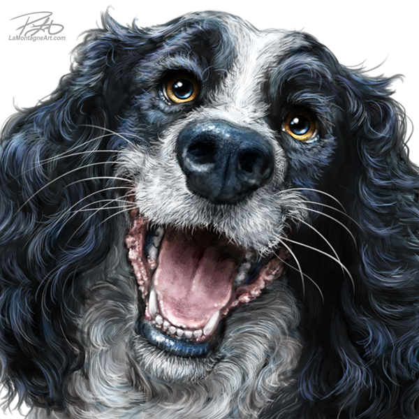
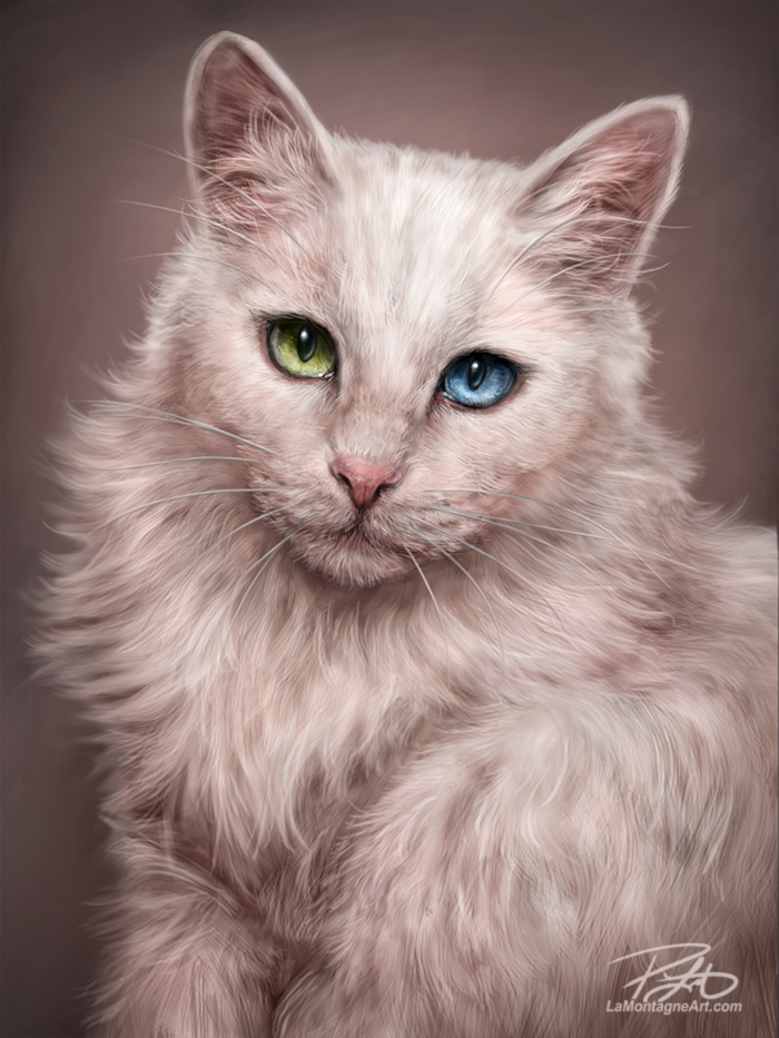
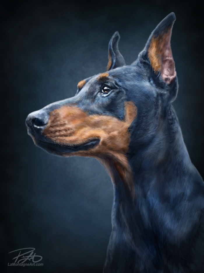
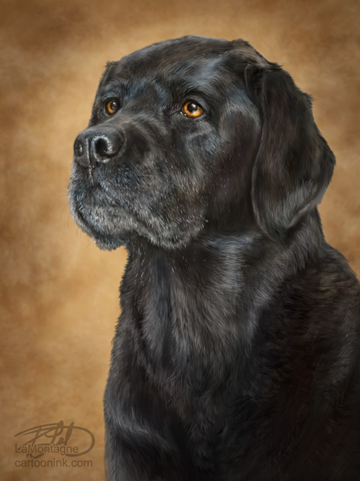
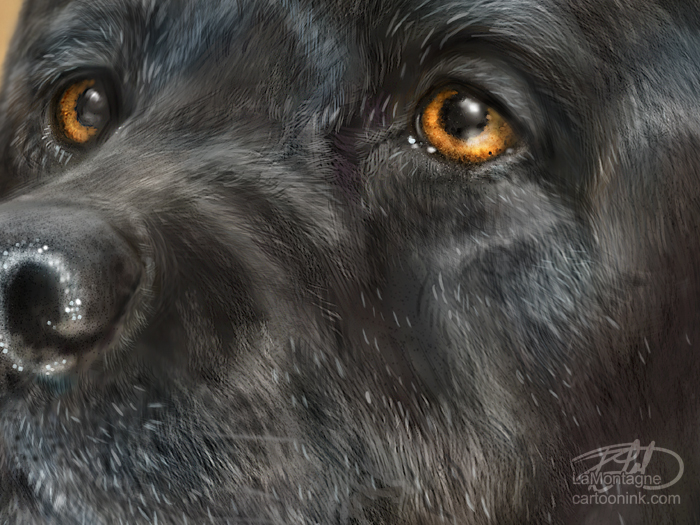
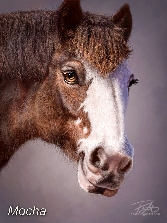
I’ve been painting commissions for a long time, and though it’s a small part of my business, I enjoy them. I’ve worked with some wonderful clients, and I hope to have more like them in the future. I’m hired most often to paint dogs, but I’ve painted several cats, too. I’ve even painted a horse.
The difficulty with commission work is that, aside from advertising the work to future clients, there is no market for the finished paintings. Most people don’t want a portrait of somebody else’s dog; they want one of their own. And when I’m working on a custom painting, that’s time away from everything else. So, a commissioned painting is an investment for both the client and the artist.

But when the right client wants my art style, they understand the work involved and the value inherent in a custom painting of their own, and it’s often a great experience.

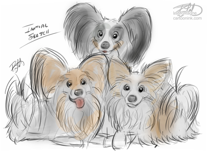
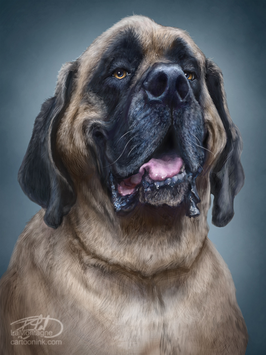
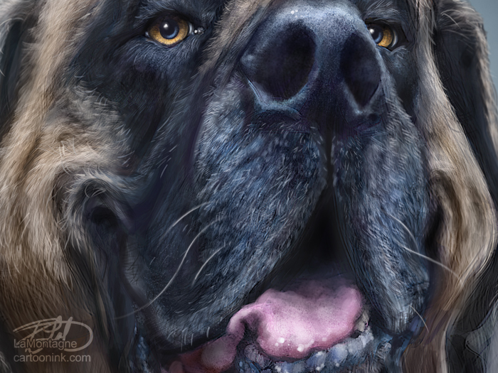
In the past, I have offered two types of paintings to my clients: a traditional portrait and my whimsical wildlife style. That’s the more exaggerated character, often near caricature rendering, of an animal with personality.

Though I have painted several traditional portrait commissions for happy clients who are delighted with the results, I prefer the whimsical style. It’s my signature work, the art I wish to be known for, and that which attracts inquiries in the first place.

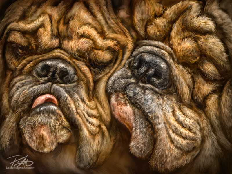
I have seen countless skilled and talented artists who can paint pet portraits; many make a good living doing that. But no matter how beautifully done, I always feel traditional portraits lack something. That’s not a criticism of their expertise or art but a consequence of my perception. I see a different spark in animals, and I put that into my paintings.
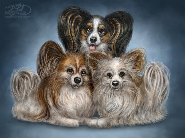
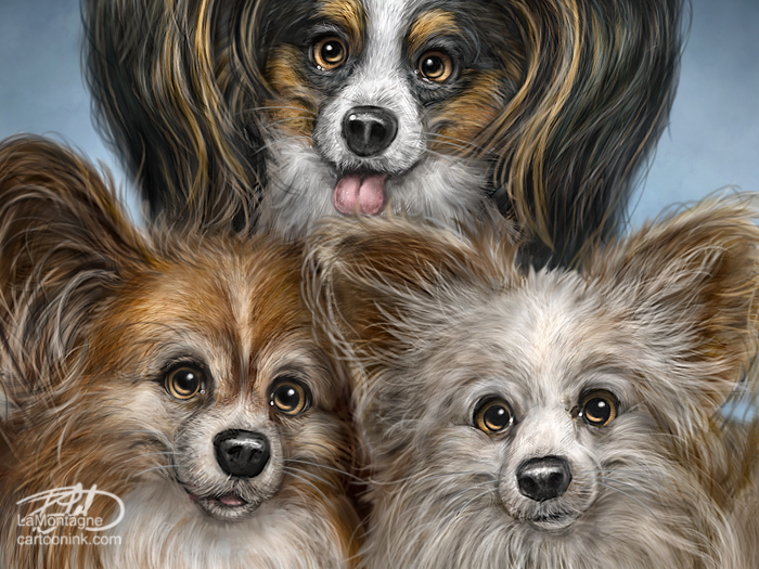
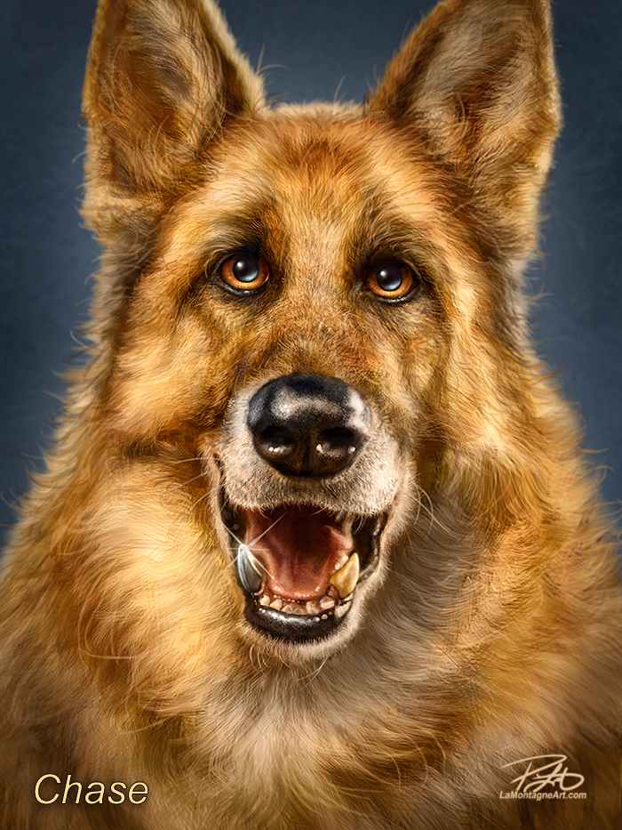
Each client and commission is different, and specific details often make a painting more fun. Chase was a retired police dog in California with a titanium tooth. It was important to the client that the tooth was evident in the piece.

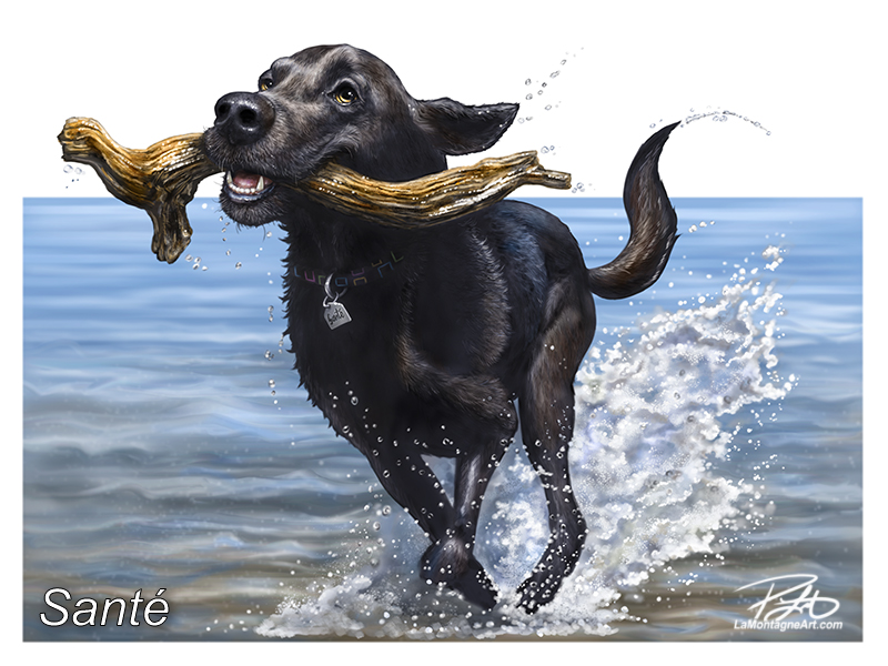
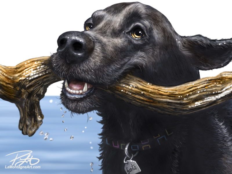
Santé was a memorial piece, and the client wanted her in action. That dog lived a full life of adventure. She had a stick library in the yard, so one in her mouth was important, too. Thankfully, the client had plenty of reference photos to help me create what she wanted, and we were both pleased with the finished piece.
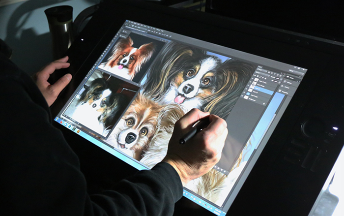
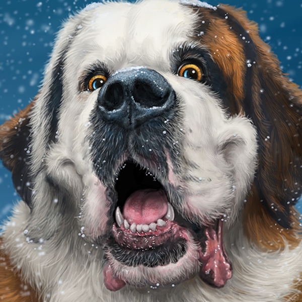
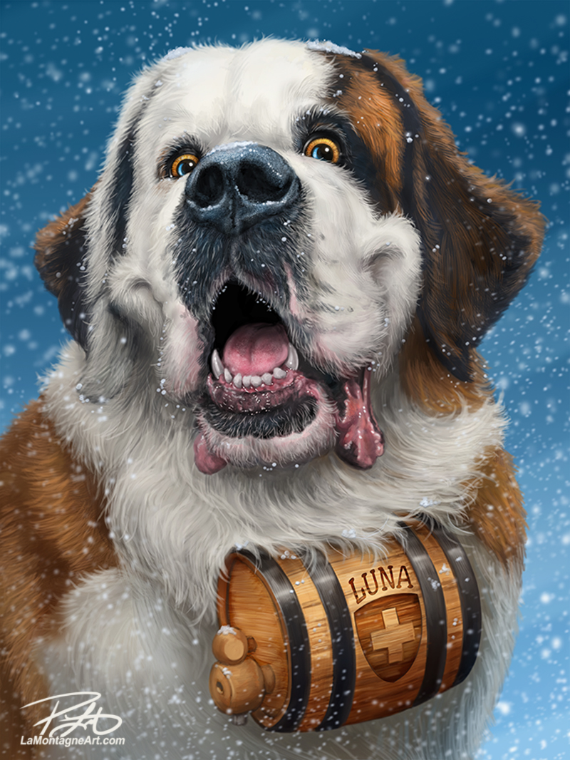
Luna (first image above) is a ridiculously happy St. Bernard, and the client found me at the Calgary Expo a couple of years ago. In our initial discussions about the piece, I asked how he felt about my painting the classic St. Bernard in the snow with a brandy cask. It turns out Luna already had a custom-made wooden cask with her name on it, and the owner provided several great photos of it for me to work from.

I now advertise my commissions at live events with the Luna painting, and I’ve had several people ask about buying it.

My style of art is not for everybody. Hell, it’s not even for most people. We all have different tastes in art. But for those who enjoy my interpretations of animals, I want to be the guy known for this style. When somebody sees my art at a gift show, they often recognize it from somewhere else they’ve seen it, such as “We bought one of these at the Calgary Zoo.”

So, before the Calgary Expo this week, I edited the Commissions page on my site and removed the traditional pet portraits I’ve done from my portfolio. From here on, the only commissions I’ll entertain will be those who want a painting in my whimsical wildlife style because that’s the best work I do.

For any questions about my custom work, please start with the Commissions page, where you’ll find all the details, including pricing and some kind words clients have said about the experience.

If you have a furry or feathered friend you’d like to see painted in my fun, whimsical, detailed style, I’d love to work with you.

Cheers
Patrick

Posted on

9 Things About Pet Portrait Commissions

An artist friend of mine recently told me she heard someone balking about my commission prices. She backed me up and explained to them how much work goes into an original painting. Based on questions and experiences over many years, here are some things I often have to address with regard to commissions.

1) I need good reference. If someone wants me to paint their dog when he was two years old on a sunny day in the park, and all they have are blurry photos of him in his senior years under gloomy skies looking sad with his eyes closed, I’ll be politely declining the opportunity. I’m going to hate the work, and they’re going to hate the painting.

2) Just because a client can’t afford it, doesn’t mean my rates are too high. I’m being asked to paint an original, personal painting, that will unlikely be of any interest to anyone else. It will take me 10-15 hours MINIMUM, which doesn’t include the time spent talking with the client, having the canvas printed, going to Calgary to get it, packaging and shipping it or delivering it personally, which is all included in the price of $1100.00 (Canadian funds).

3) Yes, I require a deposit of 50% up front. It’s non-refundable. Why? Because over the weeks it’ll take for the painting to be done, the client is more likely to have a change of heart if they’ve got nothing invested in it. Some will also try to renegotiate the price of the painting at the end of the job. Amazon doesn’t ship stuff until it’s paid for. Neither do I.

4) When a client says they “only want a small painting,” “something simple,” or it “doesn’t have to be as detailed as my other stuff,” what they’re after is a cheaper painting. I work digitally. It’s all the same size; it’s only the printing that’s large or small. Even if I worked traditionally, a small detailed painting is much more difficult than a large one. I don’t know how to do a half-assed job and they wouldn’t like it even if I did. Otherwise, they’d have asked somebody else.

5) If a man owns a hardware store, he might offer a friend or family member a discount. It’s inventory on the shelf, so he’ll just order another and it didn’t cost him anything. With somebody whose product is ALL labour, they’re losing money on any cut in their rate because they can only work on your thing instead of other work that pays their bills. That goes for artists, plumbers, mechanics, hairstylists, and anybody who makes their living from their time, our most valuable non-renewable resource.

I’ve long been a pushover on this point, actually offering deals before they’re even requested. It’s a common problem that many artists have and it’s nobody’s fault but our own. At this stage in my career, I would rather not get the gig than do it for peanuts.

Every professional artist I know has often heard, “I wish I could draw,” and other compliments that express an appreciation for the skills that have been acquired through decades of hard work and practice. But when it comes to paying for art, people expect it to cost a hair more than the paper on which it’s printed, or nothing at all.

6) Someone else’s procrastination is not my emergency. The fact that a birthday is next week and they kept meaning to get in touch with me doesn’t change the fact that I won’t have time to get it done, even if I didn’t have all of the other work I’ve committed to already. I’m not always available. Commissions are the smallest part of my business and I’ve got a lot of other work on the go. Always! Often I know I won’t be able to meet the deadline and I won’t accept the commission because of it.

7) From time to time, I will donate prints for charity auctions, but I get asked so often, that I’ve restricted donations to causes that support animals or wildlife conservation. I’ve also been asked to donate commissions, but that’s a hard NO. That’s how I end up with clients that provide the worst photos, the shortest deadlines, make the most unreasonable demands and if I don’t meet them all to the letter, I’m accused of lying about the donation.

8) I will often get people wanting to hire me after their pet has passed and only then do they realize they don’t have any good photos. Take lots of photos! Even if you never hire me to paint your pet, you’ll want those photos after they’re gone. Taking photos of your pets is fun. They’re all nuts, in the best possible way.

I’ve had the privilege of working for and with many wonderful clients over the years, some of whom have hired me more than once to paint their pets. This somewhat rant of a list should in no way diminish all of the great experiences I’ve had with so many people who’ve trusted me with painting an image of their adopted loved ones, whether those furry friends are still around or have passed on. In all of those cases, having lots of photos to choose from made the difference.

9) Because they’re often memorials, most people commission me to paint their pets in a portrait style rather than in my whimsical wildlife style, which is the work I enjoy most. So when I’m working on a traditional look portrait, it’s not work I would have done anyway. I don’t have the creative freedom to distort the expression, make the face goofier, add big strings of drool, and have fun with it, because that’s not what the client wants. Paintings in a portrait style are work, so while I’ll still put my best effort into it, I’d rather be painting the funny looking animal version. That’s my niche, what makes my work unique, and for what I want to be known.

Lastly, just like any other skilled professional, I’ve spent many years working on my craft. I’ve become very good at what I do and I keep raising the bar for what I’ll accept from myself. My best keeps getting better because I invest a lot of my life into my art.

If you want my best work, you have to pay for it.

Cheers,
Patrick

If you’d like to receive my newsletter which features blog posts, new paintings and editorial cartoons, follow this link to the sign up form.

Posted on

Papillons, Paintings and Prints

PupsMy final commission of the year was completed this past week, a challenging piece.

Featuring three Papillon dogs, each with distinctive colouring, personalities and subtle size differences, keeping them straight was almost an exercise in futility. From the top, moving clockwise, they are Desperado, Ringo and Mick.

For some reason, I kept mixing up the personality traits and subtleties of Desperado and Mick. Apparently Mick is less vocal, but I’d originally drawn him with his mouth open, which didn’t fit. Desperado is the mouthy one. Mick tilts his head left, but I drew Desperado doing that, which I ended up keeping after all. Then, after I made the changes in the sketch and got approval, I went back and started painting on the original sketch, which meant I had to correct it again. Chalk it up to a silly mistake from not paying close enough attention.
Sketch
While the client gave me dozens of photos to work from, almost all of the eyes in the usable pics were washed out by flash reflection or were small pics with low resolution and poor lighting. It happens and I do my best to work with what I’ve got. For the details, however, I did buy half a dozen stock photos of other Papillons. The colours were all wrong, but it helped me see fur direction, layering, poses and to fill in the missing anatomy I needed, but didn’t have in the supplied reference.

All well in the end and the client told me I managed to get each personality right with each dog. The painting has gone to print and I should be able to pick it up and ship it by week’s end. Thankfully, this one is right here in Alberta, so there shouldn’t be any issues with shipping at one of the busiest times of the year for parcels.

It occurred to me this week that I’ve been breaking an important rule of mine recently. I’ve said in the past, and have advised other artists, that proofing is essential every time I have a painting printed. A proof is a test print.

Kelly at Chroma Surge has been printing my canvas and matted prints for the past five years. During that time, there have been growing pains. Prints came out too dark or too light, colours too bright or not bright enough, whites and blacks sometimes washed out and muddy, different papers and materials producing different results.

Kelly’s printers and machines are colour calibrated, as is my own display, but with different profiles and myriad little adjustments here and there, a bunch of little deviations can make for large problems, and it wasn’t anybody’s fault. This is why proofing has been essential, especially in the beginning. For my poster prints, I use Maranda Reprographics and Printing in Calgary, and the same thing happened when I first went with them. The adjustments I make for Kelly’s prints are different than those I make for Maranda’s prints.

In recent years, Kelly and I have come to that Goldilocks zone for printing my work. When I send a painting to print, I know which adjustments I have to make ahead of time and I save them in the Photoshop file, a layer that tells me what I did, and that becomes the Master File. A dog with a lot of black fur (which is really not black), needs to be lighter than a dog with light fur, because I know the detail in those blacks is going to be gone if I don’t compensate.

Whites can’t be fully white and blacks can’t be fully black because it sucks the life right out of a painting. Pinks, reds, blues and greens have to be selectively desaturated in the print file, which means making them less colorful. I’ve seen skin tones print very red on portraits, a dog’s tongue so pink that it overpowers an entire painting, or a green background dominate the animal in front of it, simply because the adjustments weren’t made or were done incorrectly on my end. A canvas print will often appear more saturated, especially after it has been spray coated, so I have to compensate for that as well.

All of these things I’ve learned by proofing, which is usually just doing a preliminary small print on canvas and taking a good hard look at the colours to make sure the shift isn’t significant. When it all works, images on canvas just POP! I’m never as happy with a painting as when I see it on canvas.

Now, I could get really meticulous about the proofing, pull out a loupe and check for every little variation, but what I’ve also learned over the years is that tiny little colour shifts from my screen to canvas, matted print, or poster print are acceptable up to a point.
PupsCloseI attended a class at Photoshop World last year, taught by my friend Alan Hess. He was talking about how to reduce noise in a low-light image and how to compensate for it with camera settings in night photography. But he also cautioned that the only people who really care about noise in an image are other photographers.

That lesson applies to my work as well. The only person who really cares if the fur colour in the print exactly matches the fur colour on the screen is me, or possibly another artist. Most people don’t see it, or don’t care. A screen is also backlit, which means every image will always be brighter on a screen as opposed to a print. So it’s all just finding a balance that’s good enough.

Incidentally, the term ‘good enough’ is like fingernails on a chalkboard to me. Like most creative types, I’m a perfectionist. Thankfully middle-age has taught me to let that go a lot more than I used to. Perfection is unattainable and as the mantra goes, “Done is better than perfect.”

As a result, I have let go of that rule of proofing everything for the very good reason that I now have plenty of experience with the known variables. I know my printer and he knows my work. If there’s a problem, he’ll let me know. Kelly did a test print of my last two commissions, but I never saw them in person. He just told me that he knows what I want and how I like my paintings and that he thought they looked good.

I weighed my options. I could take a few hours out of my day to drive to Airdrie to see the proofs and then tell him to go ahead with the print, or I could just gamble on our past history and the fact that I can’t remember the last time I’ve had to reproof something with him. So I told him to go ahead and when I picked them up this week, the prints were fantastic.

For this commission of the three dogs, I decided to continue the streak and let it ride. I sent Kelly the image Friday morning and got back, “The proof looks great! I’ll run it off here shortly.”

I’ve no doubt that I’ll be happy with finished result.

Technical details. This was painted in Adobe Photoshop CC, using both a Wacom Cintiq 13HD and 24HD displays. Photos were only used as reference. For most of the painting, I kept each dog on it’s own layer, to help with painting the hair.
PupsCintiq

If you’d like to receive my newsletter which features blog posts, new paintings and editorial cartoons, follow this link to the sign up form.  Thanks!

Posted on

A Tale of Two Paintings

My usual routine is to write a little blog post after each painting I do, to provide a close-up and maybe share a little bit of relevant info. Given the fact that I’ve been working on two commissions at the same time recently and finished them quite close together, I thought I’d share them both in the same post. It gives me an opportunity to show the difference between the two styles of commission paintings I do.

Loki

The first painting I recently finished was Loki, a beautiful old boy who passed away a little while ago. This is the second memorial painting I’ve done for this client; the first was Odin a couple of years ago. The client is very familiar with my work and chose a portrait style, which is quite often the case with memorial paintings I’m commissioned to do. With plenty of photos to choose from, I had the freedom to go with whichever pose I wanted to use. As usual, one photo spoke to me clearly and I got to work.

LokiCloseI usually only have a rough idea of what a painting will look like before I get started, but it’s usually enough. The background colour might change in the middle of a painting, but this one was orange and yellow from the beginning. The reference pic was taken in the fall and I knew those colours would just bring out his eyes. For me, it’s all about the eyes. If I get the eyes right, the rest of the painting will always come together. And if they’re wrong, nothing looks right.

Having lost a pet of my own this summer, there was a little more gravitas for me with this one. This old boy was loved a lot and I thought of that often while working on it. What a privilege.

SaxonThe next painting was in my Totem style, which is a whimsical caricature look, the same way I paint my wildlife paintings. The clients saw my paintings for sale in About Canada Gallery in Banff while on vacation and looked me up to see if I did commissions.

Saxon was described as a “beautiful drooling mastiff” and when I saw the photos, I was inclined to agree. His personality was evident in many of the pics and again, I found one that I thought would best represent what the client wanted him to look like.

SaxonCloseAs is the case in many of my whimsical paintings, I found myself smiling a lot while painting this big fella, and even laughed out loud a few times. I really wanted to paint in long strings of drool coming from those jowls, but the client didn’t want that. A commission is a significant investment, and while most of my clients give me carte blanche to paint what I want, I’m willing to take direction if it makes for a happier client.

Case in point, when this piece was finished yesterday, I had intentionally made the body a little narrow to draw attention to his big head, but the client thought I made him too skinny and wanted me to bulk up the body a bit. I spent another hour on the painting last night and delivered a final that pleased everybody, including me.

No matter what style my clients choose for their paintings, portrait or whimsical, memorial or just because, it’s such an honour to be trusted with the task. I enjoy these a great deal and each one challenges and teaches me something new. These two were no exception.

These will both be sent for proofing tomorrow and I intend to have them printed, framed and shipped in a couple of weeks.

Thanks for stopping by,

Patrick

If you’d like to receive my newsletter which features blog posts, new paintings and editorial cartoons, follow this link to the sign up form.  Thanks!