 As anyone who creates digital art for a living will tell you, it’s difficult to do without a Wacom tablet or display. Beginning with the Graphire and the first generation Intuos tablets in the late nineties, I’ve used almost all versions and evolutions of Wacom products. Currently, the one I use on a daily basis is the Cintiq 24HD display. When I want to get out of the office, which usually just means moving to other parts of the house, I’m drawing and painting on the Cintiq 13HD.
Many people have asked me if I’ll be getting one of the new Cintiq Companion displays, but having just purchased a top of the line laptop to supplement my desktop PC, I don’t need another computer. I make my living with my artwork and have daily editorial cartoon deadlines. I can’t afford any downtime, so having another full system that I can work on if my main computer needs repair is very important to me. As I work at home and spend 90 percent of my time here, a fully functional portable Cintiq Companion would be wasted on me, so the 13HD and a laptop suits me just fine.
From time to time, however, I do enjoy the portability of drawing and painting on my iPad. I bought my first gen iPad about three months after it came out in 2010 and I used it almost every day. I began with finger painting, and then I probably spent a couple of hundred dollars in the first year, trying to find a stylus that would work well for drawing and painting. Eventually, I settled on the Wacom Bamboo Stylus and it worked very well for its intended use. Having tried many different drawing apps, I found that the ProCreate app suited my drawing style best and it’s the one I use above all others to this day.
I like to rest my hand on the screen, so I cut the thumb, index, and middle fingers from a light glove and wear that while drawing and painting on the iPad. I worked around the lack of pressure sensitivity by manually varying the opacity in the app. A similar method is to add a new layer and vary the opacity of that as well. A little awkward, but I managed to create some iPad drawings and paintings that I was pleased with, even if they took longer than they would have on my PC with a drawing tablet or display.
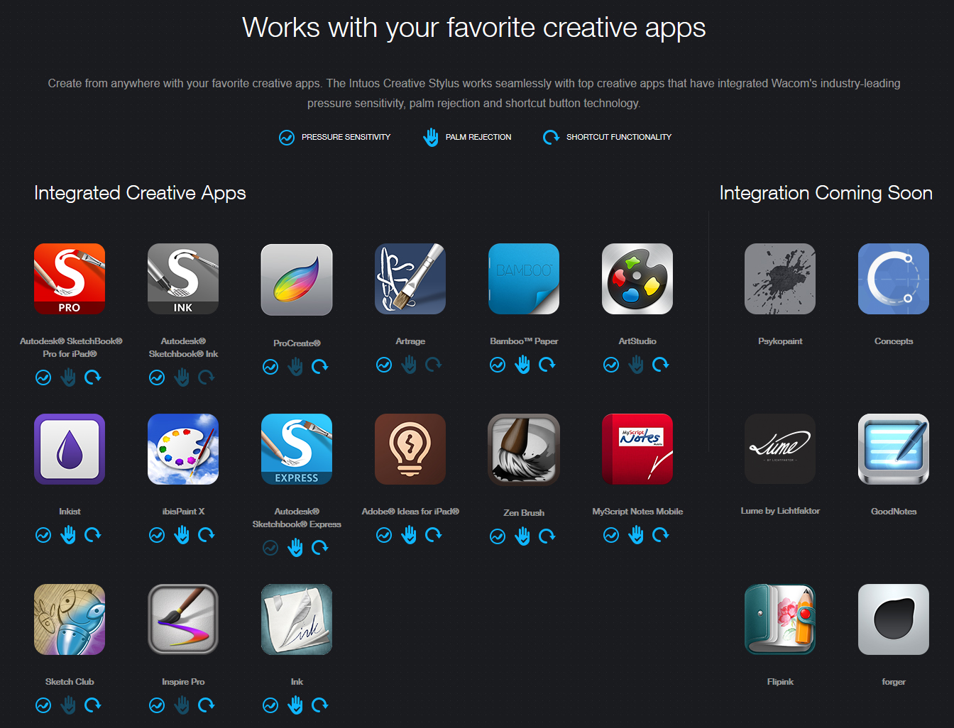
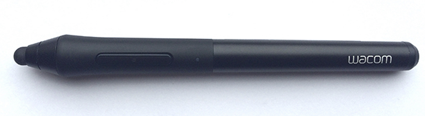 Recently, Wacom introduced their Intuos Creative Stylus for the iPad and I was intrigued. It connects via Bluetooth, has pressure sensitivity, programmable buttons like their other tablet and display pens, and palm rejection capability, which means you can rest your hand on the screen without your palm creating any digital pen marks. The key word here is ‘capability.’
As my first gen iPad had been proving unreliable and twitchy over the last year, I finally retired it and bought the new iPad Mini with Retina display, preferring the smaller size to the iPad Air. The Wacom Intuos Creative Stylus arrived last week and I was eager to put it through its paces.
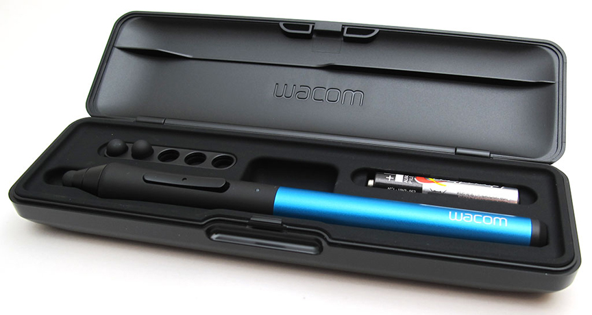
The first thing I was impressed with is that it comes in a very nice case. With space for five spare nibs (it comes with two spares) and battery included, you feel you’ve purchased quality. My Cintiq 13HD came with a very nice case for the stylus as well and it gives me peace of mind that these portable styli are well protected while they’re being carted around.
 Through trial and error and a little research, I found out some important technical info that will make your life a lot easier when using this pen.
First, the stylus takes an AAAA battery (that’s 4 As). It comes with one of them, so it’s ready to use. But I happened to be out running errands the day mine arrived so I wanted to see how hard it was to find replacements. Fortunately I found a set of two at The Source, a small franchised electronics store. A package of two batteries set me back $12. Our grocery store battery display didn’t have AAAA batteries, so you might have to look to find them. The Wacom site says a battery will last you 150 hours. I spent a few hours painting with the stylus and the battery still reads 100% in the ProCreate app, so I’ve no reason to doubt the claim.
Second, I have a wireless keyboard that connects to my iPad via Bluetooth and you connect it in the iOS settings. You can’t do that with the Intuos Creative Stylus, since it doesn’t even show up there. The stylus connects to your iPad inside of the supported apps (click here and scroll down for the list). In ProCreate for example, there’s a dropdown menu that shows a device option and sure enough, the Wacom Intuos Creative Stylus is one of the choices. The connection was very stable and putting it away in the case seems to shut the pen off so it doesn’t waste the battery.
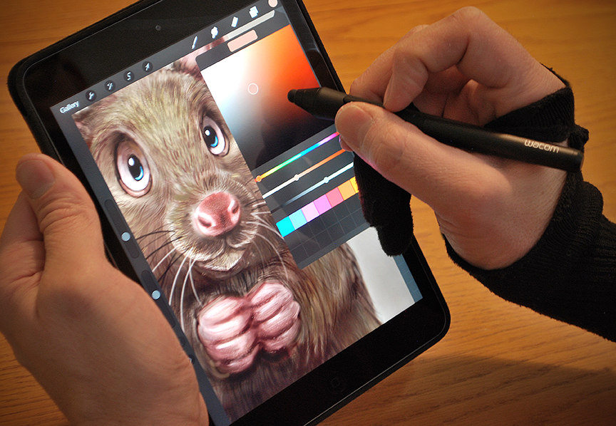
 I didn’t bother to try any of the other drawing apps, so let’s just talk about ProCreate and this stylus. I haven’t done any iPad painting in a while so I was very impressed with the recent updates ProCreate has made to their app. They’ve got great blend mode options for layers, adjustments for color, sharpness, blur, multiple transformation tools and their brush engine allows for a LOT of customization. ProCreate is a very robust app and I see no reason to change my preference. It didn’t crash once while painting my funny looking rat, so it’s very stable.
I was disappointed that I couldn’t get the palm rejection to work well in ProCreate, so I ended up wearing the makeshift glove again which doesn’t really bug me. It was only later that I found out that it isn’t the stylus that doesn’t support palm rejection, it’s the app. Again, refer to the list of which features work with which apps.
The pressure sensitivity on this stylus works like a dream! With the programmable buttons, ProCreate allows you to choose which task you want each button to perform. I set one button to activate the color picker, and the other button to Undo. You don’t even need to have the pen in contact with the tablet to get these to work, either.
 Bottom line, this stylus works as advertised. While the price may seem steep to some ($99.95 from Wacom), I’m a big believer that you get what you pay for and my experience with Wacom devices is that they last and work well for a long time. I’m being careful not to drop this stylus, though, as it’s still a precise electronic device.
A couple of final thoughts. It would be unreasonable to expect this stylus to perform as well as a Cintiq display. I can make quicker brush strokes, enjoy much more precise pressure sensitivity and paint with larger documents with higher resolution on my professional displays than I would expect to on the iPad. This stylus does not turn your iPad into a Cintiq Companion display. Also, keep in mind that Wacom created the stylus, not the apps with which it is used, so if there’s something that doesn’t work the way you might expect it to, it’s likely the app, not the pen.
I’m very pleased with the Wacom Intuos Creative Stylus and I expect to use it often for sketching and rougher paintings. Beginning the rat painting you see at the top on the iPad was quite enjoyable and the image will eventually become a much larger, much more detailed rendering using Photoshop and my Cintiq 24HD display.
I would recommend both the Wacom Intuos Creative Stylus and the ProCreate app without reservation, but as always, the tools are only as good as the artist using them. For best results with your artwork, keep learning, follow the work of other artists, and draw and paint as often as you can.