About ten years ago, I couldn’t think of anything I would rather be doing for a living than editorial cartooning. I had a full-time office job, and I was working my ass off to try and leave it. It wasn’t a bad job; in fact it was a pretty good one. My boss was a decent guy (still is), he paid me well enough, and I wasn’t expected to work overtime or on weekends. But it just wasn’t what I wanted to do.
Without boring you with all of the details, I was eventually able to leave that job with the blessing of my employer and I often tell people that it was the best last job (and boss) to have. It was very scary, but exhilarating.
Fast forward eight years and editorial cartooning is now ‘the job.’ I don’t really enjoy it as much as I used to, but there are plenty of worse ways to make a living. While I’m still trying to be original and do my best, I’ve often said to people that the job can be emotionally taxing and I wonder if any of these smartass illustrated comments even matter to anybody.
I’ve likened following politics and the news for a living to getting out of bed every day, having a shower, then wading into raw sewage. The animosity and venom online that accompanies any news story (don’t read the comments, don’t read the comments…), the general distrust of elected officials, the hypocrisy of entitled federal politicians who will walk across the aisle and hug after a national tragedy, but then will say the most horrible things about and to each other just days and weeks afterward, thinking we’re all too stupid to notice, (take a breath!) it’s a little much to take sometimes. They’ll all campaign for more civility in the House of Commons, but their actions rarely match their words.
Ask them about this behaviour and they’ll tell you that it’s all part of the game and you find out that a lot of these people in opposing parties are quite civil and friendly with each other when the cameras are off. Somehow they figure that they can justify these actions at taxpayer expense, with “Oh, we’re just playing.”
Follow politics long enough and you realize that it doesn’t matter who is in power. They’re all playing the same shell game and Canadians are the dupes who continue to put down the money, only to have it taken away. And of course, the game doesn’t work unless we believe that one day we’ll be quick enough to beat the shifty con man on the other side of the apple crate.
See? I’m well into a rant I had no intention of writing. But it’s because I get worked up about it. While I do try to use it to my advantage and see the humour in it, tell myself that it’s all part of the job, I also become angry about it, a lot more often than I want to.
Clearly, I take this job way too personally. But as the scorpion said to the frog, “I can’t help it. It’s my nature.”

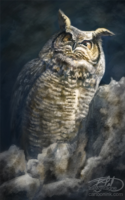
What brought this all to mind today was something one of my editors said to me about my Remembrance Day cartoon I sent out this week, the one shown here. It’s a topic on which I must draw each year, and I’ll be honest, I dread it. This year was especially difficult given recent events.
I’ve often used quotes in these more serious images, so this particular editor asked whose lines I’d used in the cartoon. I think he thought I might have forgotten to credit them appropriately. When I told him that the words were mine, he was complimentary and I thanked him, explaining that with a military family background on both sides, and five years spent in the Reserves, I always try to be as respectful and original as possible with this particular cartoon without being maudlin and trite. I usually spend a lot of time on it, both in thought and on the artwork.
On that point, he said something that made me stop and think, not just about the Remembrance Day cartoon, but about editorial cartooning in general. He said, about his own job, “I try my best with my limited abilities, and I plan to come to work every day until they tell me to stop. Once in a while, though, those of us who do this sort of thing for a living, like you, create something that DOES matter, that DOES resonate with people, that DOES meet our own expectations. Not always, but sometimes. And it’s worth it, you know?”
Thanks, Steve. I think I needed that.