Sometimes having too many choices is just as bad as having too few, especially when it comes to technology. What works for one person may not work for somebody else.
While I’m primarily a PC user, one piece of Apple tech that I really enjoy is my iPad, a first-gen device I bought in the summer of 2010 that I’m still using today. With each new iOS, it gets a little twitchier and temperamental, but I have definitely got my money’s worth from it.
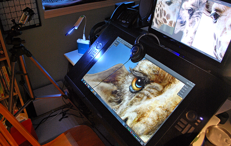
I’ve also been using Wacom devices for well over a decade now, from the early first generation Intuos and Graphire tablets to the Cintiq 24HD display that I use today, and I wouldn’t be able to do the work I do without one.
One of those fortunate souls who works at home every day, I have a dedicated office and spend the majority of my time at my desk, drawing and painting on my Cintiq 24HD, a display I’m very happy with. Everything I need to be productive on a daily basis is in my office. In the evenings, however, I like to sketch the next day’s cartoons or other images with pencil on paper while relaxing on the couch in front of the TV. Sometimes I’ll do rough paintings and sketches on my iPad as well.
But lately, I’ve wanted to paint more detailed work or move on to the digital ink and paint stage of a cartoon without having to go upstairs to sequester myself in the office that I’ve already been in all day.
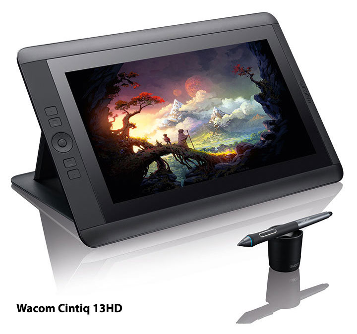
The newer Cintiq 13HD has abandoned the power brick of the previous 12wx, and while you still have to plug it in and connect it to a laptop, it has the resolution and screen space I want, and the ability to just prop it up on my knees to paint. So I figured this would be my next portable device.
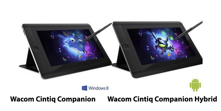
But then, Wacom recently announced the Cintiq Companion and Cintiq Companion Hybrid Devices. The first is a stand-alone 13” Cintiq with all of the functionality and power of a laptop. The Hybrid device works as a fully functional Cintiq 13HD when it’s plugged into a desktop or laptop, but becomes a portable Android device when it’s unplugged.
 Decisions, decisions.
First Option: Having just bought a very powerful laptop I eliminated the Windows 8 Companion quite quickly. I like to write, which is one of the reasons I wanted the laptop, rather than a portable device with a peripheral keyboard. The Cintiq Companion Hybrid, however, would allow me to work on the couch and also give me an untethered portable device to take with me on the go.
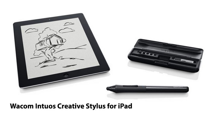
Second Option: Provided Apple doesn’t try to reinvent the wheel with the pending iPad 5, I could pair that with the standard Cintiq 13HD. This would give me the portability I want for painting outside my office while still tethered to a laptop, plus allow me to keep using the iPad, which has many apps I rely on. Wacom’s new Intuos Creative Stylus for the iPad (not first-gen) allows pressure sensitivity and palm rejection in some of the apps I already use for iPad painting, which means you can rest your hand on the screen and it won’t be confused with a pen stroke. Currently, I have to wear a fingerless glove when I paint on the iPad to prevent that problem.
 Break it down, now.
Portability: The Companion and Companion Hybrid are being marketed that you can take them anywhere. While I do enjoy working in a coffee shop once in a while and have to travel on rare occasions, most of my portable sketching is done with a pencil and sketchbook, especially since I’m usually out in the woods or in a creek canyon somewhere while I’m doing it. The thought of taking a digital device with me to these wild places is unappealing. Worrying about charged batteries, dirt and moisture on an expensive device, not to mention that I don’t want to be connected when I’m out in nature, is unappealing to me, which is why I even turn my phone off. Whether it’s on a hike, camping, or out at a buddy’s cabin, I still prefer to draw in a traditional sketchbook.
When I do want a portable digital device, I already know that an iPad works very well for me and the Hybrid is too big to be a suitable replacement. With the new Creative Stylus, painting/sketching on the iPad when I’m in a coffee shop or other urban setting will do the trick nicely.
 If I lived in a city, had to commute, was constantly out and about and in need of all of the full tools I enjoy on my desktop, an argument could be made for the Cintiq Companion or Hybrid, and I’m sure it will appeal to folks who find themselves in that daily environment. Living in the mountains, working at home, and wanting to be away from electronics when I’m out in the woods, however, I wouldn’t use this device to its full potential.
Cost: A lot of people are complaining about the cost of these new Wacom devices, but when you own the market, are leading the way in the technology and have put the R&D into creating the tech that every digital creative wants, to give it away is just bad business. Supply and demand is as old as the hills.
That being said, budget is a factor. Living in Canada, I have to buy from a reseller since only U.S. residents can buy from the Wacom site. Despite the U.S. and Canadian dollars being at or near equal the last few years, Canadian prices are significantly higher than in the U.S., an angry reality that Canadians live with on clothing, books, technology, cars, and many other products.
The best price I can find on a Companion Hybrid in Canada is $1749. That’s more than I just paid for my laptop. The price on the Cintiq 13HD is $1089.00.
 All weighed and measured, I think I’m going to go with the Cintiq 13HD and a new iPad with the Intuos Creative Stylus. The cost of all three of those, estimating for the iPad 5 of course, would work out to around $1900.00 and would give me the all-around best solution to fit all of my creative portable needs for a few years to come.
It’s important to understand that the reason I’m explaining all of this is not to tell you what you should buy. It’s to illustrate the point that we all have individual needs and wants when it comes to technology. Rather than buy every new phone, TV, tablet, computer or other piece of tech that comes out simply because it’s new, take a step back and ask yourself if what you want is really what you need. Make a list of what you want to be able to do and buy the devices that fit you best. Take the time to tailor your tech to your needs and you’ll be a lot happier in your work.