Posted on

Pet Portrait Commissions

Brisby

So you’re thinking about commissioning a pet portrait.  Well, thanks for considering me for the job.  Here’s some information that should help you out.

Commissions for animal portraits are pretty straightforward, as long as you’re looking for the same style of image that can be seen in my portfolio.  An animal portrait painting, whimsical Totem style or not, is a lot of work, but it’s straightforward and there are usually few surprises.   There are always little differences in each inquiry, but consider this the foundation on which all of my painting commissions are built.  These are the current prices and details.  While they’re unlikely to change in the very near future, prices will go up over time, and with demand.

Whether it’s the Totem or realistic style, the price is the same.  For 1 (one) animal, commissions start at $900.00 (CDN), which includes a hand-signed giclee canvas print with shadow box frame, and free shipping anywhere in Canada or the Continental U.S.  The time to complete a commission will vary, depending on my workload, but usually it’s around 4-6 weeks from the time I receive the reference photos.  If you live in Canada, there is GST or HST added to that price, depending on the region.  You can blame the government for that.  I require a 50 percent non-refundable deposit on all commissions once an agreement has been reached, the remainder due upon completion.

Moneypenny

One request I’m getting more and more of these days is for the full-resolution digital file.  While I used to be on the fence about this, as many artists and photographers are when it comes to their images,  I now give the digital file to every client.  I still retain the copyright, but these days, people like to be able to post something like this on a website and social media and maybe print a few extra copies for themselves. As long as you’re not trying to pass it off as your own work, or sell copies of the images, I feel that’s fair.  You’re paying for the work, just as if a company might have paid me for an ad illustration.  That way, if you want to put the painting of Fido on your Christmas card,  you’re free to do so.

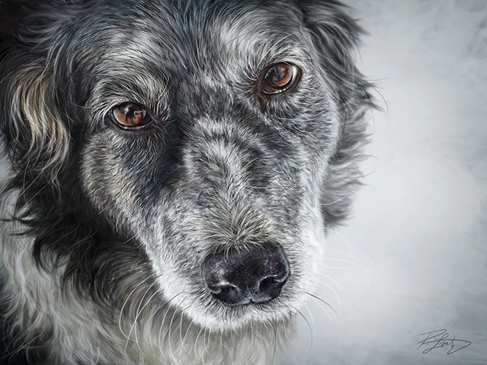
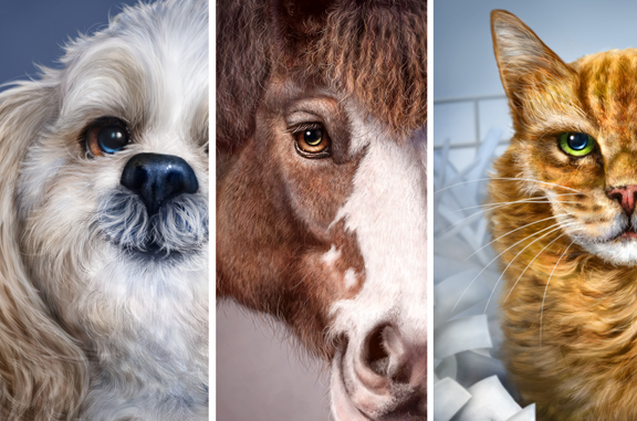
While no photos are ever part of the paintings, I can’t very well paint those little freckles you love so much on your cat’s nose if I don’t know what they look like, so I need good photos to work from.  Some of my clients have been photographers.  As a result, many of the reference photos I’ve had to work with have been great.  Since not everybody can be a photographer, it’s often a challenge to find the right photos.  The better the photos I have, the better the painting will be.  In a perfect world, the photos should be sharp, good lighting, fairly close up of the face of the animal, a straight on or 3/4 pose, at eye level, and looking at the camera.  The more photos to choose from, the better.  Problems that occur with some animal photos is that their eyes are highly reflective, and a flash can completely wash out the detail.  If your dog or cat looks sad in all of the photos provided, it can be tough to make him or her look happy, without the risk of losing the likeness.

http://www.lamontagneart.com/wp-content/uploads/2012/05/Montage.jpg

Let’s use fictitious Fido as an example.  Fido is a shaggy dog that is dirty and in desperate need of a haircut.  Can’t see his eyes, he’s looking elsewhere, it’s dusk, the photo was taken from far away, and the only copy available  is a 4X6 low resolution image on Facebook.  The client’s instructions are, “his hair is usually a lot shorter than that, he has big brown eyes.  When we go to our cottage in the woods, he always likes to put his paws up on the window and look out, so I’d like to see him like that.”

Based on this, I’m going to ask for more photos and negotiate that pose.  If this were all I had to go on, I would decline the opportunity, because the client wouldn’t be happy with the finished work, anyway.  Having done a number of these commissions of people and animals over the years, I can usually tell quite quickly if it’s going to work out or not.  Difficult photos double the workload.

Suppose, however, that the client has given me fantastic photos of Fido to work from, great lighting, sharp detail and is flexible on the pose, but then adds, “I’d like him to be wearing his collar with his name tag on it.  He also likes to sleep with his favorite fifteen stuffed animals and toys.”

The collar would be no problem and would not affect the cost.  The same would apply to maybe sticking a bow-tie on Fido, or even a comical pair of glasses if that’s what the client wanted.  Some of that I can make up, and  I would consider that part of the foundation.  All of those toys, however, very specific toys, well, that’s going to definitely be an added cost, as would any other additional specific details that the client would like to include.  Any additional animals would also affect the cost.  While a few have asked, I decline the opportunity to paint a person and an animal in the same portrait.  My styles for both are very different, and they just don’t go together.

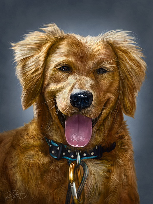
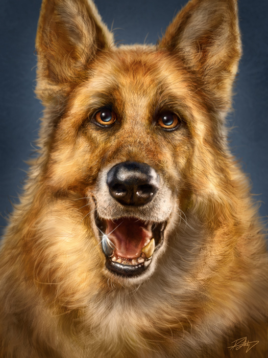
Painting these animals is a joy most of the time and I find that I like hearing the ‘back story’, too.  We sure do love our animals, and hearing folks talk about the personality of their furry, hairy, or feathered friend is something I enjoy very much.  I’ve no doubt that it helps me paint a better likeness and hopefully capture some of that personality in the painting.  One of my favorites was Chase, the happy German Shepherd with his titanium tooth.

Chase

I’ve been hired to paint a couple of memorial portraits of furry loved ones, too,  and the importance of that isn’t lost on me.  Being chosen to paint the image that will help you recall all of the happy memories with your best friend is quite an honour.  And if you’re facing the difficult task of choosing photos for that purpose, I would recommend that you find ones that show your pet the way you want to remember him or her.

I enjoy these commissions, and will continue to do them as long as folks keep asking me to.  If you’ve been thinking about a commission, or just have any questions that weren’t addressed here, please do drop me a line, either on Facebook or by email, and I’ll be happy to answer.

Posted on

Chris Hadfield Portrait – “Here Comes Home.”

ChrisHadfield

If you don’t know who Chris Hadfield is by now, especially if you’re Canadian, then you’ve probably been studying in a monastery somewhere, cut off from the rest of the world.  Currently aboard the International Space Station on his third mission in space, Hadfield has become the face and voice of the Canadian Space Program.  With his multiple daily tweets and photos from orbit, his now frequent Q&A communications to schools and media, and his high profile life high above the Earth, Hadfield has Canadians and people around the world excited about space travel again.  I’m 42 and often kind of cynical about our species, largely due to the editorial cartoon portion of my career, but when I see the images and video being sent back from the I.S.S. each day, I feel like a 10 year old kid again, excited about the possibilities, if we can only keep moving forward.

Hadfield seems to have that charismatic personality that so few possess, able to speak to world leaders and grade school children in a way that puts both at ease and allows them to understand what he’s saying, while still being the same guy with both audiences.  Because of his obvious passion for his work, his willingness to share so much of his rare experience with the world, and his ability to be a scientist, engineer, artist and humanist all at the same time, I couldn’t help but be inspired to paint his portrait, especially after seeing the video of the musical event featuring Hadfield, Barenaked Ladies, and the Wexford Gleeks.  The reference and title for this painting came from that video and song.

There is no better legacy than to inspire those around you and the next generation to believe in the possibilities before them.  I can’t imagine how many children are now considering futures in the space program because of Hadfield’s example.  Whether they’ll remain on the ground as part of the team that sends us further into space or actually get to be one of the few who go, will be up to them.

If all goes to plan, Chris Hadfield will take command of the International Space Station on March 13th, the first Canadian to do so.  Just recently, the Canadian Space Agency posted a video where Hadfield demonstrated how he controlled the Canadarm2 from the cupola.  In it he said, “Canada built the Canadarm2.  And Canadarm2 built this space station.  Everybody should be proud of that.”

We are, indeed.

CloseupFor the artists who are always interested in the tech specs.  This was painted in Photoshop CS6 Extended with a Wacom Cintiq 24HD.  Final file dimensions are 32″X24″ at 300ppi.  It’s a big file!  Reference was a screen capture from the YouTube video mentioned above, which meant the quality wasn’t great, but I muddled through.  Photos are never used as part of the painting, all was painted from scratch.  I wanted desperately to put stars in those windows, but they just wouldn’t be visible in real life, so I kept that urge in check.

Posted on

Painting Choices and Challenges

I’m currently working on a portrait of Canadian Astronaut Chris Hadfield.  The reference that I’m using is from a Youtube video, so even in web HD, the quality isn’t great.  I’m used to working with poor quality reference from time to time, and it’s actually a good thing when it comes to portraits, as long as the quality isn’t too bad.  If the quality were perfect, I might rely too much on the photo and there wouldn’t be enough art in it, just replication.

A common practice in painting from photos is using the grid method.  The short explanation is that you divide your reference photo into grids, then you divide your canvas into equally proportioned grids.  This helps a person establish where the major landmarks fall on the reference photo and suggests that those same landmarks should fall in the same place on the canvas grid.  Here’s a very basic explanation of The Gridding Method if mine doesn’t do a decent job of it.

Norman Rockwell, Leonardo da Vinci and many other artists of note would use the grid method in their work.  Some artists consider it cheating, but then again, I’ve met artists who say I’m not a real artist because I sell my work commercially.  Art for a living is not a profession for anybody with thin skin and there is often no harsher critic than another artist.  I don’t have the rare skill to paint a person’s likeness from memory, so I need photo reference, as do most portrait artists.  My take on the grid method is that it is a tool that has its place, but I wouldn’t rely on it completely.  Photoshop has the ability to apply grids in any configuration over your image.  It’s under Preferences > Guides, Grids, and Slices.  When I do use it, I choose percentages, but you can choose more precise methods of measurement as well.  7 percent is pretty small, but you’ll see why I chose that at the end of the post.

Preferences I never use the grid at all when I’m painting my Totem paintings because they’re not supposed to look like the reference photos.  Nor would I use grids when doing caricature work, because exact proportions would defeat the whole purpose.

Just to prove that I can paint without the grid method, this is a portrait of James Whitmore that I did on the iPad, where grids weren’t possible.  I had a photo, the iPad, and nothing but time.  It did take quite awhile, and a big challenge was the low resolution possible with the first gen iPad,  but I’m pleased with the likeness I was able to achieve.

James Whitmore - iPad painting

I try to only use the grid method when I’m stuck on something in a realistic portrait of a person or know that something is wrong and just can’t quite see it.  For example, when I’m working on a likeness of a person, I may know that there’s something wrong with the eyes, but can’t figure it out.  I’ll flip the canvas horizontally, vertically, try all of my tricks and still be stuck.  By using the grids, I’ll see that it could be something as simple as the corner of the eye is in the wrong place or the iris doesn’t have the correct curve.  I only use the grids when a painting is in the middle stages.  Once the likeness is there, I don’t use them anymore, because I find that relying on it too much makes the subject of a portrait look wooden.  I pride myself in the personality and life in my images and that doesn’t come from accurate placement of features, but from artistic impression of the subject.  This is also the reason I paint people that inspire me or characters I feel a connection with, because that helps me with the feeling of the work.  Having the tools is easy, knowing when to use them comes from experience.

Here’s a challenge I faced this morning on the current painting of Chris Hadfield.  In the reference image I’m using, his mission patch is clearly visible on his shirt.  Because I’m trying to capture a moment, I want to include that in the painting.  I went back and forth on how to do it.  That mission patch is readily available online in pristine condition, just as the designer would have finished it.  One way to do it was just paste the perfect image in position, use the distort and warp tools, maybe rough it up a bit with a texture brush, add a little blur and it’s done, quick and easy.  Another way I could do it, was do a vector trace of the graphic, basically just using the pen tool, trace over the coloured elements, convert them to paths, fill with colour, distort, warp, place, texture, blur, done.

So why didn’t I do either of those?  With a logo in an editorial cartoon, I do that all the time, and I’m fine with it.  Usually on a tight deadline, it’s a satirical commentary, and an accurate logo that I’ve recreated with the pen tool by tracing over it is something I’m comfortable doing because of the context.  It’s part of the job and spending 20 hours on each editorial cartoon would be career suicide.  With the painting, however,  it felt like cheating.  To somebody else, it might not have, and that’s OK.  Everybody needs to make their own choices.  I just know that had I done either of those,  I’d finish the painting, would probably like the end result, but every time I look at that patch, it’s going to bother me.

HadfieldWIP04

So I decided that for the patch, I would use the grid method to help with the accuracy of the pieces in the patch, but paint it as I see it in the reference image.  It’s going to take me quite awhile longer to paint the patch, but I’ll be happier with it in the end.  As you can see from the above reference image on the left and painting on the right, I’ve got a long way to go to get it right, but it’s not like it’s wasted time because I’m still learning from every painting I do.  In the end, I’ll be happier with the painting, so it’s time well spent.

Posted on 10 Comments

Martin, Emilio, and Tom’s Road.

PromoSheenFinalSometime around the middle of December, I finished painting a portrait of Martin Sheen.  More accurately, the portrait was of his character, Tom, from the movie The Way, written for the screen and directed by his son, Emilio Estevez.  While the painting was done purely for my own enjoyment, sometimes a seemingly innocent pursuit will take on a life of its own.  Since the movie inspired me to paint the portrait, as did their father/son memoir ‘Along the Way,’ I wrote about that when I posted the painting.  Click here, if you’d like to read it.

As is my practice, I posted the link on social media and also tagged Estevez’s account on Twitter, especially since he has used that vehicle to promote the film.  I thought that if he saw it, he might like what I wrote and painted, but didn’t actually expect anything to come of it.  Twitter is a busy place and it’s impossible to keep up, so a lot more gets missed than noticed.

Imagine my surprise when just a couple of hours later on that same Saturday, an email arrived from Estevez via my website.  He thanked me for my support of the film and then asked about buying a print, with the intent of giving it to his father for Christmas.  With just five business days remaining, I had to tell him that even a rush job would have been impossible by the 25th, especially considering that I’d want to be meticulous about the proofing, given the recipient.   I told him I’d be happy to set things in motion in January, if he was willing to wait.  He was very gracious, completely understood, and we began talking about it again after the holidays.

In the meantime, his mother had seen the painting and wanted him to inquire about buying the original.  Here’s the technology hiccup when you start talking originals and digital painting.  A digital painting exists only on a hard drive and screen until it’s printed, so there really is no original in the traditional sense.  One solution is to supply documentation that certifies a specific print to be the original.  Mine are always printed on canvas and I gave Emilio the option of choosing the size.  After a month of proofing, printing, signing, and packaging, the original 18″X24″ stretched canvas shipped last Friday.  I also certified the canvas itself by writing the title of the piece and an additional signature on the back.  Incidentally, until all of this occurred, I hadn’t titled this painting, but decided it needed one before it shipped.  Yesterday, “Tom’s Road”  arrived at Martin’s home.

MartinSheenThe reason for this piece in the first place was to take a small break from the commercial work, as every image I’ve created lately has been a product.  The whole point was to get away from everything being about money and marketing, if only for a moment.  I wanted to paint my best portrait work, for no other reason than that.  I am a commercial artist, no doubt about it, and I make a good living at it.   This is my business, my livelihood, and my career.  But this piece was special, inspired by a movie I loved, which was, in a way, a light at the end of a tunnel.  My gut instinct told me that to try and make money from this would have tainted the whole experience, something that was worth much more to me than a paycheque.  So, when Emilio asked to buy the original, I chose not to put a price on the work, but still offered the painting, charging only my printing and shipping costs.

Sometime in the near future, I’ll be receiving a paper print that I’ve asked them to sign.  I’ll have it framed for my office, a souvenir of the experience, and a constant reminder that I must make time for personal work.  I’ve also asked Emilio to have Martin sign one more print, something I can reserve for a charity auction sometime in the future.  He was happy to oblige, and you can bet that I’m going to be very picky about which cause benefits from this unique item.

There is no doubt in my mind that had I attempted to orchestrate any of this, had I painted the portrait with the intention of bringing about these events, none of it would have happened.  I created this portrait for me, to remind myself why I paint, and since I truly enjoyed working on it, that was enough.   But to have it appreciated by his family, was a wonderful and unexpected bonus, not to mention a validation of my recent choices.

If all that weren’t enough, the greatest compliment I received was something offered by Estevez in one of his e-mails this past month.  He said, “…the image is gorgeous and you have captured my father in a way that few have.”

It just doesn’t get much better than that.

Posted on

A couple of hours at the zoo

Penguin2

This past Thursday found me in Calgary, running a few errands that had been piling up.  Had to exchange a faulty hard drive, buy some office supplies, and meet with the Retail Manager at the Calgary Zoo.  I’ve had Totem prints in their store for a little while now, and we’re still learning what works and finding new ways to promote the work.  I also wanted to show her the shirt samples I received recently, as the zoo sells The Mountain tees already.  So while I did get a cartoon out that morning before I left, it was largely an out-of-office day.  I had been trying to get into the city for about a week, but the roads and weather kept putting the kibosh on that.  Calgary is only about an hour drive from Canmore, but Hwy 1 can get slick and the main city routes are even more treacherous in bad weather, especially considering that many Alberta drivers are notoriously aggressive.  My rule of thumb has always been, if the weather is bad and I don’t have to be on the road, don’t bother.   It only takes one wing-nut in a hurry to ruin your whole week.

Turns out that the repeated delays benefited me a great deal.  When I finally did get into the city, the weather was downright warm for winter, thanks to Chinook winds, and a day running errands turned into a great outing.  Considering I was at the zoo already and have an annual membership, I brought my camera to see if I could get some reference photos.  I’ve said many times that I’m not a good photographer, largely because I have no interest in putting in the work required to become one.  I take snapshots.  On recent trips to the zoo, I had a borrowed zoom lens and tripod for our camera, an older Nikon D-60, which is basically just a higher end point-and-shoot, or at least it is the way I use it.  With the zoom lens, I just couldn’t take a decent shot to save my life, so this time I left it at home.  Setting the camera on automatic, I figured I’d wing it and take what I could get.

The strategy worked well.  The Calgary Zoo is very popular and is often quite busy.  Their newest exhibit, the Penguin Plunge that opened last year, can often have very long lineups in the summer months.  When you do get in, you only have a limited time to spend, as others are waiting.  It’s a great enclosure, designed so that you’re so close it would be simple to reach out and touch a penguin as it swims by, the water’s surface at chest level.  Of course, there are attendants on hand to ensure people don’t touch them, but it’s great to have that proximity.

Penguin

On Thursday, the zoo was so quiet, that after my meeting, I just walked into the Penguin Plunge, and spent almost a half hour in there just snapping photos.  The penguins were active, talkative and a lot of fun to watch.  At any one time, there were only about 10 people in the enclosure.  Must have taken a hundred or more photos, and about 10 of those ended up being great for painting reference.  While I’ve already painted a Rockhopper Totem, I’ll be painting a Gentoo at some point as well.  That’s the species in the above image.

Meerkat

Once I got to this little meerkat, she seemed to have no issues with me taking photos of her.  Turning her head this way and that, only about three or four feet away, she stood tall, crouched down, gave me almost every angle I could want.  A gentleman standing near me actually said, “She’s posing for you!”  It certainly seemed that way.

And finally, while I was hoping for some photos of the red pandas, just before I reached their enclosure, a woman deliberately changed her direction, walked over to me and said, “They just fed the tigers.  They’re all right there if you want to get some pictures.”

I thanked her (it really was a nice gesture on her part) and walked over to their nearby enclosure.  Sure enough, the mother and her three cubs, who aren’t small anymore, were lying down together eating whole raw chickens.  A real treat to see as one cub snarled at another for getting too close to his meal, the mother grooming one of the other cubs, just getting to see them so close and active on a such a nice day, with very few people around.  Even through glass, the shots turned out quite well.

KittyWhile I`d thought I’d taken 500 photos,  turns out it was around 400 as there were already a bunch on the card.  The wonders of digital cameras, taking as many shots as you like without incurring any expense.  Once I got home, I just opened up the card in Adobe Bridge and started deleting everything with bad focus, light, composition and within 10 minutes, I had about 20 photos that will serve me well for future painting reference.  I had a very enjoyable day, one of the best I’ve had at the zoo.  Not bad for an errand day in the city.


Posted on 1 Comment

Miss Moneypenny

This was my last commission painting of this year, a little lady named Moneypenny.  She’s a young pup with a great personality and I was given the option of painting her in a realistic portrait style or Totem style, artist’s choice.  Believe it or not, there is no exaggeration in this portrait.  She was really smiling like this in the reference photo, so I didn’t see the point of painting her in the Totem style.

Moneypenny’s portrait was finished earlier this month, but I wasn’t able to show it ’til now, just in case the recipient happened to see it online.  Since I know both the client and the recipient, there was a chance somebody would let it slip, so it was best to hold off.  It was printed and stretched on canvas at 12″ x 16″ and framed.

I found out last night that the gift has been given and while her owner loved it, Moneypenny herself was a little freaked out, thinking there was another dog in the house.  Apparently she barked at it.  Either that was a harsh critique or a wonderful compliment.

Here’s a closeup of the details.


Posted on 1 Comment

Martin Sheen – The Details

Martin Sheen - Portrait
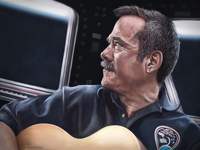
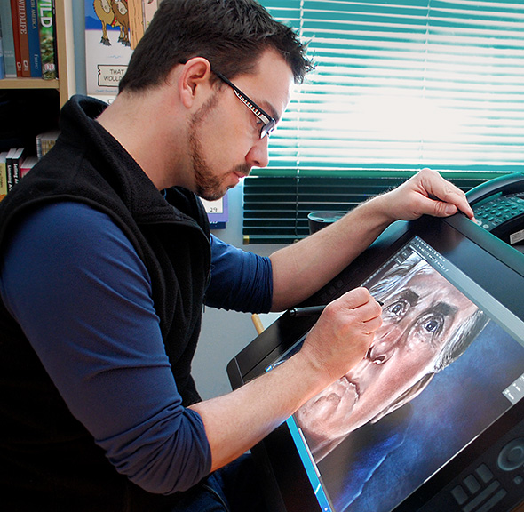
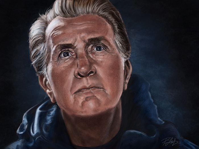
Yesterday, I wrote about why I painted this portrait of Martin Sheen’s character, Tom, from the movie ‘The Way.’  Click on this link, if you’d like to read it.  Today, I figured I’d write a little bit about the how, as there are always artists out there who want to know the technical details, and I’m happy to oblige.

This painting was done entirely in Photoshop CS6 Extended using a Wacom Cintiq 24″HD display.  No photos were used in the painting, aside from reference.  I didn’t keep track of how long it took me to complete it because I wasn’t on deadline or in a rush, so while I could easily say 20 hours, it was probably more, over a few weeks.  Without a deadline, I was able to nitpick it and get it as close to perfect as my current skills will allow.  At some point, however, I just have to call it done, because any changes become so minute that nobody will see them but me.

With all of my previous work, it has become my practice to start a painting at low resolution, usually around 9″X12″ at 72ppi.  Then, as the painting progresses, I will keep bumping up the size and resolution.  I teach this method in my PhotoshopCAFE DVD, “Animal Painting in Adobe Photoshop” and it’s the same practice I use for painting portraits of people.  There used to be two reasons for doing this.  First, when you’re working at low-res, you can’t get distracted by putting in too much detail because the size just won’t allow any.  This forces me to well establish ‘the bones’ of a likeness before working on wrinkles, skin texture, and hair.  The other reason for starting at low-res was that my computer had reached the end of it’s efficient life for this type of work and at full-size and full-res, the brushes just wouldn’t move well enough to make broad strokes across the digital canvas.  A completed painting was never more than 18″X24″ at 300ppi, because at that size, I could only work on the fine details without experiencing some lag.

Recently I had a new computer built and I’m back to working on a very current, high end machine.  Running 64bit Windows 7 with 64bit Photoshop, 16GB of RAM and a 4GB video card, everything is running incredibly smooth.  I could have started and finished this painting at full-res, without any problems at all.  BUT, I’m going to continue using my low-res to high-res workflow for the first reason I mentioned.  It forces me to get the likeness right and it works well for me.  That being said, I decided to push this painting to see if I could make it larger, which also allows more attention to detail.  This final painting is 32″X24″ at 300ppi.  At that size, the brushes were working just fine, and I could have bumped it up even more, with no issues in performance.

I’m still using the regular brushes in Photoshop and haven’t used any of the Mixer or Bristle brushes in my paintings.  Those brushes are designed to simulate traditional media and I honestly don’t feel the need to do that.  Digital painting is a medium all on its own, and I don’t try to make it into something it’s not.  I do intend to give those other brushes a try in the coming year, however, simply to see if they’ll offer me some choices to make my work better.  While I’m pleased with the quality of this painting and very much enjoyed working on it, there will always be room to improve.

Thanks for stopping by.


Posted on 8 Comments

Martin Sheen and The Way

You could never consider me a film snob and I’ve never wanted to be a filmmaker or an actor, but I love movies.  Great stories told on the screen by talented storytellers, always a collaboration between the writers, directors, actors and all of the other professional creatives and technicians that make up the industry.    I just know what I like, regardless of critical acclaim or popular opinion.

Earlier this year, I watched the movie, ‘The Way’ and it had a profound affect on me.  Written and directed by Emilio Estevez and starring his father, Martin Sheen, it tells the story of a father and son and their experiences on the Camino de Santiago, or the Way of St. James.  I’m not ruining the movie for you to tell you that the son (Estevez) dies early in the film at the beginning of his own pilgrimage and the father travels to Spain to retrieve the body.  Despite it seeming to be against his nature, Sheen’s character, Tom, decides to walk the Camino, and in doing so discovers his son and himself.

My wife and I rented this movie and I really enjoyed it.  Likely because I’m now in my early 40’s, dealing with my own evaluation of life and meaning, and realizing that there is probably less time ahead than behind me.  There’s a reason they call it a midlife crisis.  Had I watched this movie in my twenties, I doubt it would have affected me as much.

Shortly after seeing the movie, I found myself browsing in a bookstore and noticed the book, “Along the Way: The Journey of a Father and Son.”  Written by Emilio Estevez and Martin Sheen, it’s a memoir of their perspectives in life,  Sheen growing up and becoming the father while going through his own trials of life, and Estevez seeing many of the same events from the son’s perspective and his thoughts about his own life and career.  It was a truly enjoyable read and one I’d recommend, but as the book references the making of The Way, I’d see the movie first.

I’ve always felt a connection to Martin Sheen, not because I know the man, but because of my own father’s resemblance to him.  Not just their looks, but some of their mannerisms as well.  My Dad’s about the same age, and while he isn’t the spitting image of Sheen, at certain times in their lives he looks remarkably similar.  So much so, in fact, that when we were stationed in Germany, a woman in Brussels insisted that my father was Sheen, even though he denied it.  I always thought that was cool, so naturally I gravitated toward Sheen’s movies.  While watching The Way for the first time, there was one scene where I paused the film and said to my wife, “Holy cow, does he ever look like my Dad.”

As it is a movie about fathers and sons and I’ve always had a great relationship with my Dad, I bought him a copy of the DVD and then sent him my copy of the book as well.  After watching the movie, he called me and asked, “So, when are we going?”

Pretty sure my Mom and my wife would have serious concerns about he and I taking off to Spain for a couple of months to walk the Camino de Santiago.  But I was pleased that he enjoyed the movie and book.

So why the painting?  Well, first of all, I’m more inclined to paint characters, not the actors themselves.  In our society where the privacy of celebrities is almost non-existent when they’re out of their homes, people seem to think they know them from what they read in gossip rags and see on trashy shows like Entertainment Tonight and Inside Hollywood.  I’m under no such illusion.  Simply because I watch their movies and read their memoir, I wouldn’t dare assume I know Martin Sheen or Emilio Estevez.  The book only shares what they wanted to share, and the movie, while infused with their own experiences I’m sure, is about characters Estevez wrote, not the actors themselves.  But good storytelling can make those characters seem real, and in this case, it was Sheen’s character, Tom, for whom I felt a connection.

Having bought my own copy, I’ve now seen the movie a few times, the last time with the purpose of gathering reference.  You may not see in the painting what I see in it, because it’s a scene that, to me, said so much about the journey the character was taking.  This image of Tom looking up and what he was seeing, was brief, but his expression spoke volumes, given what he’d been through.  The scenes that follow really get to me each time I see the movie, and I don’t mind admitting that.  It’s a wonderful story with rich characters, played by a very talented cast.

Lately, all of my work has been product driven.  Editorial cartoons on deadline, illustration commissions, painting commissions, even my Totem paintings have become about prints, licensing and always selling the end product.  As a result, it’s been awhile since I’ve truly enjoyed a painting from start to finish.  One of the reasons I painted this portrait was that it had no deadline and has no commercial value, other than that it will find a place in my portfolio.  I painted it for myself, simply to paint something personal, and I’m pleased to say that I thoroughly enjoyed it.  It was a bit like a vacation from the work of being an artist for a living, and I wanted to find the joy in it again.  There is a balance to be found there and I’m still working on it.  This painting was a good start.

For more on the technical details of this painting, click on this link.

Posted on 6 Comments

Bald Eagle Totem

Here’s my latest painting, the Bald Eagle Totem.  This one was a real challenge because of the ‘white’ feathers which really aren’t white at all.  I used three different reference photos for this one.  The main image was from well-known wildlife photographer, Moose Peterson.  It was a full body shot of a bald eagle and while all of the main features I needed were there and it was a very good photo to work from, I had to buy a couple of stock photos as well, ones that focused on the close-up details of the main features.  I’ve started to use a minimum of three reference photos for my paintings this year, all paid for or used with permission, of course.  I find that more images provides more insight and I can do a better job with the details.

From looking at the three reference photos, I quickly realized that bald eagles are just like people.  Their features can be very different from one another, the colouring of their feathers, even the shape and texture of their beaks.  So between the three images, I had to make my own choices, based on what I liked and which features from all three would best contribute to the final painting.

One choice I made was to include warmer tones around the face, blending out to cooler colours around the edges and shadows.  As I said, white really isn’t white, so painting the feathers was about finding a balance between yellow and blue and the tones in between.  There’s even some magenta in there.  While another artist might not have chosen to make the blues so prominent, I really liked how those tones contributed to the overall mood of the image.  It felt right, so I went with it and while it still fits the look of my other Totems, it has a different light quality to it.

As for the expression, I don’t know where that comes from.  As I’ve said about many paintings before this one, the personality just seems to show up at some point during the painting process and I’m really pleased with this one.  Pardon my candor, but he just looks like an absolute bad-ass, and I love that.

On to the next one!

Posted on 2 Comments

Brisby

A little while ago,  I just happened to see the reference photo for this one on a friend’s Facebook page and asked her if I could paint it.  I was thinking sometime in the Fall.  It was clear to me from the beginning that this was not going to be a Totem style rendering.  I just loved the winter scene that was captured here.   Brisby is a 14 year old Australian Shepherd/Red Heeler cross and the photo not only showed her senior years, but just spoke to me.  I’ve never met her, but there’s a gentle soul behind those eyes.  I especially liked the reflections of her people in her eyes and even though I briefly experimented with painting her eyes without those reflections, it didn’t take me long to realize they belonged in the painting.  I enjoyed working on this one a great deal and for most of the time, it just seemed to paint itself.

Coincidentally (yes, I know, there are none), Brisby belongs to a friend who works for Wacom.  When they recently invited me to demonstrate my painting techniques at their Photoshop World booth, I realized I’d only do a good job of it if I painted something especially for that demo.  Since I already had the reference, I figured this was as good a time as any to paint this image.  As it wouldn’t be possible for me to create a painting from scratch and complete it in a 45 minute presentation, I saved this painting at multiple stages from beginning to end.  With each stage, I’ll show how I paint and talk about what I’m thinking and looking for at that particular point of the process.

If you’re going to be at Photoshop World, stop by the Wacom booth at any time during the conference when the Expo is open, but if you’d like to learn more about my process and this painting in particular, I’ll be presenting on Thursday, September 6th, from 3:00-3:45.  I’ll be available following the presentation to answer questions as well.  See you there!