 The first time I asked somebody if I could paint their portrait, it was a spur of the moment thing and I was woefully unprepared. My buddy Darrel and I were attending a small concert at Ironwood Stage and Grill in Calgary last year for Alan Doyle’s debut solo album, ‘Boy on Bridge.’ An intimate venue, I could have put my feet up on the stage from where we sat. A trio of Doyle, Corey Tetford and Kendel Carson, all talented and accomplished musicians, it became one of my favorite live music experiences to date, just had a really great time.
During the show, when Carson was playing her fiddle in one of the songs, I noticed the way the light was bouncing off of the wood, her face and her long straight blonde hair. It was just this instant feeling of, “I want to paint her.”
While gearing myself up to ask, all I could think was, “no matter how I do this, she’s going to think I’m creepy.”
But, I knew I’d regret it if I didn’t try, so at the end of the show, I approached her with my business card and mentioned that I’d like to paint her portrait, showed her a few images on my phone and told her if she was interested, I’d love to see any photos of her playing that I could possibly paint from, really wishing I’d brought my own camera. It was that image of her playing that I really wanted to paint, but I had missed that moment. While she was friendly and polite, I knew right away this wasn’t going anywhere. Pretty sure she thought I was creepy, and in that profession, I imagine she’s got reason to be wary of strange men approaching her after a show. Who can blame her?
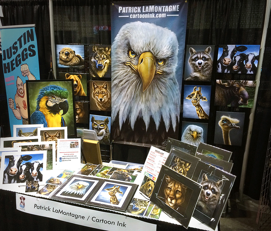
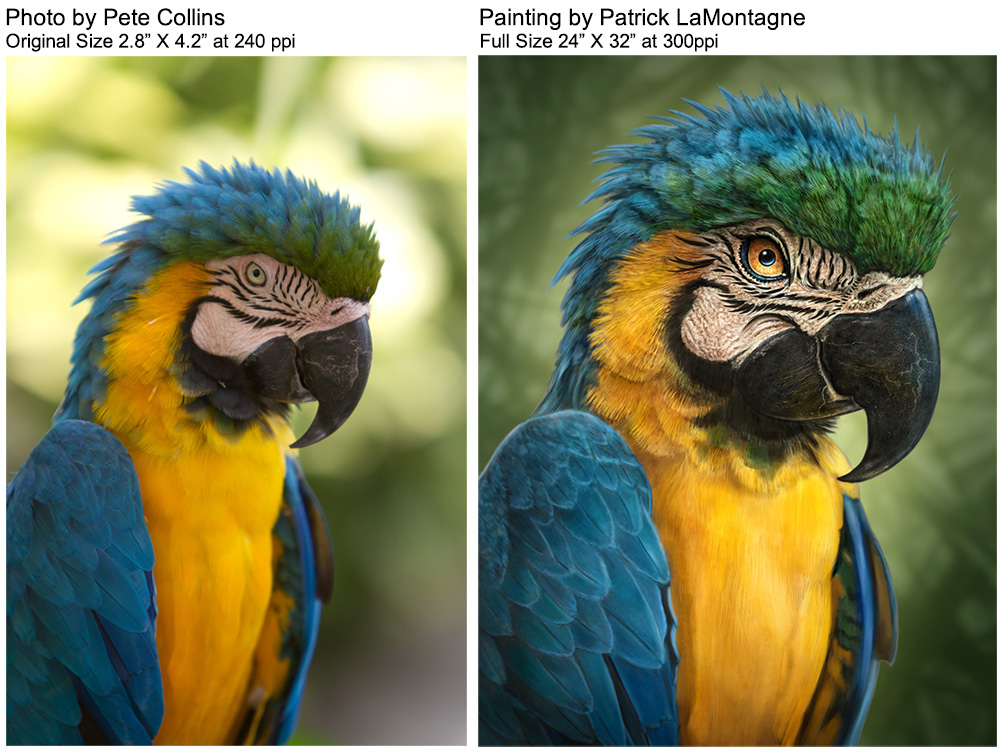
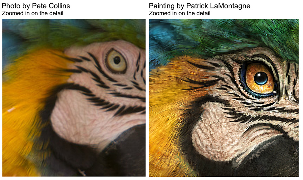
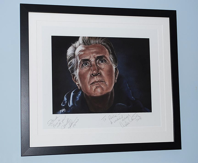
I’ve painted a number of portraits over the years, mostly characters from movies, and all personal projects. A few have ended up having some very nice stories to go with them. Emilio Estevez bought the original of my portrait of Martin Sheen to give to his father last year and when astronaut Chris Hadfield was hired to speak at a conference here in Alberta, the host company bought the original of his portrait to give to him as a gift. They all graciously signed prints for me, which hang in my studio.
 Even though I make my living as an artist, portraits of people are solely for my own enjoyment, at least for the time being. Up until recently, they’ve all been painted from reference from movies or online video, nothing I’ve shot myself.
A few weeks ago, I was at the local outdoor market here in Canmore. A regular Thursday event downtown in the summer months, it attracts vendors from all over, selling all sorts of food and creative products.
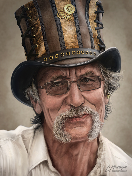
One particular booth, Spirits of the Creek, sells pottery, jewellery, and bio magnetic products. It’s excellent quality handmade work. As I was perusing the merchandise and talking to the vendor, with his eclectic hat that he said was handmade by a friend in California (Head n Home), there was that little voice again. “I want to paint him.”
The next week, I returned to the market with my camera and while I wanted a candid shot of the gentleman, I also knew that if I started snapping photos of him, he would notice, so I just approached him, introduced myself, told him what I was after and showed him some of my portrait work on my iPad. Bruno seemed amused by the whole idea and said he was fine with my taking the shots. He later told me that he and his wife, Donna (the creative force behind the pottery) thought it amusing afterward. Were the roles reversed, I would have as well.
Now, no matter how well a person thinks they’re being natural, a camera will always make a non-professional change his demeanor, unless the photographer is very good at putting their subject at ease. So, I skulked around the other booths, taking candid shots of Bruno from a number of different angles, and was pretty sure that most of the time, he didn’t see me. But a couple of times, he did and sure enough, he changed his posture and expression.
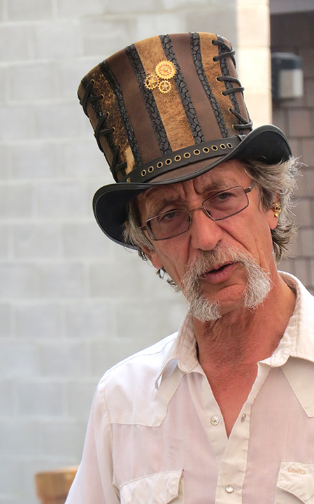 At one point he was talking to a customer, and for a split second he noticed me and only his eyes moved in my direction. I snapped the shot and instantly knew that was the one. As I don’t like chimping (constantly looking at the display screen at the back of the camera while shooting), I waited until I got home and sure enough there was the shot I needed, that one out of about two dozen.
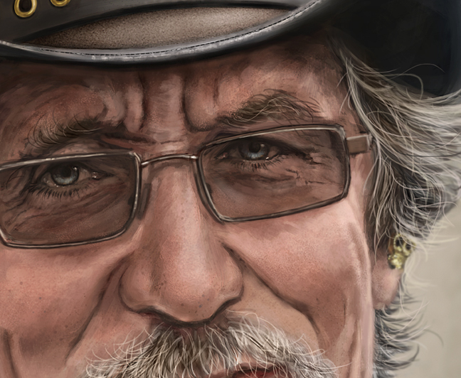
I set to work painting and over the next two weeks, managed to produce what I think is probably my best portrait piece to date.
When I showed up at the market with the finished image on my iPad, I was relieved that Bruno liked it. He asked me to email it to him so he could show his wife and she sent me a lovely email the following morning, approving of the work. It was really a lot of fun to paint and I look forward to sending Bruno and Donna a canvas print next month.
On the legal side of things, I did get him to sign a model release, which basically allows me to use the image as I see fit, whether it ends up in a book or some other media. From what my professional photographer friends tell me, a model release will rarely come into play for most people, but you get everybody to sign one just for the one person that makes it necessary.
Perhaps the best thing I’ve learned from this experience is that I want to repeat it. The next time I see a person with an interesting look or character, and that little voice pipes up inside my head, I’ll be more willing to take a risk and ask if they’ll let me paint them. Some will say No, I’m sure, but for those who say Yes, I can only hope that I do them justice.
And if it’s a woman, I’ll probably get my wife to ask her.
If you’d like to receive my newsletter which features blog posts, new paintings and editorial cartoons, follow this link to the sign up form. Thanks!

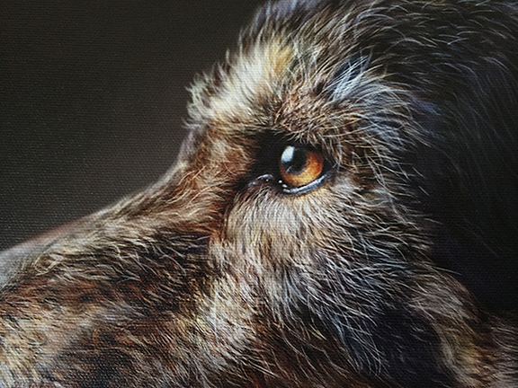
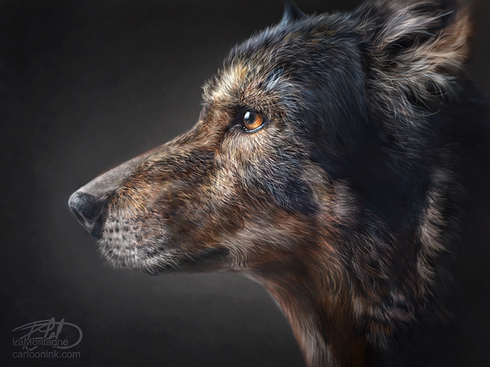 My latest painting, a memorial for a dog named Denzil. He was a very loved senior pup, almost 14 when he died earlier this year and I was commissioned to paint his portrait as a birthday gift.
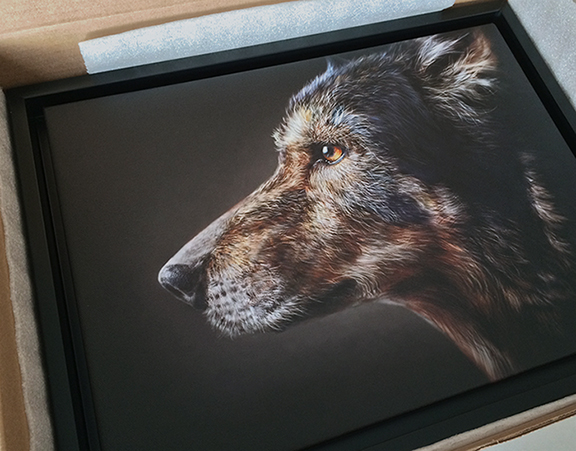 This was printed at 12″ x 16″ on canvas giclée with a shadow box frame. I’ve often said that I believe my work looks best on canvas and this was no exception. These iPhone pics of the canvas (above and below) really don’t do the quality of this print justice, credit to Kelly at Chroma Surge in Calgary who never lets me down. I believe this is my best work to date and I was very pleased with the result.