Posted on 3 Comments

Wacom’s Bamboo Splash Tablet and ArtRage Studio

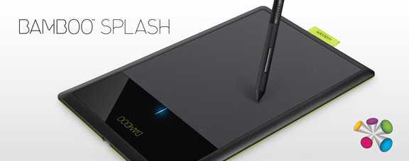
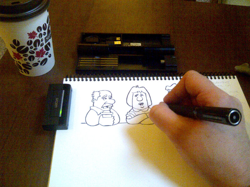
Wacom just released a new entry level tablet, the Bamboo Splash, and I had an opportunity to put it through its paces.

The Bamboo Splash tablet is designed for the amateur or beginner digital artist.  It’s perfect for kids and teenagers, allowing them to experiment with digital art without having to spend a bundle to do so. Best of all, even though it lacks the bells and whistles of the more advanced tablets, it doesn’t sacrifice much in performance.

As I draw syndicated editorial cartoons almost every day, I wanted to see if I could still get real work done using the Bamboo Splash, rather than with the medium sized Intuos5 that I use every day.

The Wacom Intuos5 is a professional tablet.  With the programmable Express Keys, the Touch Ring, high end pen, and the onscreen customizable features, not to mention the larger size, it’s unfair to compare the two tablets as they are designed for different skill levels.  As I’ve been doing this for a living for many years, I’ll admit that the Bamboo Splash isn’t tablet enough for my daily needs, but then again, it isn’t meant for me.

The Bamboo Splash tablet was simple to set up.  Plug it in; install the drivers from the CD, restart the computer and it was working flawlessly.  Visiting the preferences utility, I found that very little aside from ‘Tip Feel’ was changeable.  For a beginner, that’s ideal.  It’s ready to go, out of the box, nothing confusing.

Put simply, it’s a great device.  The Bamboo Splash has 1,024 levels of pressure sensitivity, which is plenty.  While a number of people may wonder about the size, your mind figures it out fast.  I work on a larger tablet every day, mapped to two screens.  I keep all of my Photoshop tools on one screen and draw on the other.  That means I’m really only using half the tablet for drawing.

When using the Bamboo Splash, I didn’t change my screen mapping, so I was only drawing on half of the smaller tablet, too.  After a few minutes, I didn’t even think about it.  My mind just figured out that brush and pen strokes required less movement.

This cartoon (with the political commentary left out) was drawn and painted entirely with the Bamboo Splash in Photoshop and it worked very well.  While I did keep reaching for the Express Keys and Touch Ring of the Intuos5 out of habit, once I got used to their absence and reverted to using keyboard shortcuts or drop down menus in Photoshop, I was able to work smoothly and still got my cartoon out to my newspapers on time.

Trying to draw with a mouse is an exercise in futility.  You really do need a Wacom tablet to draw with a computer.  While the Intuos5 tablets and Cintiq devices will represent more of a financial investment, you’re not risking too much with the Bamboo Splash.  The tablet comes in at well under $100.  Best of all, it comes with two very nice pieces of creative software.  One is Autodesk’s Sketchbook Pro and the other is ArtRage Studio.

I spent some time with ArtRage, and it was very enjoyable to use. While it’s not designed to be a professional illustration and painting tool like Photoshop or Painter, it offers a lot to anybody wanting to try their hand at digital art.  With pencils, crayons, chalk, oils, watercolors and a number of other tools, there’s very little to limit your creativity.  It even supports layers and blend modes, and has a number of other fun tools and settings to mess around with.

Pairing ArtRage Studio with the Bamboo Splash was a great idea, because they’re both designed to allow you to create digital art, without a steep learning curve.  You can start working with both right away and if you’re like me, preferring to figure it out as you go along, you’ll be able to get pretty far without having to look through the manual.

When you do want more info, the ArtRage website has plenty of tutorials.  You can also upgrade the software to ArtRage Studio Pro and they have iPhone and iPad drawing apps as well.  If you do want to try out the mobile apps, I’d recommend the Wacom Bamboo Stylus as a drawing device to go with them.

Here’s a video I recorded for Wacom’s ‘See What You Can Do’ campaign, designed to share a little bit of my thoughts on digital painting, and to show some of the drawing and painting tools available in ArtRage Studio.


Posted on 2 Comments

The proof is in the printing

Spent a couple of hours at ChromaSurge in Calgary yesterday morning.  This is a small business print shop that handles all of my canvas and matted paper prints.  Kelly (the owner) was recommended to me by another Canmore artist.

There’s a lot to learn about printing, even when you’re not doing it yourself.  There are so many different types of machines, canvas, paper, coating, stretcher materials, and frames.  As I have no interest in trying to be a jack of all trades, I don’t do any of my own printing.  Recently, my printer (the guy, not the machine) bought some new equipment, canvas, paper, and inks.  Part of me, the part that doesn’t like change, was thinking, “Hey, my prints looked great, why are you messing with the formula?!”

The other part of me, however, was thinking, “He who refuses to adapt, dies!”

That is true of so many professions these days, and I plan to be doing this for a long time.   I made an appointment with the printer (again, the guy, not the machine) to reproof all of my current prints, and set to seeing how I could make them better on my end, in preparation for them being better when they came out of the printer.  One of the things I noticed with my prints was that some of the shadows were a little too dark, not something many people would notice, but when you spend as much time painting the details as I do, you don’t want to see them lost.  So I lightened them all up a bit, just some simple adjustments in Photoshop.  The lighter versions don’t look the way I want them to on the screen, but they look just right on paper.

Many digital artists and photographers become frustrated that their images don’t look the same in print as they do on their screen.  No matter what they do, they can’t make it happen.  Even with a professional color calibrator, the right printer profiles, and technical adjustments up the wazoo, it never quite gets there.  The reason is that a screen is back-lit while paper and canvas are not.  Therein lies the difference and it’s a HUGE difference.  Took me years to make peace with that.

As in all things, you do your best, and you make compromises.  You get your images to look as good as you possibly can and let go of perfection.  Those of you who know me well probably don’t believe I can do that when it comes to my paintings, but when it comes to prints, I actually can.  I know that nobody sees the imperfections the way I do when it comes to my own work, and that’s true of almost every artist I know.  We’re our own worst critics.  That’s a good thing, because it means you’re always going to try to become better at what you do.

One of the ways I try to compensate for the back-lighting  issue while painting digitally is that I have two monitors.  For Photoshop, one is my painting screen, and the other is for all of my tool palettes.  My Wacom pen is set to just go between them, so it actually acts like one big monitor.  The painting monitor is calibrated.  I use the Eye-One calibrator but there are others out there just as good.  The brightness on the monitor is also set to 13.  Yes, that’s 13 out of a possible 100.  If that seems way too low, trust me, you get used to it.  It minimizes eye strain for long periods of computer work, and also allows me to paint in more subtle shades and tones because I’m not dealing with harsh contrast.   When a painting or cartoon is done and looks good, I’ll often move it over to the other monitor, which is set a lot brighter and is NOT calibrated.  This way, I know how it’s going to look on other screens.

It’s a cheat, and one that works very well for me.  Because of working this way, there is much less of a screen vs. print shock.

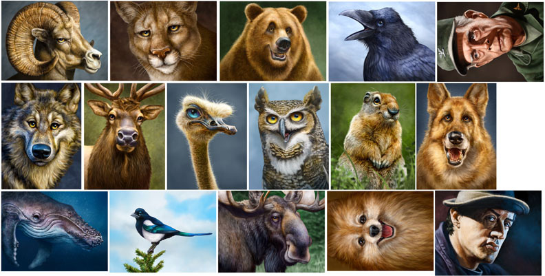
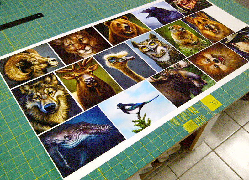
My printer (the guy, not the machine…do I need to keep saying that?) takes the time to make sure I’m happy with the product he’s delivering, and good service is worth paying a little more for, especially now that it seems so rare.  When I told him that I wanted to reproof everything, and that I wanted to do it while I was there in his shop so we could talk about the results and I could ask some questions, he was fine with it.  I had all of my current paintings copied and pasted to one image that measured 18″X36″, which meant each image was around 5″X7″, just large enough to see what I needed to.    First it was printed on canvas, after which Kelly spray coated it so I could see what it would really look like when it was done.  Then he ran the same file on paper, because I sell matted prints in the galleries as well.

The difference between the two materials is that canvas has a natural texture to it.  It’s bumpy because of the weave of the fabric.  That adds a little more light and shadow, as does the protective coating.  The colours appear more saturated and richer, and there appears to be more depth in the image as a result.  I love my work on canvas, even more than on screen.  The paper prints have a flatter look, and although there isn’t a ‘shine’ to them like canvas, the quality is great, the colours are very nice and I’m very pleased with them.  With a sharp looking black mat, they pop.  But canvas is better, which is why it costs a fair bit more, both for me to have printed and for the customer to buy in the gallery.  And neither of them look like the other or like they do on screen.  Not better or worse, just different.  This photo doesn’t even capture what the canvas really looks like.  It’s just something you have to see.

I was very pleased with the prints and glad I took the time to go in and get the proofs done.  Cost me a bit of money for the ink and materials, not to mention taking the morning off from drawing and painting, but in the long run, it was a valuable use of my time.  My printer (really?  again?) also knows for a fact that I’m happy, so that likely makes him feel that he’s done right by his client.  Even better, he printed off a copy for himself so that whenever I order prints, he now has an approved standard to compare against, and so do I.  We have a baseline with this canvas, paper, ink and machine.

Like I said, I was already happy with my prints, but these new ones have just a little more spark in them.  I doubt that others will notice it, but I do, and that matters because it makes me feel better about the product I’m selling in the galleries and to my commission clients.  When new and better materials come along, we’ll have to do it all over again, and it will be worth it.

Posted on 2 Comments

Wacom’s Inkling – Lowering Expectations

Anybody who knows me or follows my work is well aware that I’m a big fan of Wacom tablets, so when I had the opportunity to put the new Inkling through its paces, I really wanted to like it.  If I drop all pretense, I’ll admit to being a little apprehensive about writing an honest review, as I really enjoy working with these folks.  But I also didn’t want to mislead any artists into buying the device and have them hold me responsible when it didn’t live up to their expectations.

The purpose of the Inkling is ingenious.  Attach a small clipped box to whatever page you’re working, use a pen device that draws just like a ballpoint pen, albeit a little larger in size, and whatever you draw is saved as a file, ready to be imported into your computer.

Let’s start with what I liked.  The device itself is elegant.  I doubt I could come up with any improvements in the case design, as everything fits together nicely, the pieces feel solid, and the case itself has a nice weight and construction.  Definitely doesn’t feel like a cheap piece of plastic that will break in a month.  While I’m normally a pencil sketcher, I did enjoy drawing with the pen.

Unfortunately, there’s a lot more that I didn’t like about the experience.  Frankly, the software is clunky.  While I’m not an engineer and can’t quite give a lot of specifics on where the shortcomings lie, it just didn’t seem comfortable to work with.  While it has a feature that records all of your strokes, enabling you to scrub or play them back, I didn’t really see the point.  Additionally, the layers didn’t really seem to work well for me, either.  I never felt the need to separate my sketches into components.

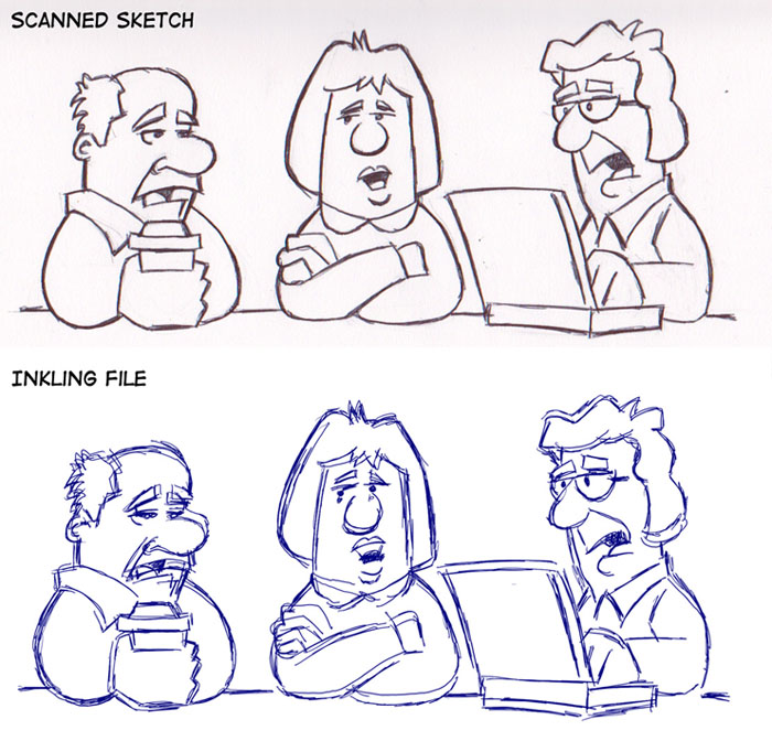
The biggest issue I had with the device is that it has serious accuracy issues.  In an effort to test this, I created a pencil drawing in my sketchbook, erased it until it was faint, and then traced over it with the Inkling pen, trying to get as clean a drawing as I could.  I created a total of four new layers, going over the same lines in places, just to test the accuracy.  Here is the result of that particular drawing experiment.

As you can see, the layers don’t line up and the recorded lines aren’t very accurate.  I repeated this experiment a few more times over a couple of days, just to make sure I didn’t bump the device or accidentally move it the first time out, and judging by the similar results, that wasn’t the case.  Even with only using one layer, the accuracy had noticeable issues.  Having imported the Inkling sketches into both Photoshop and Illustrator, I can verify that bringing the sketch and layers into both programs works as advertised.  It was a smooth import and looked the same as it did in the Inkling Sketch Manager, layers intact.  The problem seems to be in the capture itself.

In an effort to be fair, my expectations for the Inkling were pretty high, and I think the disappointment lies primarily with that.  I was expecting the same level of accuracy I get from an Intuos tablet.  If you look at the Wacom site, it says that the Inkling is  “Designed for rough concepting and creative brainstorming, Inkling is ideal for the front end of the creative process. Later, refine your work on your computer using an Intuos4 tablet or Cintiq interactive pen display.”

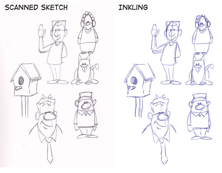
Using this device for solely that purpose, it works as advertised.  I did a page of rough sketches using the pen alone, the results you can see here.

If you weren’t being a stickler for accuracy and comparing it to the original sketch line by line, the Inkling does what it was designed to do.  For rough sketches and concept ideas, to simply record something you can throw into your laptop and email to a client or collaborator, it works just fine.  It just wouldn’t do what I wanted it to do, which basically was to replace my scanner.  I know a number of other artists that were hoping for the same thing, and for this purpose, the Inkling is not the right tool.

When it comes to creative tools, the goal should be to find ones that will make your life better and fill a need.  When it comes to the Inkling and my own personal workflow, I find myself struggling to invent a use for it, in order to justify having it.  Unfortunately, I can’t.  When I import a drawing into Photoshop, I need it to be clean, and I will rarely have any use for a rough unfinished sketch like the ones you see above.  Will this device be useful to others?  Yes, I’m sure that it will, but it’s not for me.


Posted on 2 Comments

Why I Paint on the iPad

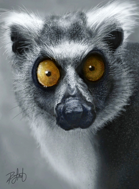
This is a painting I recently finished on the iPad.  For those who want the technical specs,  I’m using the first generation iPad, the Wacom Bamboo Stylus, and the procreate app.  The actual size and resolution of this image is roughly 13″ X 9″ at 72 ppi.  The only photo used was for reference (thanks, Pete!) and I designed my own brushes.  I have no idea how long it took me to paint as I worked on it over four or five days, an hour or two here and there.  I’ve never done a painting in one sitting and doubt I ever will.

Since the resolution and size for the iPad is so low, I’ll likely never be able to do what I call ‘finished work’ on it, so you might wonder why I bother at all.  As a sketch pad, it’s great, but why put all the time into painting in detail, light and shadow?  Very simply put, it’s a challenge, and it’s fun.

At the risk of sounding immodest, I already know how to make Photoshop sit up and do the boogaloo when it comes to painting.  I know what it takes to get the fine details and I’ll always keep working to add more realism and texture to my paintings, but any limitations I have in my painting are my own.  If my paintings aren’t as good as I can possibly make them, the fault doesn’t lie in Photoshop or my Wacom tablet, it’s in my ability.  I can’t remember the last time I thought, “I wish Photoshop could do…”

With the iPad, however, the challenge is to see just how far I can take a painting before I’m limited by the tools I’m using.  The resolution tops out at 72ppi.  The size is finite.  I have to work with what I’ve got, which is a combination of the device, the stylus and the app, all three I feel are the best I can find for my needs at the moment.  I’m not about to buy a new iPad while this one still works very well.  By working with limited hardware and software, it forces me to become a better painter, to find new ways of achieving the best I can from an image, with the tools I have at my disposal.  That stretching of skills can’t help but translate to better painting when I’m NOT limited by the hardware and software.

The fun part comes from being able to paint on a portable device.  As much as I enjoy working with the Wacom Cintiq 12wx and a laptop, or even just the Wacom Intuos4 small tablet and a laptop, neither option is REALLY as portable as a pencil and sketchbook, or an iPad and stylus.  Even though I work all day in my office, I often sketch the next day’s cartoon or paint on the iPad while sitting in front of the TV with my wife in the evening.

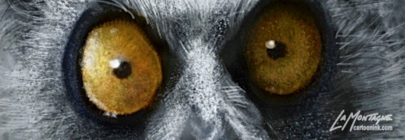
When I began to paint this ring-tailed lemur, I really had no intention of taking this image any further than this.  It was fun to work on, but it wasn’t supposed to be a finished painting.  But, much like the ostrich painting that was first started on the iPad, I’m pretty happy with it, and I love the manic expression in this little fella.  There is a very good chance I’ll be taking this painting into Photoshop, bumping up the size to 18″X24″ at 300 ppi and spending many more hours finishing it.

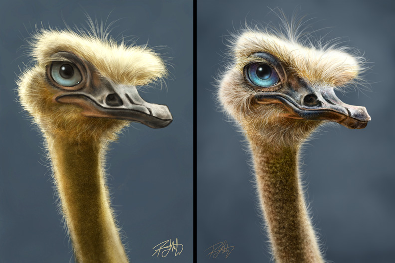
For the difference in iPad painting vs. Photoshop painting, here’s a comparison of the Ostrich Totem.

Posted on 2 Comments

The upside of 2011

Bighorn Sheep TotemAll things considered, 2011 was a great year.  While every year will have it’s challenges, I’ve been fortunate that I’m honestly able to see each year of the past decade as having continual forward momentum.  The work I’m doing is far beyond what I had hoped for when I first started in this profession and I’m very grateful for it.

I became nationally syndicated in September of 2001, sending cartoons out across Canada each week, and got very few bites.  For two years, I had no more than three newspapers, paying the bare minimum rate, and I will admit to almost giving up on it more than a few times.  With a full-time job to pay the bills, I had to get up at 5:00am each morning to get a cartoon out before I went to work.  When I came home, I had to sketch in the evening and work on the weekends in order to manage it all.  Finally I started making progress, got a few more papers, took advantage of other opportunities, and about six years ago, I was able to leave my job and play this game full-time.

Through it all was my ever supportive wife, Shonna, and I’m incredibly grateful that she never told me not to do any of this.  The only caveat given when I went full-time was that if I couldn’t pay my half of the mortgage and bills, I had to go back to work.  Canmore is an expensive place to live and we couldn’t do it on one income.  Fortunately, it never came to that, and each year has been better than the one before.  At the time, it was an incredible struggle, but in retrospect, I’m glad I had to go through it because it makes the present all that much sweeter.

If my 2001 self could see the work I’m doing now, he’d be pleasantly surprised, and I try to think about that when I’m having a bad day or feeling sorry for myself because of a heavy workload or when money is tight.  So far, I’ve not only gotten what I wanted, I’ve gotten much more.  Best of all, I discovered that I loved getting up at 5:00am to work, I still sketch in the evenings, and being self-employed means you often work weekends anyway, so I was already used to the routine.  Now, I can’t imagine doing anything else.

Here’s a recap of my professional highlights of this past year, some of which I’d forgotten about until I went back through the blog entries month by month.
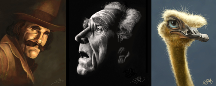
iPad Painting: Started playing around with this in January, and damn if it hasn’t been a lot of fun figuring it all out.  Ended up trying four different styli and half a dozen apps.  It would seem that I’ve finally settled on the Wacom Bamboo Stylus, the Nomad minibrush, and the procreate app.  The combination of those three gives me the best results, and while I don’t consider anything I paint on the iPad to be finished work, I would go so far as to call it advanced sketching, and I plan to keep doing it.
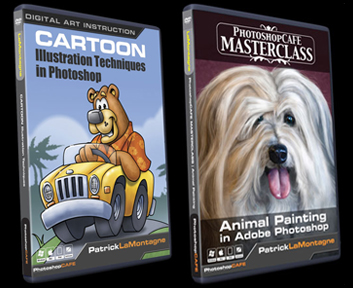
PhotoshopCAFE DVDs:  In March, I finished my first DVD, called Cartoon Illustration Techniques in Photoshop.  Easily one of the most difficult projects I’ve ever worked on.  Having only done a little bit of sound and video editing for a failed Flash animation project a few years back, it was a struggle.  But I finished it, it went into production, and is selling well.  I’ve heard from many who bought the DVD that have learned a lot from it and complimented me on my instruction, so I’m guessing I didn’t do so bad a job.

The second DVD, Animal Painting in Adobe Photoshop, was a lot easier and a lot more enjoyable as I wasn’t teaching raw Photoshop beginners.  It was more about the painting than the software and while it was a challenge, the difficulty I went through with the first DVD paid off while recording the second as there were few problems I hadn’t already solved.  Recording one DVD this year would have been enough of a milestone, but I never expected to record two, and to be very pleased with both of them.
Cartoon Ink: While my old website was ‘fine,’ it had become difficult to use and it was no longer the image I wanted to project.  While I had always done my own website in the past, this time I realized one of the most important business practices that so many have learned before me.  Hire professionals to do their job, so you can focus on doing yours.  With that in mind, I hired Erik Bernskiold of XLD Studios in Sweden to create a new website for me.  I knew Erik’s work and know him personally, so I was confident he would deliver much more than I could create myself.  With the help of Elizabeth Gast at Design by Firgs, another colleague and good friend who consulted on the site, and created an improved evolution of my logo, I was very pleased with the final logo and website and would highly recommend both of their work.  The time I saved was well worth the money spent and reduced stress.
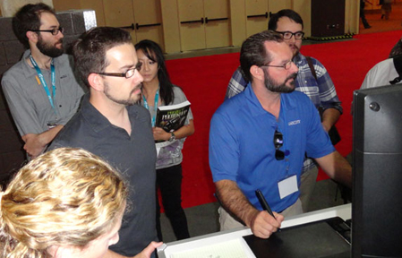
Wacom: I began to form a relationship with the great folks at Wacom at Photoshop World in 2010 after I won the Guru Awards for two of my Totem paintings and I couldn’t be happier about it.  Having used their tablets since the late 90’s, you won’t find a bigger fan, so I’m very pleased to be working with them from time to time.

Over the course of the year, I’ve been featured in the Wacom eNews, have represented the company and demonstrated their products at one of Scott Kelby’s seminars in Calgary, and have been a featured guest on two of their one-hour Wacom webinars.  The people I’ve worked with at Wacom have been incredibly supportive and are absolute pros at what they do and I look forward to a continuing relationship with them.

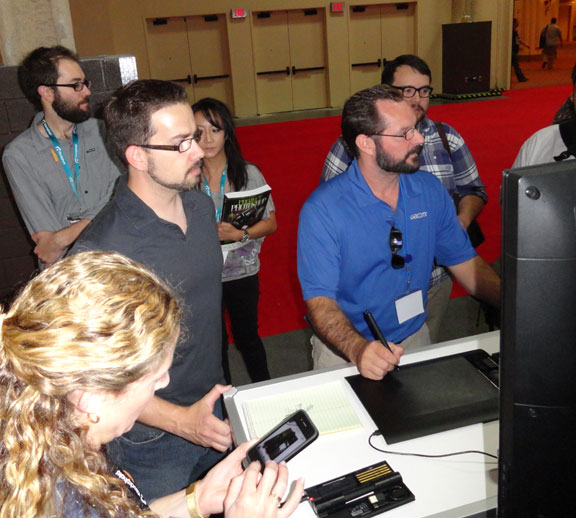
The photo shown here is Joe Sliger demonstrating the new Wacom Inkling for me at Photoshop World this year.  He is also one of the moderators of the webinars.

Island Art Publishers: In July of this year, I began a licensing deal for some of my Totem paintings to be produced on art cards.  These are distributed throughout Western Canada and the northwestern U.S. and time will tell whether this arrangement bears any fruit.  An artist friend once told me that art cards are often your best advertising, because not only does the person buying it see your work, but so does the person receiving it.  You may not make much money early on, but it’s enough to get your work out there to a market that otherwise might not see it.  And the cards look really good.
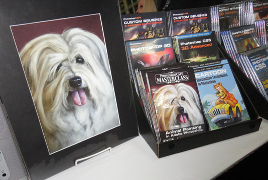
Photoshop World: While it’s true that I didn’t learn much about technique or improving my work at this year’s Photoshop World in Las Vegas, I still think it was worth attending because of the networking opportunities.  Having recorded two DVDs for PhotoshopCAFE, it was great to finally meet the owner of the company in person, and see their operation on the Expo Floor.  I was able to meet a few more of the Wacom folks in person, and talk with other industry professionals I otherwise might not have had the opportunity to talk to.  Online interaction is fine, but it doesn’t compare with face-to-face conversations.  So while I won’t be going back as an attendee, I still think this year’s trip was well worth it.

knmadventuresAt the time, I was doing some illustration work for wildlife photographer and instructor, Moose Peterson as well, and being able to go over sketches with him in person was a real treat, as most of the time this would have all been done online.  The other benefit of the Photoshop World conference is that I get to meet with so many talented photographers, many of whom I consider close friends.  For somebody who relies on great photo reference for my painted work, their skills and talent are often one of my most valuable resources, not to mention their generosity with their work, and the support they offer for mine.

Paintings: Saved the best for last.  I am so very pleased with the progress I’ve made on my painted work this year.  The first half of the year, I was so busy with the DVDs and other work that I only painted one animal in my Totem series, the Great Horned Owl.  When I realized this in the latter half of the summer, I was ticked off.  The work I love to do most, I had placed in last priority.  In retrospect, however, I’m glad it happened because when I realized it, I vowed it would never happen again and it stoked the fire.  The end result is that from September to December, I’ve painted a number of new images and I feel they are my best work to date.
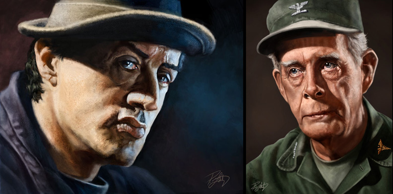
I had been becoming bored with painted caricatures of people in the past couple of years, but recently, I’ve realized that it wasn’t people I was bored with painting, just caricatures of them.  Beginning with a couple of iPad paintings, I’ve discovered how very much I enjoy painting portraits, and I’ve done a couple of pieces recently that I’ve really enjoyed.  Inspired by the work of Drew Struzan and others, I think I’ll be painting a lot more portraits of people, if nothing more than for the sheer enjoyment of it.  While style is always evolving, I think my paintings now have a definitive look that is mine, whether it’s people or animals, and it’s one I want to continue to develop and refine.
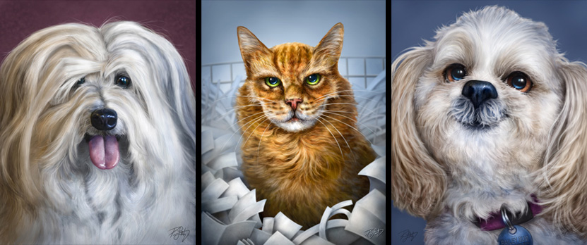
I’m now getting commissions to paint pet portraits and caricature this year, and it’s really enjoyable work.  The painting of Don Diego that I did for my DVD, the memorial to Titus the cat, and to being able to finally create a real painting for my folks of their dog, Bailey, it’s looking like this could be a big part of my work in the coming years.  Working on another commission at the moment, and having fun with it.

My real passion, however, is still the Animal Totems.  Nothing I’ve ever done in my career has filled me with as much joy as that I get from painting these whimsical caricatures of wildlife.  Not only are they fun to work on, but they sell well in the galleries which means others like them, too.  I’ve been fortunate that a number of wildlife photographers I know have been willing to sell me the license rights to use their photos as reference, or have enjoyed my work enough to want to trade me the use of their images for canvas prints of the painting when it’s done, both of which I’m more than willing to do.

Humpback Whale TotemEach of them is my favorite for different reasons, but the one I was most happy with this year was the Humpback Whale Totem.  I don’t know if it’s because I’ve wanted to paint it for so long or that it was such a challenge to paint an animal with no fur or hair, and the end result lived up to my expectations.  Either way, these paintings are the only work I’ve ever done that I still enjoy months and even a year after I’ve painted one.  That alone tells me this is the work I’m meant to do, at least for now.

As you can see, I’ve had a very good year, and I’m grateful for it.  For all of you that follow my work, your messages of support here on the blog, through social media, and email are all appreciated.  It’s a solitary existence, this freelance lifestyle, and it’s nice to know that others are getting enjoyment out of the work I do.  And if you’re struggling with your own creative endeavors, whether you’ve just begun or are just trying to keep going, I would urge you not to give up.  It may not seem like it in the moment, but I assure you, if it’s something you love to do, it’s worth the effort.

Posted on Leave a comment

Another Wacom Webinar: Cartooning Techniques!

Since the last one was so well received, the good folks at Wacom have invited me back for another webinar on November 22nd.  While the previous one touched on both cartooning and painting, turns out that some folks felt there was not enough on each, so this one will focus on some more techniques and methods I use in my everyday editorial and illustration cartooning.  A number of these techniques are included on my DVD from PhotoshopCAFE, but I’ve also added a few other things to this webinar that aren’t on the DVD.

I really enjoyed the last one and heard from a lot of people that did as well, so I’m looking forward to another opportunity to share a little of what I know about cartooning in Photoshop.  Hope you can join me in November.

Click HERE to register for the upcoming webinar (or on the image.)  If you’d like to take a look at the last one, here’s the link to Wacom’s YouTube channel.


Posted on Leave a comment

Wired for Wacom

If the name Wacom means nothing to you, we’ve likely never met, you’re not a digital artist, or you landed on this blog entry by accident.

I’ve been using Wacom tablets since the late 90’s.  It’s true that you’ll occasionally hear stories in chat rooms about other tablets, but much like the Sasquatch or the Loch Ness Monster, I’ve never met anybody who’s actually seen one.  Wacom is by far, the industry standard.

My first tablet was a first generation 4″ X 5″ Intuos and I used that for many years.  While I replaced the pen nibs a few times, and the transparent overlay at least twice, the tablet never gave up.  The only reason I replaced it was that it had a nine-pin connector, and my new computer did not.  Over the years, I’ve had a small Graphire, an Intuos and Intuos 2, and I currently own a medium Intuos 4, a small Intuos 4, and a Cintiq 12wx.  Add to that a Bamboo Stylus for my iPad, and my plans to buy a Wacom Inkling, and it’s obvious I’m a fan.

I’ve been fortunate to form a relationship with the company over the past year, and have been pleased to meet a number of great people from Wacom.  In the Spring, I was asked if I’d like to demo for Wacom at Scott Kelby’s ‘Light It, Shoot It, Retouch It’ tour when it came to Calgary in July.  It was a great experience, one I’m eager to repeat if the opportunity shows up again.  Not only did I get to see what it was like to be on the ‘other side’ of an event like that, but I was able to remove the fear of new technology for a few people.  These devices aren’t difficult, they’re a lot of fun, and often it just takes sitting down with somebody, and putting the pen in their hand to get them to realize it.

An added bonus of demoing for them was having every tablet Wacom makes show up at my front door a week before the show.  It was like winning the lottery for this digital painting art geek, until they insisted I send them all back once the show was done.  How is that fair?

Wacom recently announced their Inkling device, and rather than a clunky explanation from me, watch the video and you’ll get the idea.

When it was launched, I started getting emails and Facebook messages from friends and colleagues who insisted I give more details on what it’s like to use it.  Let me tell you what I told them.  I found out about the Inkling when the rest of the world did.  I was not a beta tester, and had no idea it was even being planned.  Wacom, like any smart tech company these days, doesn’t talk about products in development and is very good at keeping secrets.  Doing a demo for Wacom does not give you access to the vault.

But since it was launched just days before Photoshop World, I was really looking forward to putting it through its paces on the Expo Floor.   The staff at the Wacom booth were being pestered about it on Day 1 (hey, they did it to themselves!), but they didn’t have one available to try right away as they  had just received them and they needed to charge before releasing them to a lineup of eager testers.

I did not get to put the Inkling through its paces.  There were far too many people wanting to try it, so I got about two minutes with the device.  But Joe (patient, patient Joe) demonstrated the process, workflow and explained the pen and device quite well.  Bottom line, I will be buying one when it’s available in October, and I’ll be sure to provide further details after I’ve given it a good trial.

Wacom also announced their new 24″ HD Cintiq this week.  This thing looks beautiful and if I had the spare $2500 lying around, I just might get one.  But I’ve made no secret that my lack of traditional art training makes the Cintiq a ‘nice to have’ for me, but not a ‘must have’.  As much as I like painting and doing live demos on the Cintiq 12wx, I do the majority of my day to day work on the medium Intuos4.  I just prefer to see my whole screen without my arm in the way.

Finally, I was pleased to be asked to be a guest on Wacom’s webinar series this week.  While I will admit to being a little nervous about the whole thing, I relaxed into it quite quickly and had a lot of fun.  Wes and Joe (yes, the same patient Joe) were great to work with, and encouraged me to keep it light and casual, which is right in my wheelhouse.  The hour flew by and I would welcome the opportunity to do something similar in the future.

Thanks to so many of you that commented on Facebook, Twitter and email afterward, letting me know that you enjoyed it.  A few of you even apparently learned something, which is always a nice bonus.

It really is a thrill for me to be working for and with Wacom once in awhile, because it’s so easy for me to pitch and endorse their products.  People will often ask me if they need a Wacom tablet to do the type of work I do.  Most of the time it’s because they’re trying to avoid making the financial investment, even though they’re very affordable.

The answer, is an unconditional YES.  To paint digitally or do almost any type of creative artwork in Photoshop or Painter, you NEED a Wacom tablet.  Just as an oil, acrylic or watercolor painter needs to spend money on canvas, brushes and paint, a digital painter needs to spend money on the necessary tools as well.  A Wacom tablet is absolutely one of those necessary tools.

If you’d like to catch a replay of the webinar that was live earlier in the week, here it is, available on YouTube.

Posted on 8 Comments

iPad Painting and the Wacom Bamboo Stylus

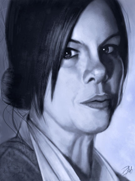
Here’s another iPad painting that I just finished.  This is Marcia Gay Harden in character as ‘Mother Carmody’ from the Frank Darabont movie, ‘The Mist,’ based on the novel by Stephen King.  She is one of my favorite movie villains which made this a lot of fun to work on.  Frank Darabont is one of my favorite filmmakers and Stephen King is my favorite author, so it should come as no surprise that The Mist is one of my favorite movies.  How many times can you use ‘favorite’ in a sentence?

Darabont has made movies out of a number of King’s books.  In addition to The Mist, there was The Green Mile and The Shawshank Redemption.  He is also responsible for the breakout miniseries ‘The Walking Dead,’ which is one of the few television shows I would pay extra to see.  And if that weren’t enough, Darabont has used Drew Struzan (one more favorite) to create the posters for a number of his movies, including the ones I’ve mentioned here.  It’s no wonder I’ve chosen two of his characters to paint on the iPad.

I’ve already written a great deal about the process for painting on the iPad and the ArtStudio app, which is still preferred over all others.  If you’d like to see other iPad paintings and posts, there are links at the end of this entry.  The process is very much like other digital painting, with some limitations due to the nature of the iPad.

What made this current painting different is that I was taking a new stylus for a test drive.  Up until now, I had been using (and recommending) the Targus stylus, but I recently got my hands on the new Bamboo Stylus for iPad by none other than Wacom.  I’ll be honest, I had REALLY high expectations for this stylus.  Wacom has long been established as the go-to company for drawing tablets, and having owned more than a few of them, I’m a pretty big fan.  I couldn’t do my work without a Wacom tablet.

I already knew that the stylus wasn’t going to be reinventing the wheel.  Anybody expecting pressure sensitivity (something Wacom tablets are very well known for) should dismiss it now, no matter what stylus you’re using.   The iPad currently does not support pressure sensitivity, so that discussion ends pretty darn quick.

Without going into great boring technical details, I can sum up the Wacom Bamboo Stylus pretty easily.  It is the best stylus I’ve used so far.  Every other stylus I’ve tried, and there have been four of them, has been a little like drawing with a piece of chalk.  A large surface area with the tip, because the iPad is built to register a finger, not a pen.   What it looks like Wacom did, however, was take that tip size to the ultimate minimum.  The contact surface is significantly smaller than any other stylus I’ve seen so far.  It’s still not fine point tip, but it’s a definite improvement over all others I’ve tried.

What else did they get right?  Well, it’s longer than any other stylus I’ve used, so it feels better in my hand.  It has better balance, too.  They included a clip (something others have failed to do) and it looks good, too.  While I’m sure a lot of work went into the research and development of this stylus, it’s not a complicated device.  It’s a pen that allows you to write, draw, and paint on the iPad.

Many people will recall that I liked the Targus stylus, and up until now, it was all I needed.  Wacom, however, raised the bar with the Bamboo Stylus and it’s now my primary drawing device for the iPad.  I still have to use the glove so I can rest my hand while drawing without activating the app with the heel of my hand, but that’s a compensation for the iPad, not the stylus.

As with all of the stylus products out there, there are metal parts on them, so a little bit of care for your iPad is warranted.  Don’t leave your stylus sitting on the screen or push really hard at a very steep angle as there is always the risk of slipping and possibly scratching the iPad.  You don’t need to push hard with ANY stylus, and if you use the Bamboo Stylus properly, you should have no issues.

I do not have a screen protector on my iPad, so I can’t say how it works with one, but I used my iPad a LOT, do a lot of painting with it, and the only scratches I’ve ever got were from a brief test of the Dagi stylus which put three nice little scars on the screen.  Even those are hard to find, but it was enough for me to abandon it.  The Apple case is all I’ve ever needed for the iPad, so I don’t see the need for a screen protector.

Bottom line, I would highly recommend buying the Wacom Bamboo Stylus.  Yes, at $29.95, it costs a little more than others on the market, but I’ve always believed that you get what you pay for, and this one is worth it.  It’s a joy to paint with and after the first few minutes, I didn’t think about the pen at all, which is the best endorsement I can offer.  I find the best products (hardware and software) are the ones that allow you to think about your work, not the tools you use to create it.

As for those who are demanding pressure sensitivity, talk to Apple about it.  In the meantime, you can easily fake pressure sensitivity with most apps on the market by varying the opacity of the brush in the app itself.  That’s what I did throughout this whole painting and it worked very well.  I rarely use full brush opacity when painting, even in Photoshop.

One final note about painting with the iPad in general…

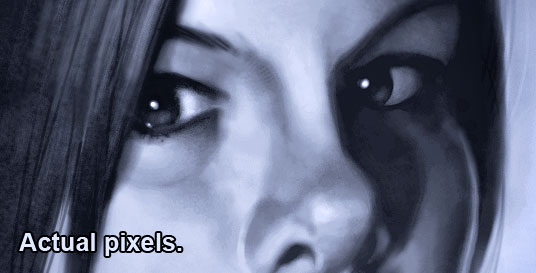
The iPad has limitations that prevent me from producing ready-for-market paintings.  Just the color calibration and resolution limitations are enough to put the brakes on creating finished work.  This ‘actual pixels’ image is as close as you can zoom in on the first-gen iPad.  Were I to import this into Photoshop, it would serve as a sketch for a painting, with many more hours required to create a finished piece.  Had I painted this in Photoshop, I would consider this to be about half done at this stage.

With that in mind, you might wonder why I bother painting with the iPad at all, when I can get much more detail and a tighter rendering with Photoshop and a traditional Wacom tablet.  The reasons are simple.  With the right app, and the right stylus, the iPad is a great sketchbook.  I also enjoy the challenge of seeing how far I can take a painting, and it’s just great overall painting practice.  Another reason is simply to show that you can create quality artwork on the iPad, despite the critics (fewer all the time) that say it’s of no practical use to artists.  One thing I’ve learned over the years by watching what talented and creative people do with all sorts of mediums in this world is that artists will decide for themselves what is and isn’t of practical use for their own creativity.

If you’d like to see other iPad painting posts I’ve written along and images I’ve painted, here are some links.

iPad Cartooning: An Ongoing Experiment

iPad Painting: Billy Connolly

iPad Painting: James Whitmore

iPad Painting: Daniel Day-Lewis

Posted on 4 Comments

Evolution

As you can see, my new website is up and running.  The site is cleaner, more efficient, easier to maintain and update, and incorporates all of the features I wanted, but could no longer create on my own.  To get the job done, I hired Erik Bernskiold with XLD Studios, and couldn’t be happier with his work.  I’ve included the testimonial I wrote for him at the end of this entry, which pretty much says it all.

If you look around the site, you’ll see that things have changed a fair bit.  Much of this will be self-explanatory, but here are a few details of some significant changes.

Editorial Cartoons

Rather than present them in a gallery format, I’ve used more of a blog post format, showing only the most recent ten cartoons.  Judging from traffic reports on my previous site, I had many regular visitors looking at the current work each day, but few people actually spent a great deal of time going through galleries from years past, so I did away with them, in favor of keeping everything more current.  I’ve turned the comments off on these images, as I would prefer to keep political arguments off this site.  I do post daily editorial cartoons on the Cartoon Ink Facebook page, if you’d like to see them there as well.

Portfolio

I’ve now got three portfolio galleries.  My totem animal paintings in one, paintings of people (caricature and portrait) in another, and commercial illustration work in the third.  I can easily add new images to each gallery as I create them and add more galleries if I find them necessary in the future.

Services

For many years, I was a jack of all trades, accepting almost everything that came through the door, but recently I’ve decided to focus on my strengths.  I’m a cartoonist, cartoon illustrator and digital painter.  That’s what I enjoy and what I’m best at.  For everything else, I have a very large network of incredibly talented friends and colleagues who excel in their creative fields and I’m more than happy to recommend them.  For example, Elizabeth Gast with designbyfirgs.com designed the evolution of my logo you see at the top of the page.

Training

This is a very exciting addition for me as it showcases my first training DVD through PhotoshopCAFE.  I’m working on the next one right now, with plans for more in the future.  Additionally, I have more training opportunities that I’ll be able to talk about soon, as well as others on the horizon.

Shop

As regular followers of my work and ramblings will know, I have a line of limited edition giclée canvas prints for sale at Two Wolves Trading Company in Canmore, Alberta and Editions Gallery in Banff, Alberta.  Those can be purchased and shipped from each of those venues, and I won’t be selling them from this site.  I am, however, offering open edition matted paper prints of the four totem paintings you will see in the Shop, with more to be released this year.  The prints are available in two standard framing sizes, so framing them won’t cost you an arm and a leg.  The Shop operates through PayPal, and I’ll ship any purchases via Canada Post.  Takes a little longer, but then you avoid duty fees if you’re shopping from outside of Canada.

If you do happen to be in the Canmore area, or plan to be in the future, I would ask that you buy them directly through Two Wolves Trading Co. They’re wonderful people there, and they treat me very well.  The prices are the same, and you’ll also get to see the work of other talented artists when you visit them.

The Blog

All of my blog entries from the past few years have been imported from Blogger to WordPress.  Most of the transfer worked well, some of it did not.  I’m still updating categories for the older entries, and some of the links need to be repaired.  Bear with me if you find a broken one, as I am making these fixes here and there when I have spare moments.

It’s going to take me awhile to get used to this site, but I’m very happy with it.  It will allow me to keep moving forward, and is designed so that I can edit and expand it when it becomes necessary.  Some of the best parts of my business, the work that I enjoy most, were not things I’d planned for long term.  I love trying new techniques and believe in being ready for opportunities, so I wanted a website that would be ready to handle things I haven’t even thought of yet.  And if something does come up that I can’t handle on my own, I know who to talk to help me out, which brings me to the testimonial I wrote for Erik Bernskiold at XLD Studios.

Testimonial

After years of creating my own websites for my freelance cartoon illustration business, I had recently realized that my online image wasn’t keeping pace with my recent successes.  As such, it became apparent that I could no longer create my own site with the limited knowledge I had and still put forward the image I wanted to.  I needed a professional designer and found one with XLD Studios.

Erik Bernskiold came highly recommended from a number of colleagues and having seen the work he did for them, I knew he could build the site I needed.  While I fully expected him to have the technical skills necessary to get the job done, I was pleasantly surprised and very impressed with the service and support Erik provided as well.  He listened to what I needed, asked all the right questions, and offered suggestions I hadn’t even thought of to take my site to a higher level than I’d expected.

Having never used WordPress before, I was apprehensive, but Erik assured me it was the best solution for what I wished to accomplish, even going so far as to give me a very detailed walkthrough tutorial via Skype when it was time for me to begin populating my site with images and content.  During that process, he patiently answered all of the questions I had about functionality and addressed each concern quickly and efficiently.

Erik provided a level of service and professionalism that is far too often lacking these days, and I am very pleased with not only the site he built for me, but with how I was treated as a client.  I wouldn’t hesitate to hire Erik again, and would recommend XLD Studios without reservation.

Patrick LaMontagne  Cartoon Ink


Posted on 1 Comment

iPad Painting: Daniel Day-Lewis


Here’s another painting drawn on the iPad for fun and practice. This is Bill ‘The Butcher’ Cutting from the movie ‘Gangs of New York.’ According to the DVD extras, Daniel Day-Lewis was so committed to the role, that he stayed in character while on set, even when the cameras were off. I’ve seen this movie a few times, and for me, the character of The Butcher is the best part of it.

Had a few requests for progress shots from the last iPad painting I did, but since I hadn’t saved any file copies, I kept that in mind while painting this one. Click on any of these images to see them a bit larger, although size is limited by the iPad resolution.

Image 1-3

Image 4-6

Closeup

Now that I’ve done a couple of paintings and a number of cartoons with the iPad, I’m aware of a few limitations, aside from the resolution, that make it difficult to ever really do any finished work.

First, the brightness of the iPad. If I paint on full brightness, it’s a little hard on the eyes, so I paint with the brightness set to about half or 60%. When I send the images by email to my desktop computer, they’re a fair bit darker than they are on the iPad, so all of these images have had exposure adjustments in Photoshop.

My desktop and laptop computers are colour calibrated, so it’s a little unnerving to paint in colour on the iPad, because it doesn’t look the same when I bring it into Photoshop. This is why I painted in black and white first, in order to get the values right. After that, I added a colour layer in the ArtStudio app, then I flattened it and continued painting. As you can see, most of the work, however, was done in black and white.

While I’m pleased with the way this painting turned out, I might have chosen a difference reference photo to work from, as I think I could have found a better pose for the character. But since this is as far as I intend on taking this image, no harm, no foul. It was good practice.