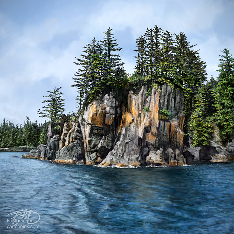
There’s an annual B.C. camping trip that a group of friends has taken the first or second weekend of May since the early 90s. At one time, there were upwards of twenty people that attended and apparently it got pretty unruly. Thankfully, I didn’t start going up there until later that decade and it has been kept small ever since.
If any of this sounds familiar, it’s because I’ve written about this trip before, right around the same time last year.
Over the years, I’ve dropped in and out of the trip for various reasons. Up until last year, I hadn’t attended in eight years as I was pouring everything I could into my business and work was a priority. My little car was also showing its age. Fully loaded for camping, no matter how careful I drove, I couldn’t make it up the goat track section of the road without rocks and high spots introducing themselves to the bottom of my car. I don’t even want to know what it would cost to get towed out of there.
Now that I’ve got a little more of a utility vehicle, a Pontiac Vibe, I started going back up last year and it’s got juuuuuust enough clearance.
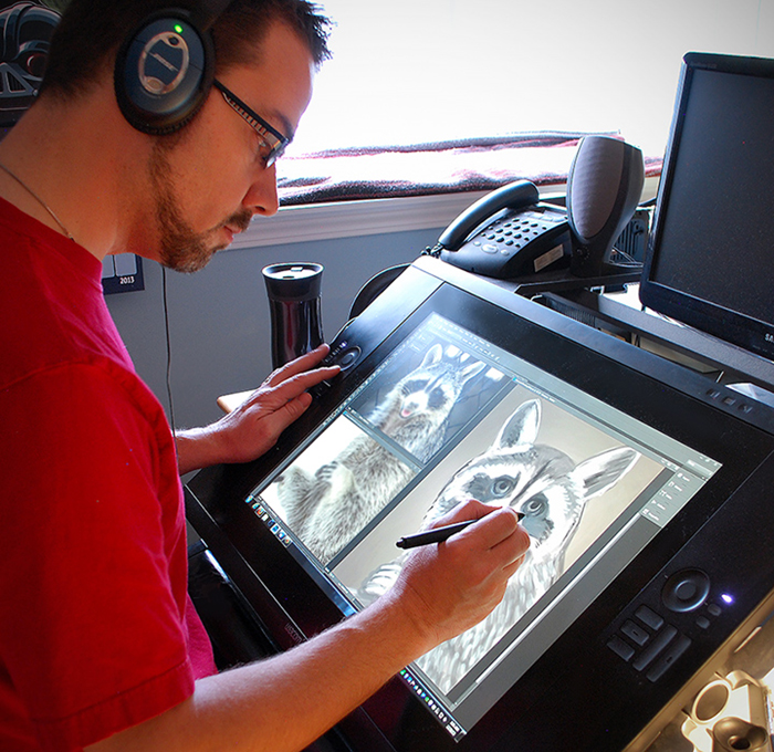
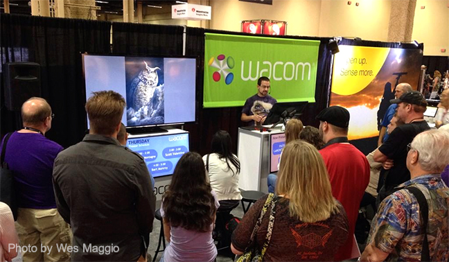
This year, The Calgary Expo was one week later and the camping trip one week earlier, just bad calendar luck. With only three days between the two, it was a scramble to draw enough cartoons for my papers, meet a deadline for an Autodesk/Wacom commission, and still be ready to leave Thursday morning, but I was determined.
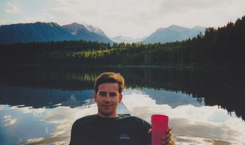
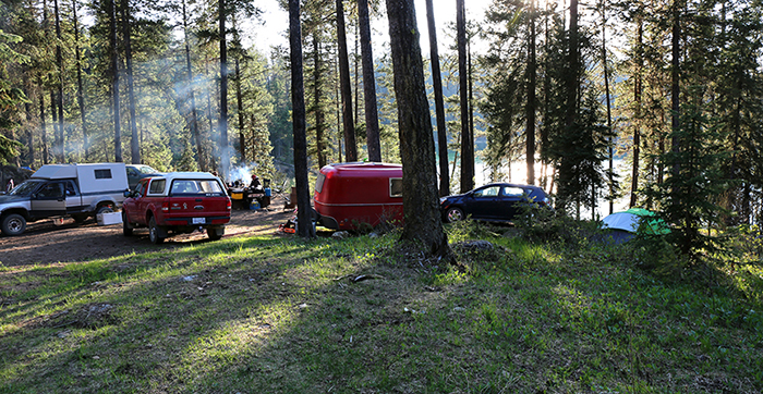
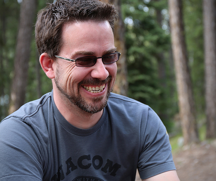
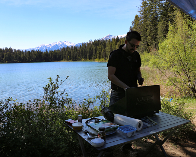
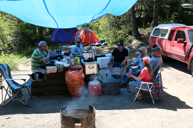
 Five of us in four vehicles, it was an easy trip up. A little rain on the first day, but three days of warmth and sunshine from Friday to Sunday, so no complaints in the weather department. With camping, weather is more than half the battle. Mosquitos are another foe, one I failed to conquer judging by the number of bites I’ve been scratching while writing this.
The last three months have been hectic, and I was glad to have it all out of the way for this trip. With nothing but my book deadline looming and the usual cartoons, I had three restful nights, even slept in ‘til 8:30 every day. For a guy who gets up at 5:00 most of the time, that’s an accomplishment.
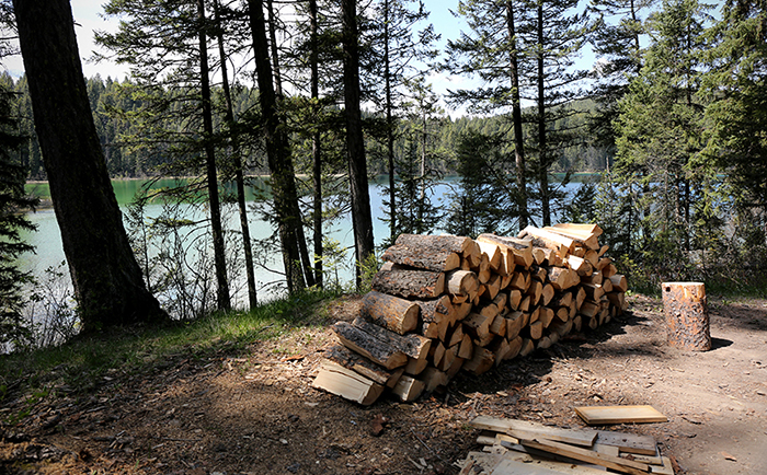
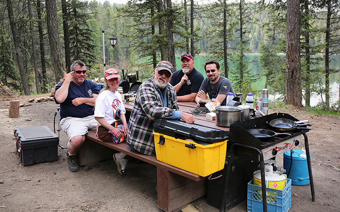
Aside from the obligatory errand into the woods to buck up deadfall for firewood, and splitting/stacking it back at camp, there was nothing on the agenda. Didn’t even eat or drink too much, so no mornings marred by poor judgment the night before. A few old friends came up for a welcome afternoon visit on Saturday and aside from campers on the other side of the lake, we had the place pretty much to ourselves with plenty of room to spread out our tents, trucks and trailer.
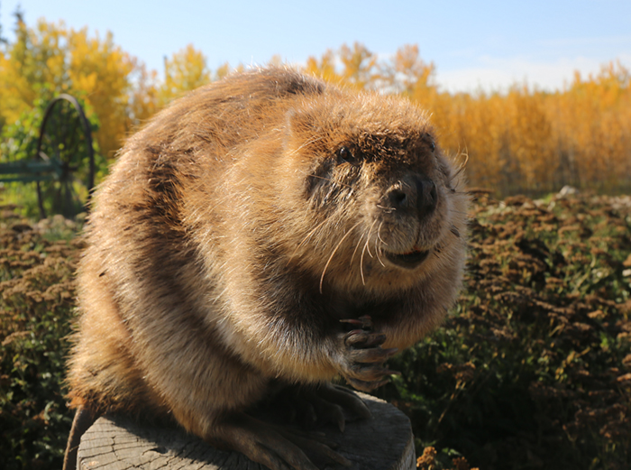
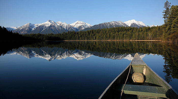
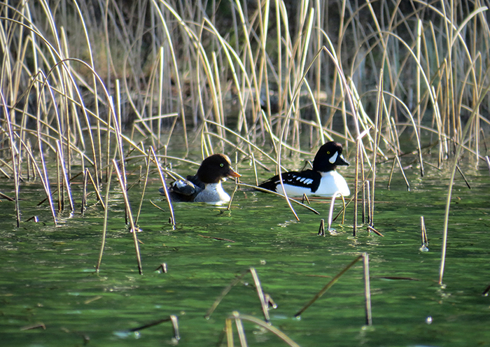
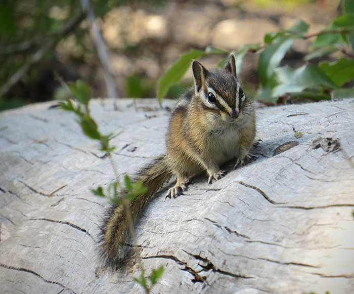
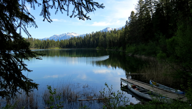
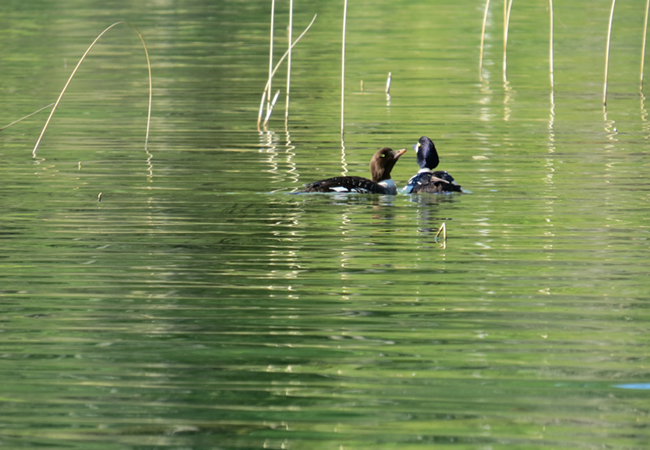
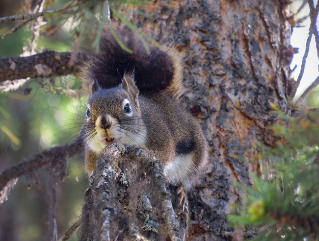
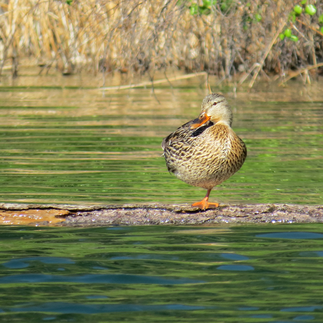
I spent my time hanging out with the group, reading, paddling around the lake in the canoe, stalking ducks and squirrels with the camera and even managed some writing on the last afternoon. I did not, however, do any drawing. Not one sketch. Apparently I needed a little break from that, too.
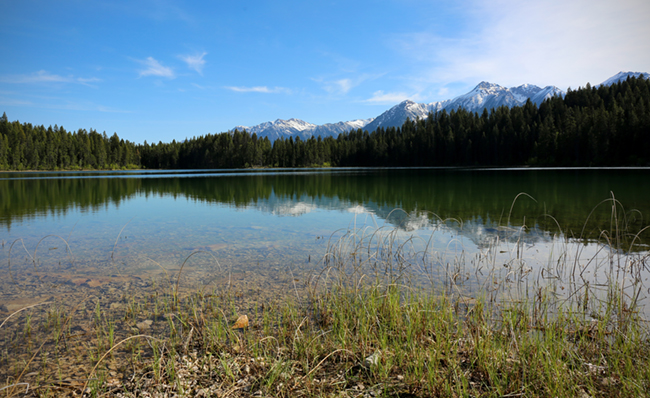
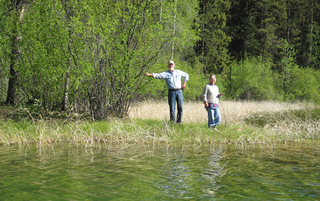
The temperature of a mountain lake in May is a might chilly, but since we all chickened out on swimming last year, I was determined to go in this time. The first dip on Friday was quick enough to get clean and it was most definitely not the typical Canadian swimming temperature of “it’s fine…once you get in.”
The next day, I did manage to swim around for ten minutes before I began to lose feeling in my toes.
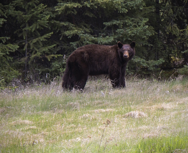
I don’t enjoy being idle for too long, and realized on the last evening, that I was ready to go home, which is a good sign. Too many lazy days and I get bored, so I was happy to make the drive home. Managed to pull over and take some shots of this black bear on the way back, too, which was a nice surprise.
On the drive home, I realized how very much I needed the camping trip this year. Next year, I might not. But it’s a nice option to have if the timing is right.
People will often tell me that I work too much, but they obviously don’t get it. I enjoy my work, even though it sometimes pisses me off (see: politics). As some of my friends are a fair bit older than I am, they’re either retired already or talk about it often. I’m of a mind that my best work is still ahead of me and my biggest fear is that some future malady or handicap will prevent me from working as long as I want to.
While I’m saving to be comfortable in my senior years, retirement is not on my radar. My work will change and evolve, I’m sure, but I can’t imagine wanting to stop. I thrive on it.
Camping trips and vacations are necessary to reset and recharge, but that means something different for each person. For me, two or three days doing nothing by a lake is ideal. Anything more than that, and I’d rather be working.
But every now and then, I still want those two or three days.