If you’ve followed my work for any length of time, you already know that the Calgary Expo has been my biggest undertaking of the year for the past six years. For people who do trade or gift shows on a regular basis, this sort of thing is routine, so the big deal I make about it each year seems like nothing to them. If I did these sort of shows a lot, I would easily see it from their perspective, but it’s not just the show that’s a challenge, it’s getting away FOR the show.
As half of my business is editorial cartooning, which requires following the news for a living and producing satirical illustrated commentary almost every day, taking five days away to focus on this show is more difficult than getting away for a vacation. My newspapers still have to be covered and when I get home exhausted late Sunday night, I’ll still be up at 5am on Monday morning drawing cartoons.
Managing the logistics to prep for this show is a lot of work because I also have to keep my papers supplied with cartoons while I’m away, which means drawing more in the week before and hoping no news of great importance breaks while I’m gone, because I can’t just abandon my booth or drive back to Canmore to get a cartoon done in between the show hours.
I’m also an introvert who spends most of time working alone in the comfort of my home, so this event takes a lot out of me, having to be ON for five days, surrounded by a lot of people.
That being said, it’s usually a fun show. Once I’m there, I really do enjoy it, even though Sunday will be a very long slog of a day. I rarely encounter somebody at this show who doesn’t want to be there and few who aren’t having a good time. Each year, my booth gets better, I learn something new for the next go ’round and streamline the process.
I recorded a video this past weekend which showed the booth set up in my garage, offered some thoughts on why I set things up the way I do, and shared it with my newsletter audience. You can watch it here if you like.
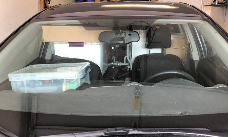
Here are some images of the prep this week. Beginning with the two sides of the booth set up in the garage, this is something I do every year to make things easier when I’m on site. With no time pressure, I’m free to leave it set up for a couple of days, nitpicking print placement and trying different things. Then I take photos of the setup and refer to it when I’m on site.
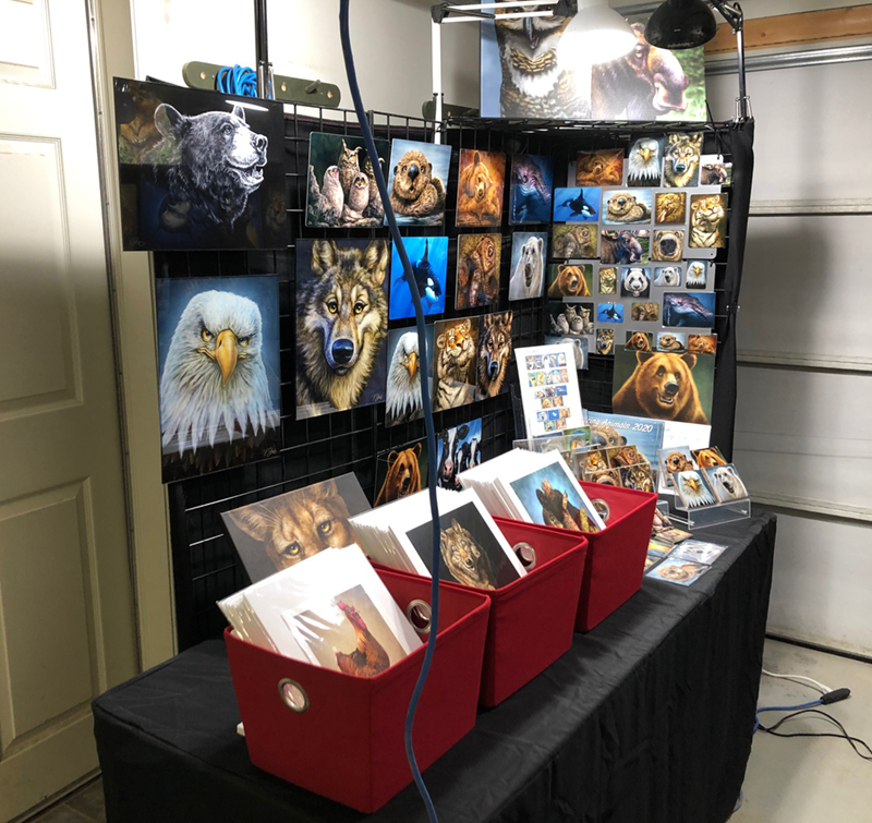
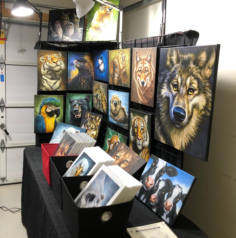
Once I’m happy with it, I pack it all up, go over the checklist and have it all together in one pile, ready to load. The snowshoes stay home.
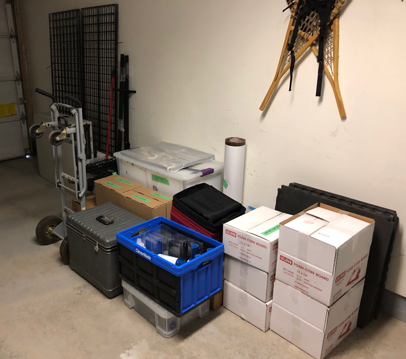
My trusty Pontiac Vibe may not be the most flashy or cool car around, but you can sure put a lot into it. The cargo capacity on this thing is impressive. There are two six foot tables in here, four 2′ X 6′ pieces of gridwall, two 1′ X 6′ pieces of gridwall and everything you see above. That being said, there is no room for anything else.
“Is there a problem, Officer?”
 Once on site Wednesday, I set it all up, made everything nice and tidy, ensured the lights were working, in order to leave as little work for myself as possible when I returned on Thursday.
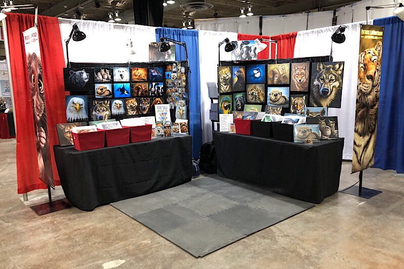
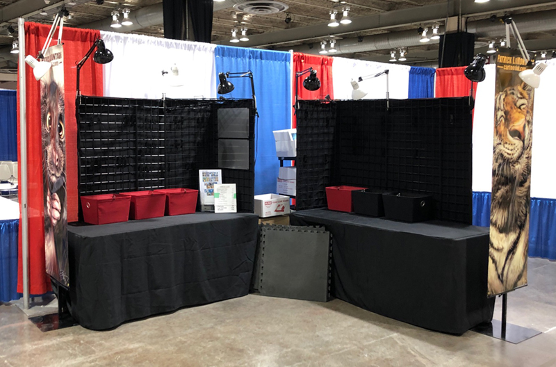 All that remained was to hang the canvas and aluminum, put the prints in the bins, the magnets on the board, the floor down and turn on the lights. It took about an hour yesterday to finish getting it show ready, the result below.
As I’m writing this in my hotel room Friday morning after the first evening, I was pleased with the first day’s sales, all things considered.
On the positive side of things, quite a few of my repeat customers I’ve gotten to know over the years came by to add to their collections and just to chat and catch up. That really is my favorite part of this show. Some of these people have been buying my work since my first year and I’m always grateful for their support. When more than a few customers greet you with a hug, you’re doing something right.
That being said, there is initially a different feel this year, confirmed by my fellow vendors and some attendees I know pretty well. It doesn’t appear that they sold out of exhibitor space this year which is a bad sign. Usually this show is FULL early on. There used to be a long waiting list.
This year, there’s actual empty space between some booths, you can see that in my above photo. When I arrived on Thursday, my neighbour on the right side of the pic had moved closer to me and said I could take advantage of it as well. I moved my far wall another two feet.
Having extra space at Expo is bizarre. We’re usually fighting for every inch. I know a couple of other vendors in the hall who had the same luxury.
Fan Expo bought the Calgary Expo a couple of years back and while changes were evident last year, the old familiar faces were still around and on the team. I haven’t seen anyone in administration that I recognize this year, so clearly they were obligated to be part of last year’s transition. In my opinion, it was those hardworking folks who made this con what it is and set the tone for the culture.
While clearly a commercial venture on all sides, there was always a feeling that we were all in this together, vendors and organizers. I’ve seen no evidence that exists any longer. Even the announcers sound bored.
Fan Expo (a subsidiary of Informa Exhibitions) doesn’t seem to be popular with the fans. At one time, I had considered doing the Edmonton, Regina and Vancouver Expos, but vendors talk with each other and there’s no incentive for me to give that any more thought. Many have become dissatisfied with those experiences and are abandoning them.
While my sales Thursday night were good, comparable with last year, I credit that to my great location on a main thoroughfare near an entrance, because there were noticeably fewer people in attendance. Thursday is usually quieter anyway, but this was the quietest I’ve ever seen.
Rumblings among the vendors is that the best days of the Calgary Expo might be behind us. One of my close friends, Michelle, a loyal Expo attendee, decided to skip this year. I’ve heard a couple of my neighbouring vendors say that this is their last year and depending on how the weekend goes, we’ll see how I feel about rebooking when Sunday comes.
If this good thing does come to an end and I bid farewell to the Calgary Expo, I’ll be disappointed, just as I was when I stopped attending Photoshop World for very similar reasons. But hanging on, expecting it to become what it used to be would be myopic, foolish and just bad business.
That being said, I still plan to have a good time this weekend, try my best to help others do the same, and I look forward to meeting and greeting my customers, both old and new.
Cheers,
Patrick
If you’d like to receive my newsletter which features blog posts, new paintings and editorial cartoons, follow this link to the sign up form.


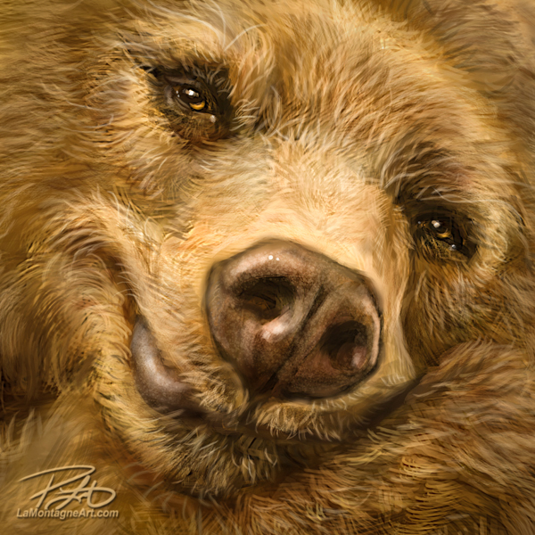
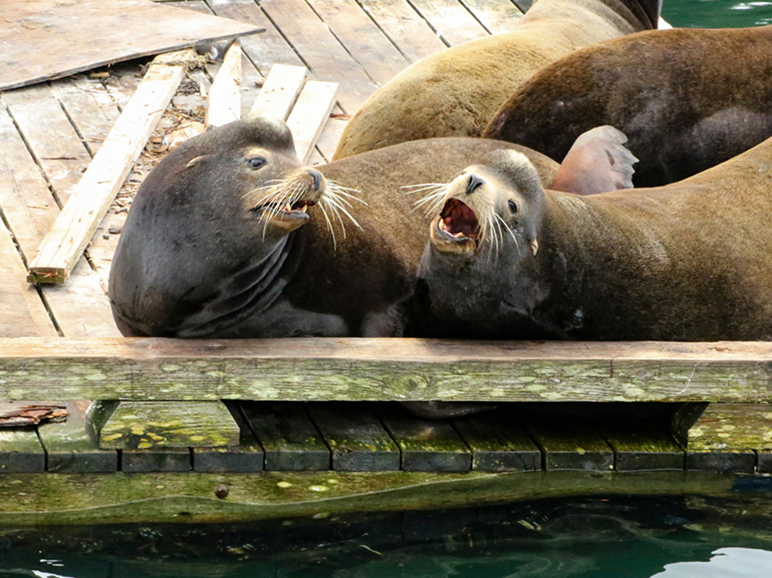
 It’s been some time since I’ve done a painting in my whimsical wildlife style, but I was pleased to put the finishing touches on this California Sea Lion this morning.
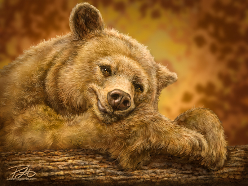
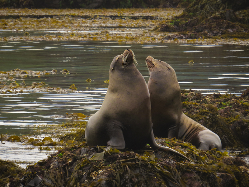 A sea lion might not come across as a big draw like a bear, eagle or whale, but they are popular with tourists, largely because they’re all over the place and accessible. They’re just a comical looking animal, with an obnoxious air of entitlement that reminds me of politicians, no offense intended to the sea lions.
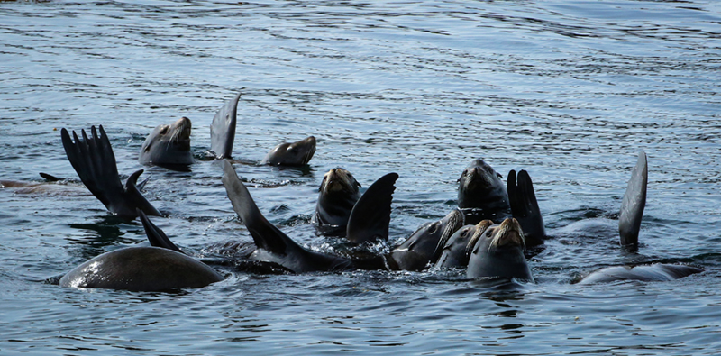
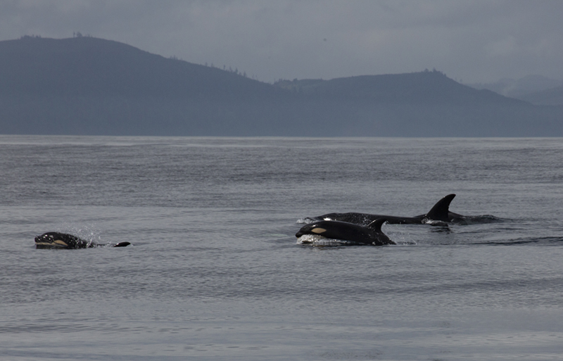
 Shonna and I do have a trip to the Island planned for later in the summer, but it will be the first time we won’t be going out to Ucluelet, one of our favorite places on earth. We’ll still be on the hunt for wildlife, but the adventure we’ve booked this year will have a different flavour and some new excitement.
 If you’d like to receive my newsletter which features blog posts, new paintings and editorial cartoons, follow this link to the sign up form.