 An artist friend of mine recently told me she heard someone balking about my commission prices. She backed me up and explained to them how much work goes into an original painting. Based on questions and experiences over many years, here are some things I often have to address with regard to commissions.
1) I need good reference. If someone wants me to paint their dog when he was two years old on a sunny day in the park, and all they have are blurry photos of him in his senior years under gloomy skies looking sad with his eyes closed, I’ll be politely declining the opportunity. I’m going to hate the work, and they’re going to hate the painting.
2) Just because a client can’t afford it, doesn’t mean my rates are too high. I’m being asked to paint an original, personal painting, that will unlikely be of any interest to anyone else. It will take me 10-15 hours MINIMUM, which doesn’t include the time spent talking with the client, having the canvas printed, going to Calgary to get it, packaging and shipping it or delivering it personally, which is all included in the price of $1100.00 (Canadian funds).
3) Yes, I require a deposit of 50% up front. It’s non-refundable. Why? Because over the weeks it’ll take for the painting to be done, the client is more likely to have a change of heart if they’ve got nothing invested in it. Some will also try to renegotiate the price of the painting at the end of the job. Amazon doesn’t ship stuff until it’s paid for. Neither do I.
4) When a client says they “only want a small painting,” “something simple,” or it “doesn’t have to be as detailed as my other stuff,” what they’re after is a cheaper painting. I work digitally. It’s all the same size; it’s only the printing that’s large or small. Even if I worked traditionally, a small detailed painting is much more difficult than a large one. I don’t know how to do a half-assed job and they wouldn’t like it even if I did. Otherwise, they’d have asked somebody else.
5) If a man owns a hardware store, he might offer a friend or family member a discount. It’s inventory on the shelf, so he’ll just order another and it didn’t cost him anything. With somebody whose product is ALL labour, they’re losing money on any cut in their rate because they can only work on your thing instead of other work that pays their bills. That goes for artists, plumbers, mechanics, hairstylists, and anybody who makes their living from their time, our most valuable non-renewable resource.
I’ve long been a pushover on this point, actually offering deals before they’re even requested. It’s a common problem that many artists have and it’s nobody’s fault but our own. At this stage in my career, I would rather not get the gig than do it for peanuts.
Every professional artist I know has often heard, “I wish I could draw,” and other compliments that express an appreciation for the skills that have been acquired through decades of hard work and practice. But when it comes to paying for art, people expect it to cost a hair more than the paper on which it’s printed, or nothing at all.
6) Someone else’s procrastination is not my emergency. The fact that a birthday is next week and they kept meaning to get in touch with me doesn’t change the fact that I won’t have time to get it done, even if I didn’t have all of the other work I’ve committed to already. I’m not always available. Commissions are the smallest part of my business and I’ve got a lot of other work on the go. Always! Often I know I won’t be able to meet the deadline and I won’t accept the commission because of it.
7) From time to time, I will donate prints for charity auctions, but I get asked so often, that I’ve restricted donations to causes that support animals or wildlife conservation. I’ve also been asked to donate commissions, but that’s a hard NO. That’s how I end up with clients that provide the worst photos, the shortest deadlines, make the most unreasonable demands and if I don’t meet them all to the letter, I’m accused of lying about the donation.
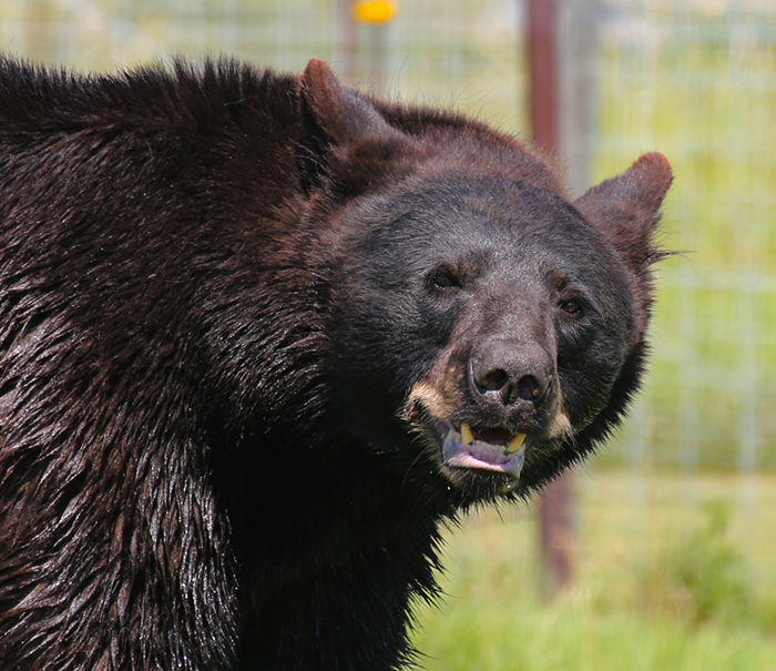
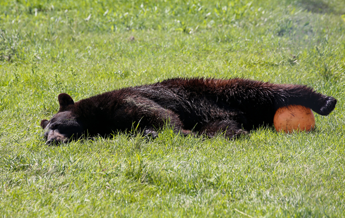
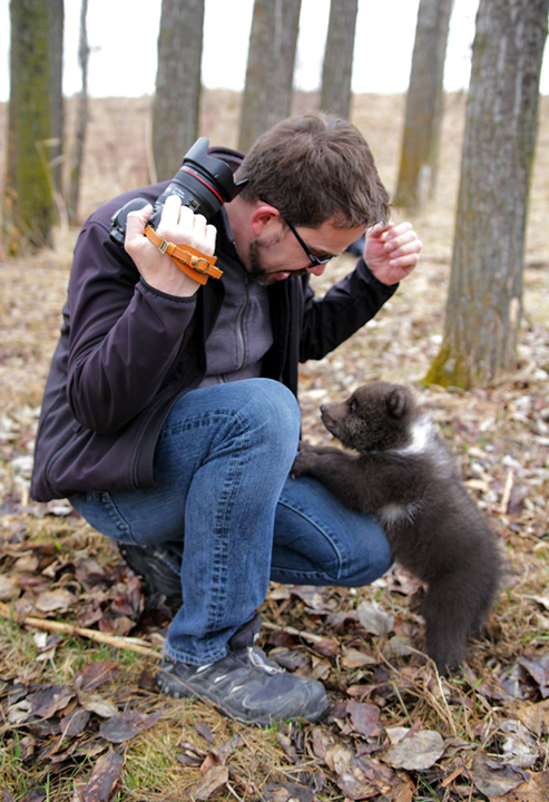
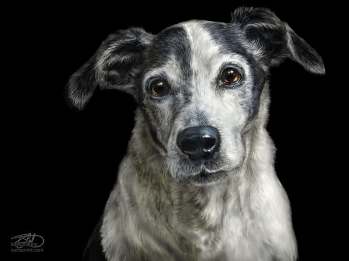
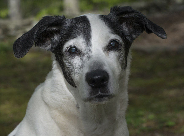
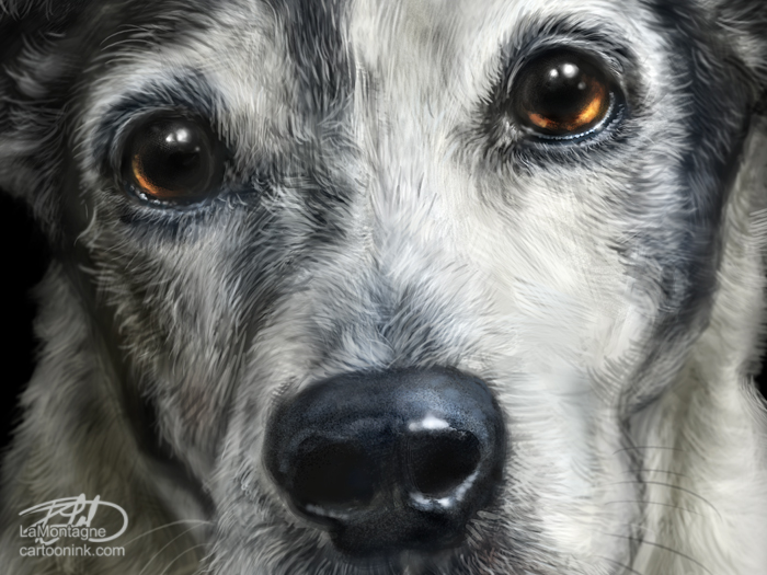
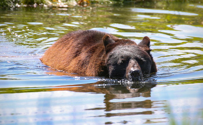
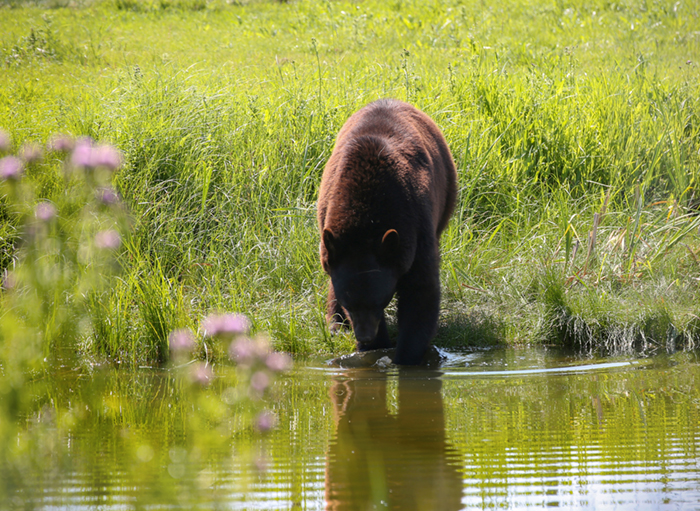
8) I will often get people wanting to hire me after their pet has passed and only then do they realize they don’t have any good photos. Take lots of photos! Even if you never hire me to paint your pet, you’ll want those photos after they’re gone. Taking photos of your pets is fun. They’re all nuts, in the best possible way.
 I’ve had the privilege of working for and with many wonderful clients over the years, some of whom have hired me more than once to paint their pets. This somewhat rant of a list should in no way diminish all of the great experiences I’ve had with so many people who’ve trusted me with painting an image of their adopted loved ones, whether those furry friends are still around or have passed on. In all of those cases, having lots of photos to choose from made the difference.
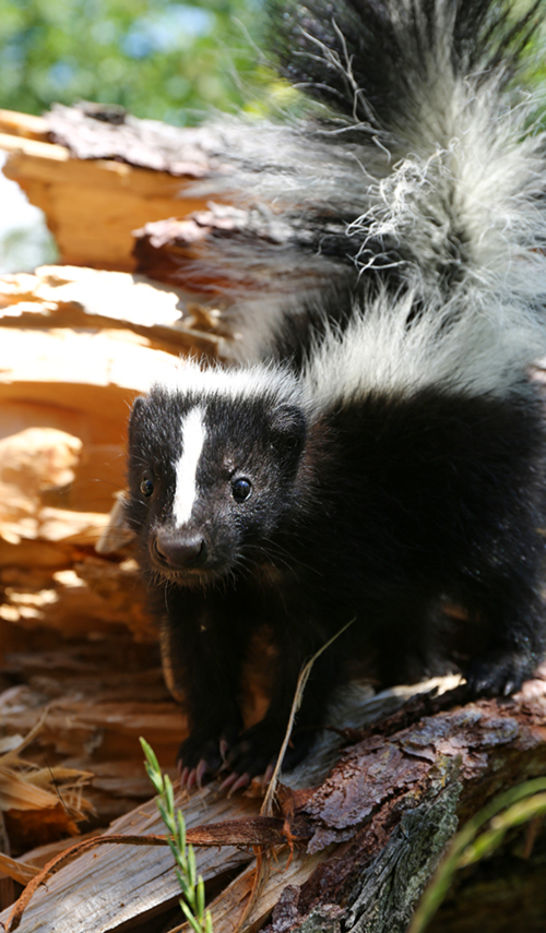
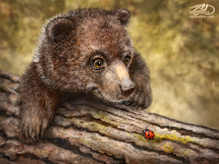
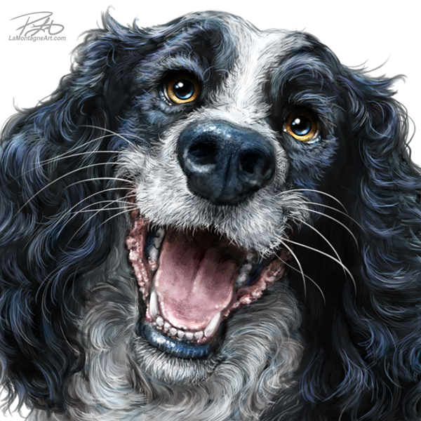
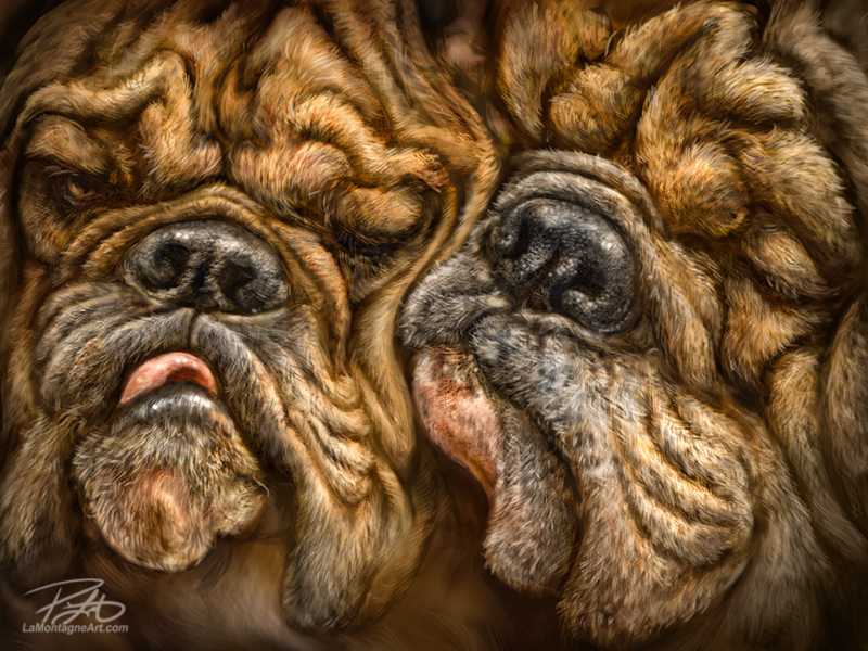
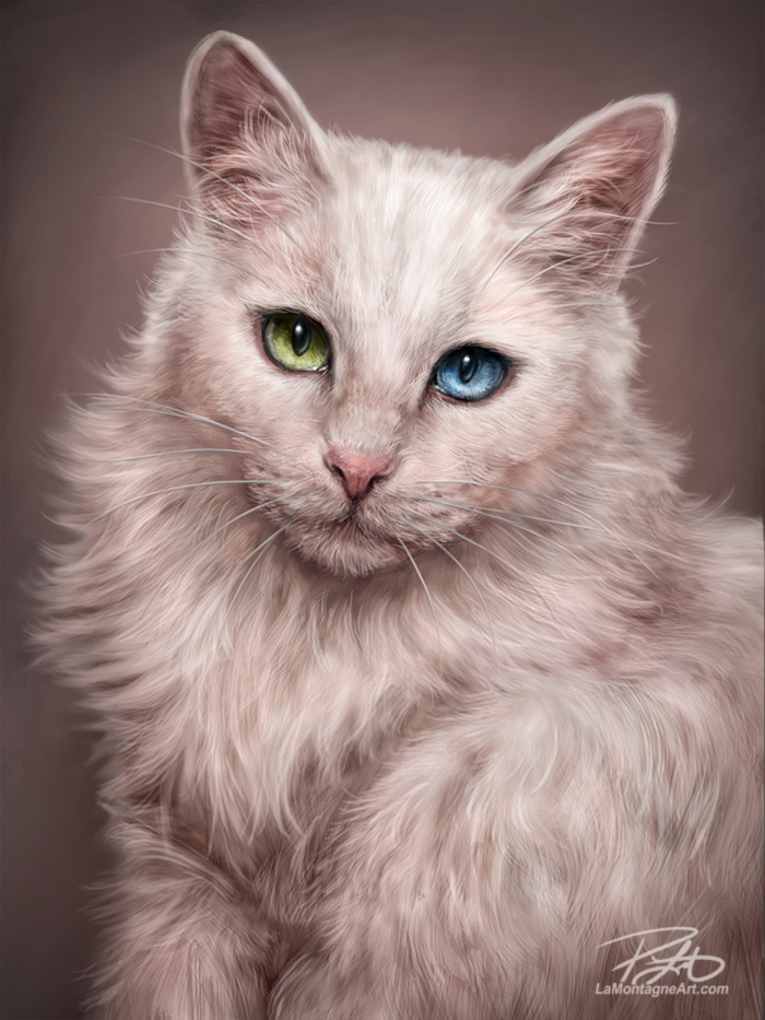
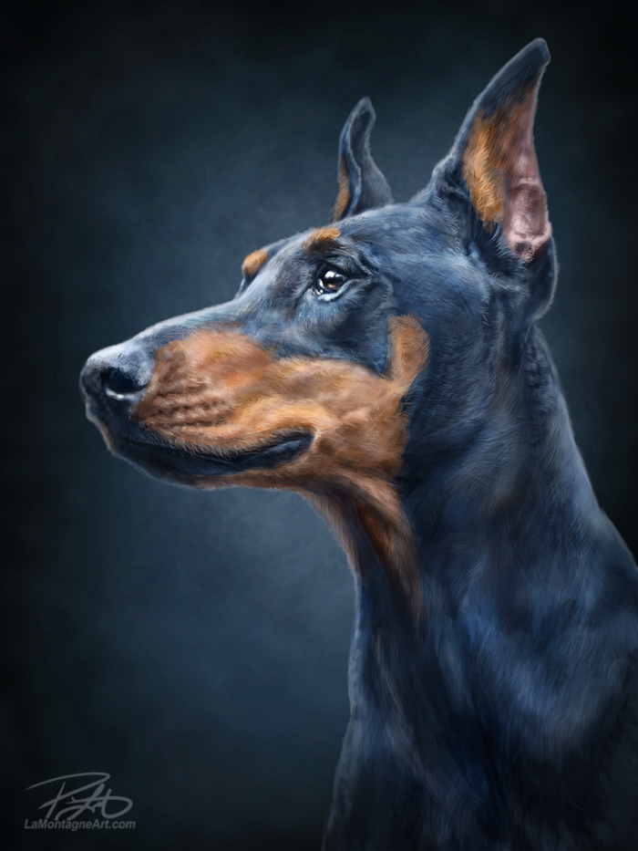
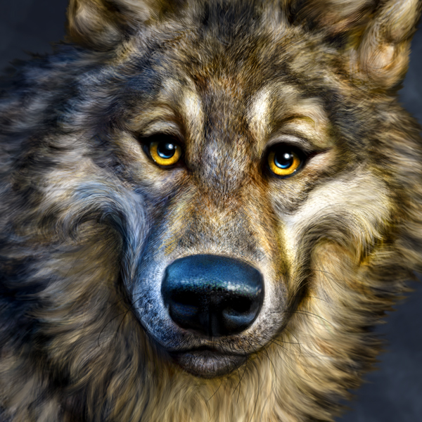
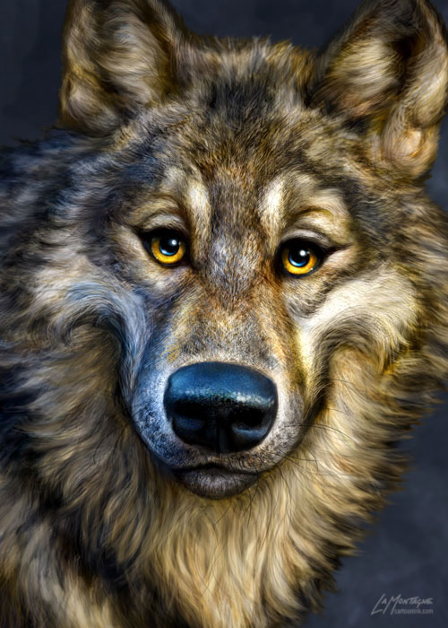
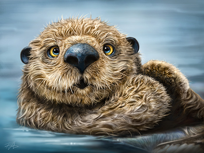
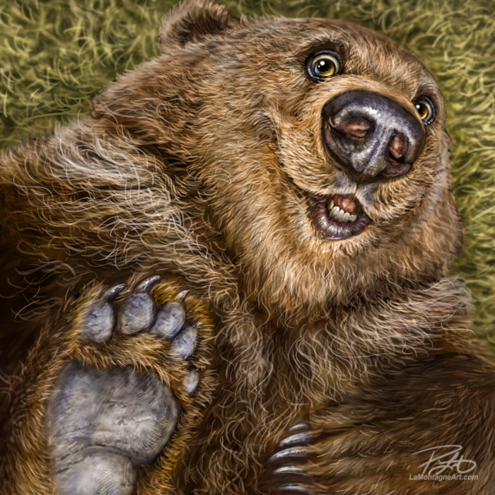
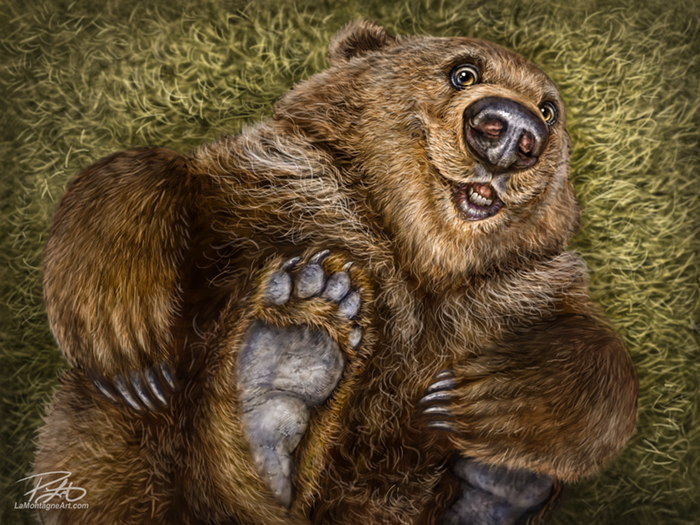
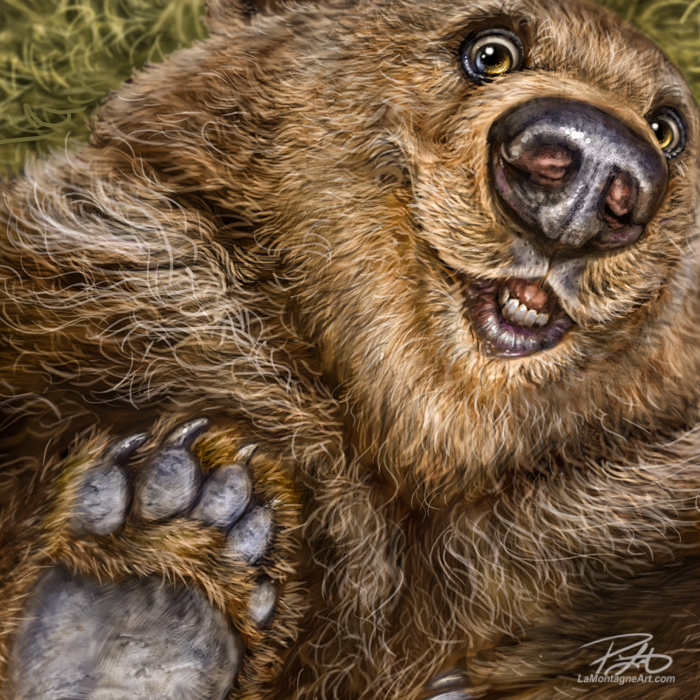
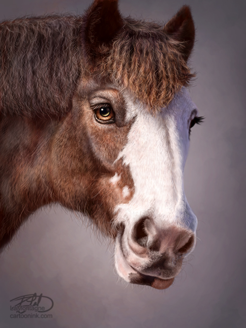
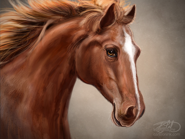
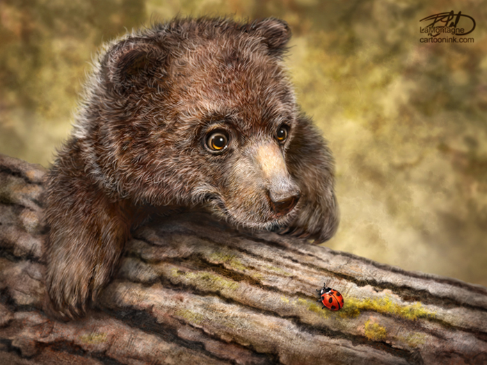
9) Because they’re often memorials, most people commission me to paint their pets in a portrait style rather than in my whimsical wildlife style, which is the work I enjoy most. So when I’m working on a traditional look portrait, it’s not work I would have done anyway. I don’t have the creative freedom to distort the expression, make the face goofier, add big strings of drool, and have fun with it, because that’s not what the client wants. Paintings in a portrait style are work, so while I’ll still put my best effort into it, I’d rather be painting the funny looking animal version. That’s my niche, what makes my work unique, and for what I want to be known.
Lastly, just like any other skilled professional, I’ve spent many years working on my craft. I’ve become very good at what I do and I keep raising the bar for what I’ll accept from myself. My best keeps getting better because I invest a lot of my life into my art.
If you want my best work, you have to pay for it.
Cheers,
Patrick
If you’d like to receive my newsletter which features blog posts, new paintings and editorial cartoons, follow this link to the sign up form.


 .
. .
.